Overview #
An alluvial plot is a way to show proportions of observations across different categories.

Visually, an alluvial plot is made up of stacked bars, and between those bars are links.
Each set of stacked bars represents a categorical field. The separations within the stacked bars represent different categories.
These stacked bars are more precisely referred to as strata (singular, stratum), and the vertical stacked bar themselves are called axis.
The links between the bars conveys the set of observations shared between one categorical field and the next.
The entirety of these links (extending all the way from the left to the right of the plot) are more properly referred to as alluvia (alluvium in singular form).
The segments of these alluvia that connect axis to axis are referred to as flows. This of these flows as shorter sugments of longer alluvia.
The heights of the bars and the widths of the links represent the number of observations. Note that the total height remains consistent all along the plot, moving from left to right.
That’s a lot of words so far. Put simply, an alluvial plot shows proportions across different categories.
Example #
A very popular example of an alluvial plot is the composition of Titanic passengers, broken down by class, gender, and survival.
Here’s a subset of that data:
| Class | Sex | Age | Survived | Freq |
|---|---|---|---|---|
| 1st | Male | Child | No | 0 |
| 2nd | Male | Child | No | 0 |
| 3rd | Male | Child | No | 35 |
| Crew | Male | Child | No | 0 |
| 1st | Female | Child | No | 0 |
| 2nd | Female | Child | No | 0 |
| 3rd | Female | Child | No | 17 |
| Crew | Female | Child | No | 0 |
| 1st | Male | Adult | No | 118 |
| 2nd | Male | Adult | No | 154 |
In this dataset, the fields CLASS, SEX, AGE, and SURVIVED are categorical fields. FREQ is a numerical field.
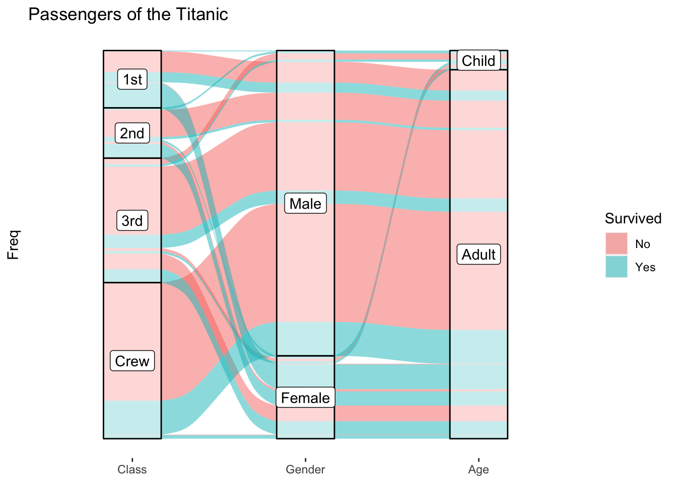
An alluvial plot of this data might look like this:
## Warning: Using the `size` aesthetic in this geom was deprecated in ggplot2 3.4.0.
## ℹ Please use `linewidth` in the `default_aes` field and elsewhere instead.
## This warning is displayed once every 8 hours.
## Call `lifecycle::last_lifecycle_warnings()` to see where this warning was
## generated.

Compared to Sankey Diagram #
Visually, an alluvial plot looks quite a bit like a sankey diagram.
They both have bars and links of varying widths. On first glance, it’s very easy to mistake one for the other.
In fact, there’s a lot of sloppiness in the usage of the terms “alluvial” and “sankey”. The two terms are often used interchangeably, when they are in fact very different visualizations.
An alluvial plot is used to convey information about categories, whereas a sankey diagram is used to convey information of flows.
In an alluvial plot, the ordering of the bars do not necessarily matter as there is no logical sequencing to the data. In the Titanic data for instance, there is no reason why the CREW field needs to come before the SURVIVED field, and vice versa.
In contrast, order does matter in a Sankey diagram, since there is a logical sequencing to how one observation moves from one state to the next.
When to use #
Use an alluvial plot when you want to show the proportion of observations that are shared across different categorical fields.
Alluvial plots are good for conveying approximate proportions. They’re less effective for communicating precise measures.
Data #
An alluvial plot requires at least two categorical fields and one numerical field.
There can be more than two categorical fields, but if there are too many, the plot will look pretty busy and could be hard to read.
The data can be structured as lodes, but we won’t talk about that here. For more details, check out the ggalluvial vignette.
R #
My preferred way of generating alluvial plots in R is with the ggalluvial package.
ggalluvial builds upon ggplot2, which means we can use the different pieces of tooling available through ggplot2 as well.
# install.packages("ggalluvial") # run this if the package hasn't already been installed
library(ggalluvial)
Let’s walk through how to build the Titanic plot from above.
Here’s the Titanic data.
str(Titanic)
##  'table' num [1:4, 1:2, 1:2, 1:2] 0 0 35 0 0 0 17 0 118 154 ...
##  - attr(*, "dimnames")=List of 4
##   ..$ Class   : chr [1:4] "1st" "2nd" "3rd" "Crew"
##   ..$ Sex     : chr [1:2] "Male" "Female"
##   ..$ Age     : chr [1:2] "Child" "Adult"
##   ..$ Survived: chr [1:2] "No" "Yes"
head(Titanic)
## , , Age = Child, Survived = No
##
##       Sex
## Class  Male Female
##   1st     0      0
##   2nd     0      0
##   3rd    35     17
##   Crew    0      0
##
## , , Age = Adult, Survived = No
##
##       Sex
## Class  Male Female
##   1st   118      4
##   2nd   154     13
##   3rd   387     89
##   Crew  670      3
##
## , , Age = Child, Survived = Yes
##
##       Sex
## Class  Male Female
##   1st     5      1
##   2nd    11     13
##   3rd    13     14
##   Crew    0      0
##
## , , Age = Adult, Survived = Yes
##
##       Sex
## Class  Male Female
##   1st    57    140
##   2nd    14     80
##   3rd    75     76
##   Crew  192     20
Note that the Titanic data is in a table format. Let’s work with as as a data frame instead.
head(as.data.frame(Titanic))
##   Class    Sex   Age Survived Freq
## 1   1st   Male Child       No    0
## 2   2nd   Male Child       No    0
## 3   3rd   Male Child       No   35
## 4  Crew   Male Child       No    0
## 5   1st Female Child       No    0
## 6   2nd Female Child       No    0
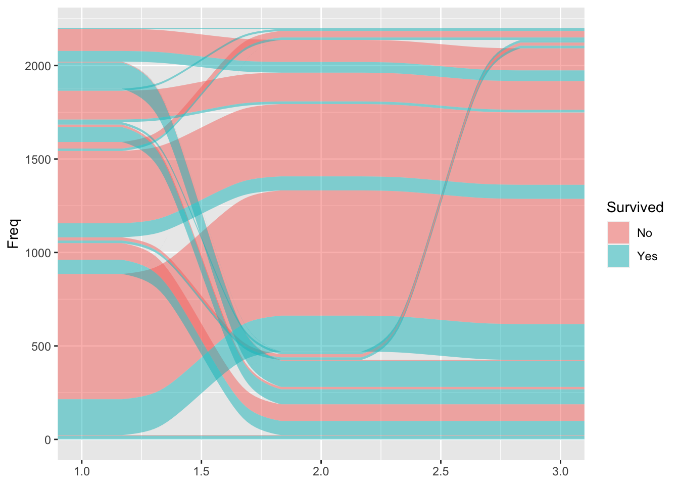
First, let’s draw the alluvia. We’ll arbitrarily order the categories to go from Class, to Sex, to Age, and we’ll have the widths map to the frequency (Freq). Let’s also map the color to survival status.
as.data.frame(Titanic) %>%
  ggplot(
    aes(y = Freq, axis1 = Class, axis2 =Sex, axis3 = Age)
  ) +
  geom_alluvium(aes(fill = Survived))

The axis parameters in the aesthetic mapping define the ordering of the categories.
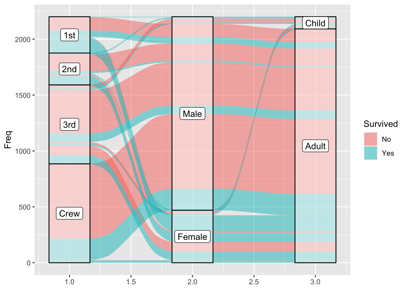
That’s visually interesting, but not very functional. Let’s add some strata with labels.
as.data.frame(Titanic) %>%
  ggplot(
    aes(y = Freq, axis1 = Class, axis2 =Sex, axis3 = Age)
  ) +
  geom_alluvium(aes(fill = Survived)) +
  geom_stratum(alpha = .5) +
  geom_label(stat = "stratum", aes(label = after_stat(stratum)))

A little tip: I like making the strata semi-transparent with the alpha parameter to allow the alluvia to peak out from behind.
For more details about the stat = "stratum" bit, check out the documentation here.
This is now functional, but let’s clean it up some by adding some more labels and removing extraneous bits.
as.data.frame(Titanic) %>%
  ggplot(
    aes(y = Freq, axis1 = Class, axis2 =Sex, axis3 = Age)
  ) +
  geom_alluvium(aes(fill = Survived)) +
  geom_stratum(alpha = .5) +
  geom_label(stat = "stratum", aes(label = after_stat(stratum))) +
  scale_x_discrete(limits = c("Class", "Gender", "Age")) + # change x-axis labels
  theme(
    axis.ticks.y = element_blank(), # remove tick marks on the vertical
    axis.text.y = element_blank(), # remove numbers from the vertical
    panel.background = element_blank(), # remove the gray background
    panel.grid.major = element_blank(), # remove the major grid lines
    panel.grid.minor = element_blank() # remove the minor grid lines
  ) +
  labs(
    title = "Passengers of the Titanic" # add a plot title
  )

And that’s it. We now have a fairly clean and functional alluvial plot.
Conclusion #
Alluvial plots are fairly sophisticated, and the amount of customization possible can be pretty overwhelming.
Despite their sophistication, I would say that alluvial plots aren’t terribly functional. They suffer from the same flaw as pie charts or donut charts in the sense that the form presented in alluvial plots aren’t great for humans to draw accurate comparisons.
They can be aesthetically pleasing to look at though, and sometimes approximately communicating data in a pretty form is good enough.