Overview #
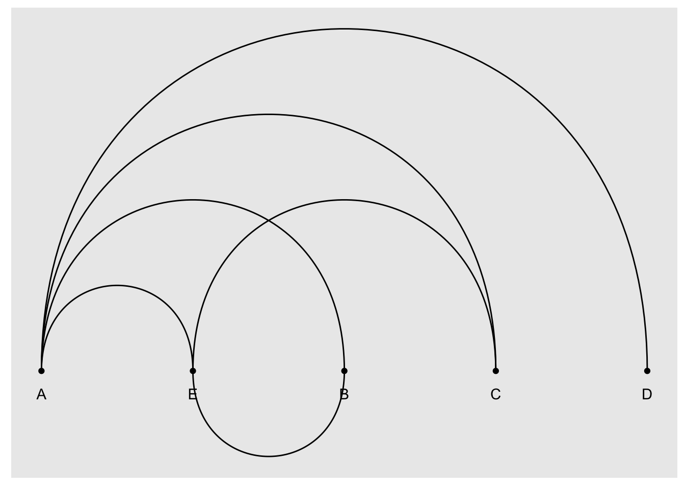
An arc daigram is a one-dimensional network graph that highlights clusters and connections.

Think of the points as things, and the lines (or arcs) connecting those things as connections.
Those things can represent people, and the arcs can represent relationships or friendships.
Those things can also represent say countries, and the arcs trade.
Or respectively computers, and data transfers.
At the end of the day, an arc diagram is really a network graph smushed flat.
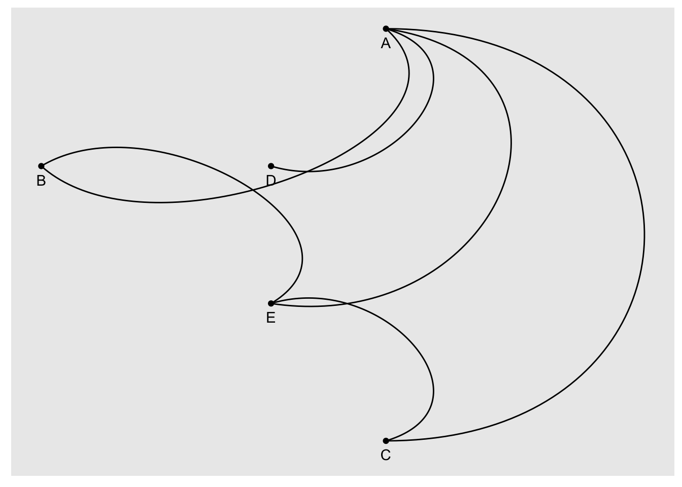
All the things – which are more properly referred to as nodes – are arranged along a single line. This is a departure from more conventional network graphs, which are more freely arranged on a two-dimensional representation.

Note that this ^ diagram conveys the exact same detail as the arc diagram above, just in a different visual form. But the visual effect is dramatically different.
When to use #
An arc diagram really excels at conveying information about clusters.
It’s not so great for getting a more general sense of network structure.
Oftentimes, it’s necessary to re-arrange the order of the nodes to really get some sort of message across. Without proper ordering, an arc diagram might end up looking like a hairball of a mess.
Data #
An arc diagram requires data structured as an edgelist, where each record represents a relationship. The columns represent the nodes in the relationship, and are often represented in a “from” and “to” field, especially if the direction of the relationship matters.
If the direction doesn’t matter, than the fields can be called anything really. “node1” and “node2” would work just as well.
Here’s an example of an edgelist that mirrors the sketch above:
| from | to |
|---|---|
| A | B |
| A | C |
| A | D |
| A | E |
| E | C |
| B | E |
We’ve talked about edgelists before in chord diagrams.
R #
We can generate an arc diagram in R using the ggraph.
We’ll use the example data from above:
example <- tribble(
  ~from, ~to,
  "A", "B",
  "A", "C",
  "A", "D",
  "A", "E",
  "E", "C",
  "B", "E"
)

example
## # A tibble: 6 × 2
##   from  to
##   <chr> <chr>
## 1 A     B
## 2 A     C
## 3 A     D
## 4 A     E
## 5 E     C
## 6 B     E
Let’s start with putting together an arc diagram in ggraph.
ggraph builds heavily on the tooling from the igraph package, so we should load that as well
# install.packages("ggraph") # run this if you haven't already installed the package
# install.packages("igraph")
library(ggraph)
library(igraph)
Now we can put together all sorts of fun graphs with ggraph.
The first thing we have to do is take the edgelist dataframe we have and turn it into a graph object.
graph <- graph_from_data_frame(example)
Now we can put together a basic network graph.
ggraph(graph) +
  geom_node_point() + # draw nodes
  geom_edge_arc() + # draw arcs connecting nodes
  geom_node_text(aes(label = name), nudge_y = -.1) # add labels with a slight offset
## Warning: Using the `size` aesthetic in this geom was deprecated in ggplot2 3.4.0.
## ℹ Please use `linewidth` in the `default_aes` field and elsewhere instead.
## This warning is displayed once every 8 hours.
## Call `lifecycle::last_lifecycle_warnings()` to see where this warning was
## generated.
 Let’s turn this into an actual arc diagram where all the nodes are arranged along a line. We’ll do that by adding a
 layout ="linear" parameter.

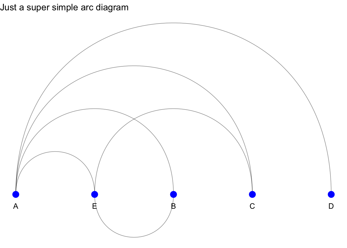
Let’s dress this up some.
ggraph(graph, layout ="linear") +
  geom_edge_arc(
    edge_alpha = .5, # give the arc some transparency
    edge_width = .3 # adjust the size
  ) + # I loved the arc up so the node covers the arc and not the other way around
  geom_node_point(
    size = 4, # make the nodes bigger
    color = "blue" # give it some color
  ) + # draw nodes
  geom_node_text(aes(label = name), nudge_y = -.1) + # add labels with a slight offset
  theme_void() + # use a bare theme
  labs(
    title = "Just a super simple arc diagram"
  )
 And there we have it: a simple arc diagram rendered in R using
 ggraph based on a made up edgelist.
Resources #
Here’s a fun example of an arc diagram is of the co-occurrence of characters from Les Misérables.