Overview #
An area plot shows how some particular value changes as another value changes.
A simple area plot is made up of a line that moves right along the horizontal axis, and its vertical position moves up and down to match some value. The area under the line is filled in with shading or color.
The line itself can be removed once the area is filled.

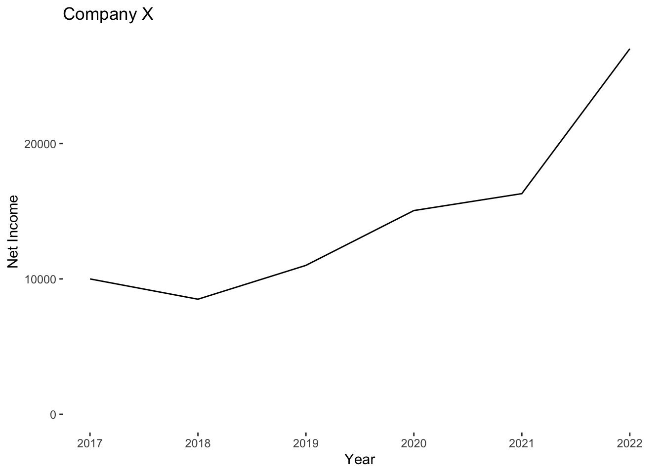
Functionally, an area plot is very similar to a line plot.
In this post, we’re talking able a simple area plot. Check out stacked area plot and proportional stacked area plot for variations of the area plot.
When to use #
Use an area plot to show how a variable changes as some other variable changes.
An area plot is more visually interesting than a line plot, but since there’s more on the visual, it’s considered a heavier plot.
We can think of “heavy” as being a reflection of how much ink we’d have to use to print the visual.
Data #
At a minimum, a simple area plot must have two numerical variables, where one numerical variable is mapped to the horizontal x-axis and the other variable is mapped to the vertical y-axis.
The x-axis should be continually increasing. For instance, an appropriate set might look like 1, 2, 3, 4, 5. Something like this would not work for an area plot: 1, 1, 2, 3, 3 because values repeat and are not continually increasing.
The y-axis value is whatever it is that we’re measuring.
R #
The simplest way to generate an area plot is with the ggplot2 package.
# install.packages("ggplot2")
library(ggplot2)
Let’s load up some example data. In this case, let’s look at the net income of Company X over the years.
example <- tribble(
  ~year, ~net_income,
  2017,10000,
  2018,8500,
  2019,11000,
  2020,15050,
  2021,16300,
  2022,27000
)

kable(example)
| year | net_income |
|---|---|
| 2017 | 10000 |
| 2018 | 8500 |
| 2019 | 11000 |
| 2020 | 15050 |
| 2021 | 16300 |
| 2022 | 27000 |
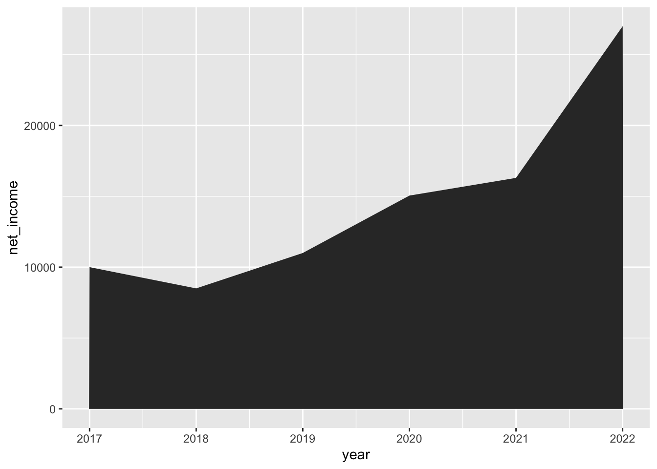
Now let’s plot it as an area plot.
example %>%
  ggplot() +
  geom_area(aes(x = year, y = net_income))
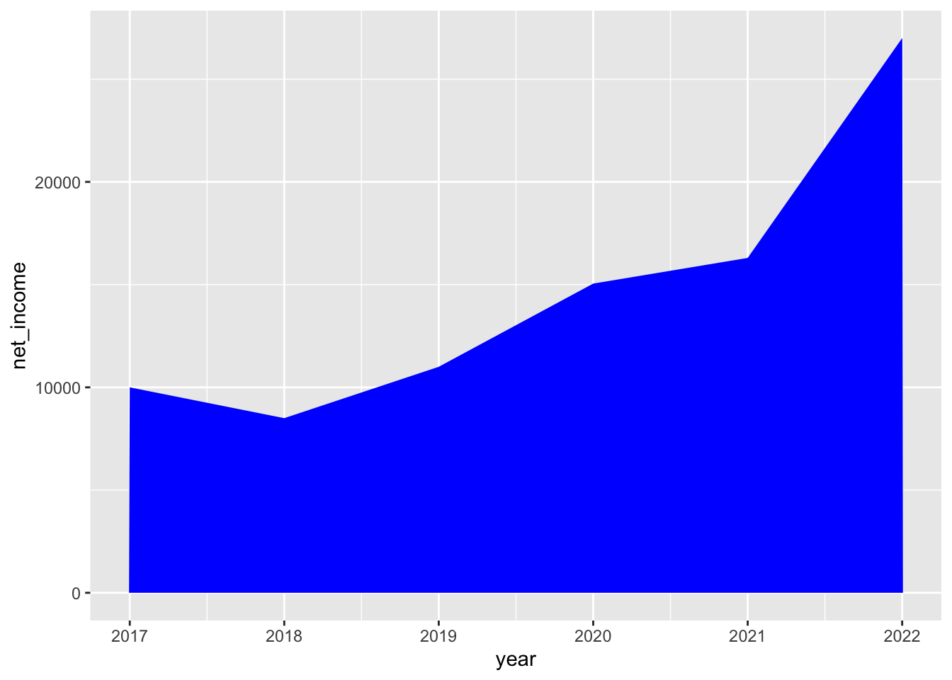
 Let’s change the fill area color.
example %>%
  ggplot() +
  geom_area(aes(x = year, y = net_income), fill = "blue")
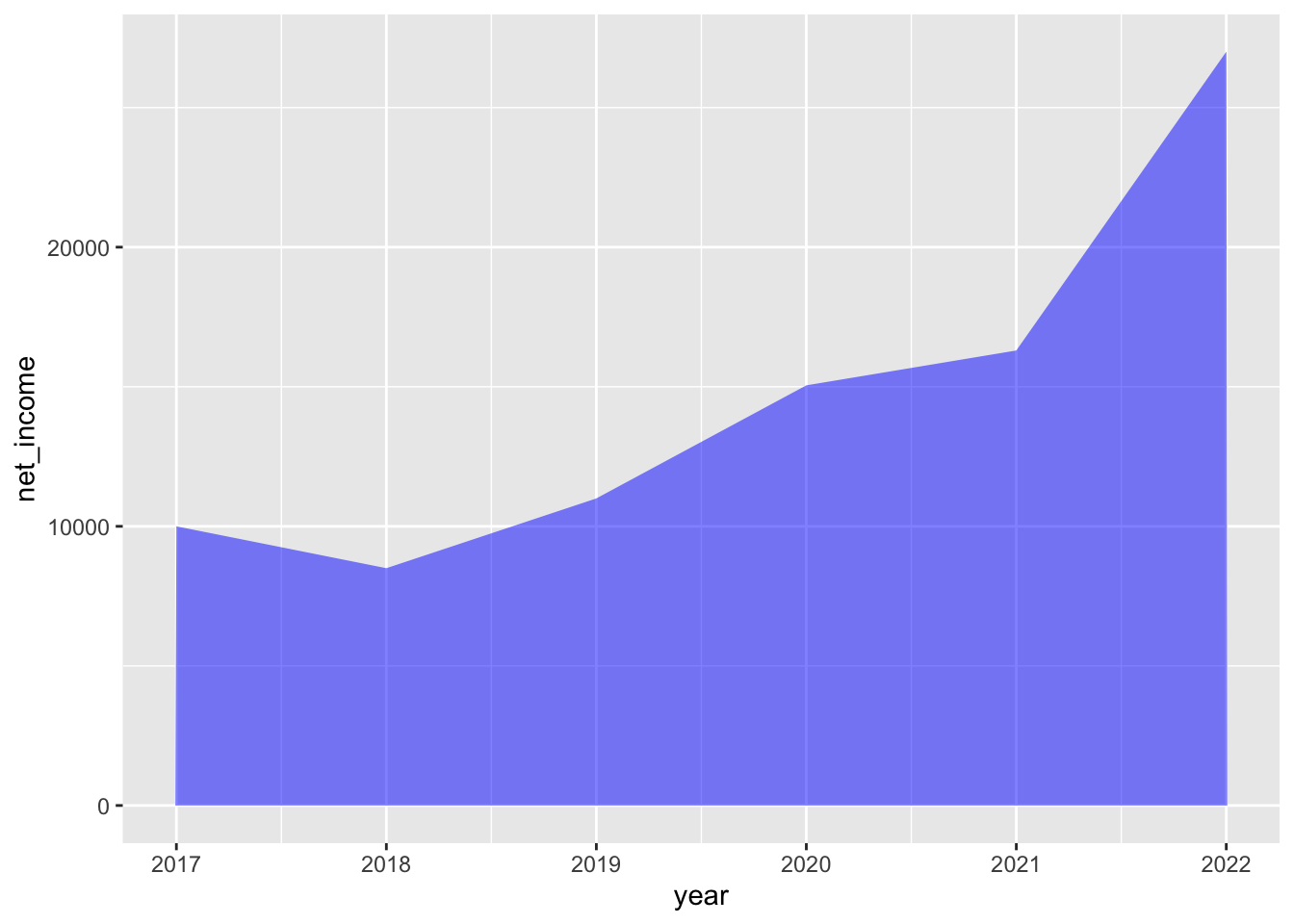
 We can also make it translucent.
example %>%
  ggplot() +
  geom_area(aes(x = year, y = net_income), fill = "blue", alpha = .5)
Let’s also give it an outline.
example %>%
  ggplot() +
  geom_area(aes(x = year, y = net_income), fill = "blue", alpha = .5, color = "black")
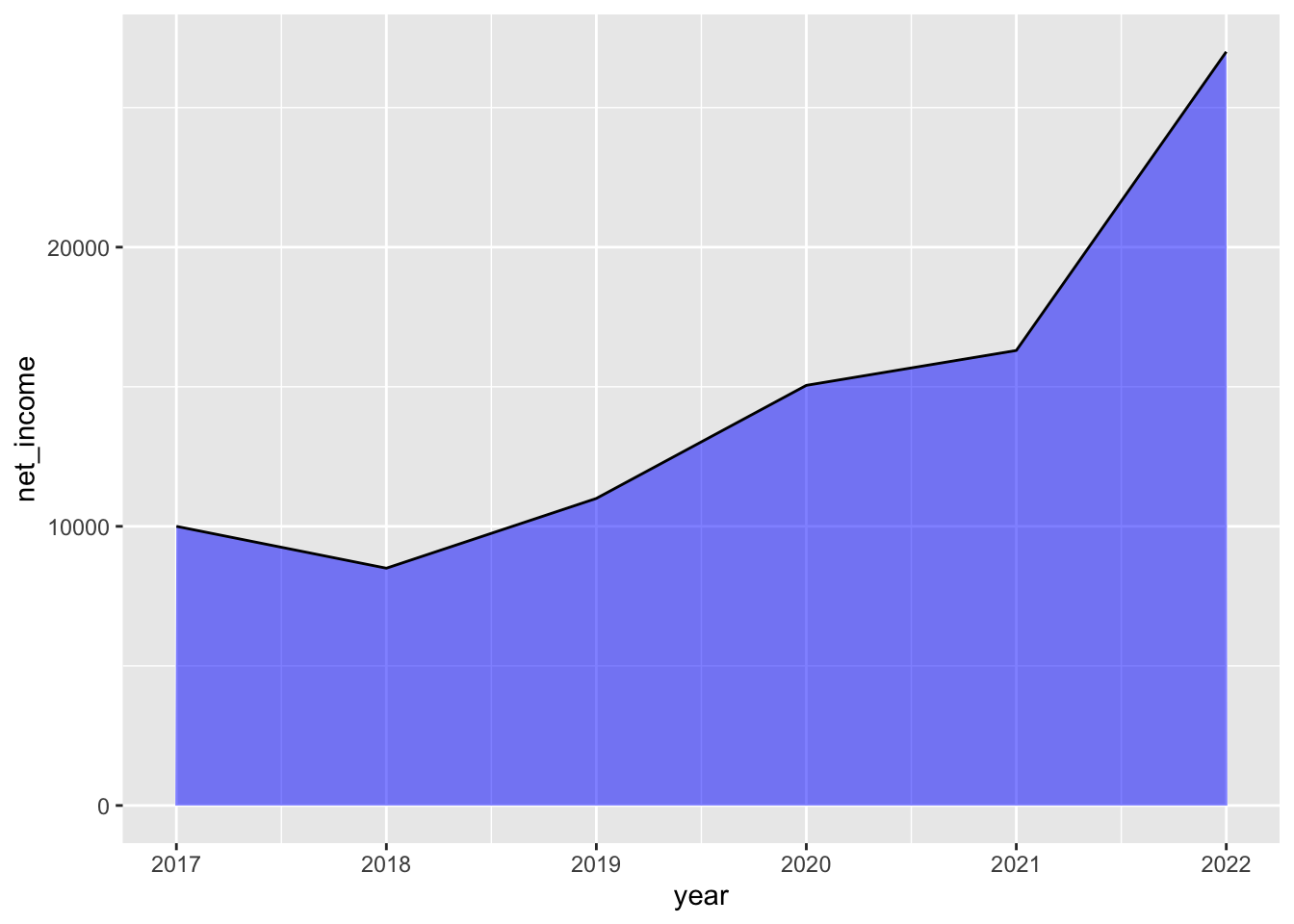
Let’s clean up the design with better labels and by removing the background.
example %>%
  ggplot() +
  geom_area(aes(x = year, y = net_income), fill = "blue", alpha = .5, color = "black") +
  theme(
    panel.background = element_rect(fill = "white")
  ) +
  labs( # give it some labels
    title = "Company X",
    x = "Year",
    y = "Net Income"
  )
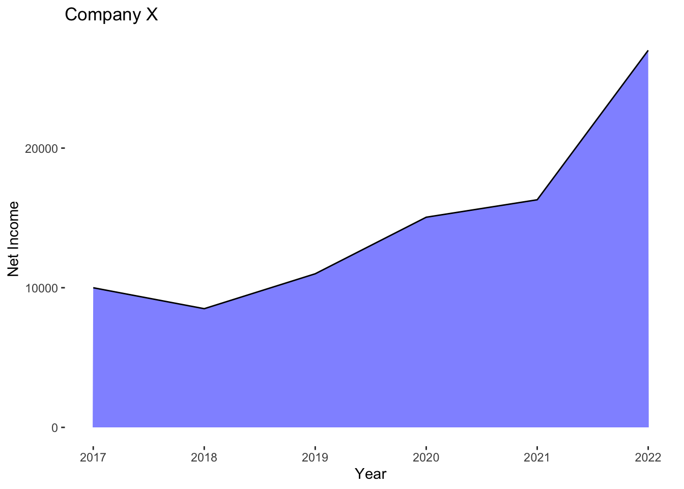
And that’s it: a super simple area plot.
Note that functionally, the plot above can be represented using a line plot as well with no loss of data details.
example %>%
  ggplot() +
  geom_line(aes(x = year, y = net_income), color = "black") +
  expand_limits(y =0) + # force the y-axis to start from 0
  theme(
    panel.background = element_rect(fill = "white")
  ) +
  labs( # give it some labels
    title = "Company X",
    x = "Year",
    y = "Net Income"
  )
