Overview #
A bar plot is a data visualization that shows the relationship between a categorical variable and a numerical variable.
Think of a categorical value as a type of thing, and a numerical variable as anything that can be counted or measured.
Data #
A bar plot requires at least one categorical variable and one numerical variable.
Additional variables can be reflected in the bar plot using such additional features as colors, textures, or outlines.
Depending on how the data is collected, it may require some manipulation before it’s of a suitable form for use in a bar plot.
R #
Let’s make a barplot in R with the ggplot2 package. We’ll also use tooling from tidyverse to manipulate the data.
library(tidyverse)
library(ggplot2) # a bit redundant, since this is included in tidyverse, but showing it explicitly here
For this example, we’ll use the built in diamonds dataset, which contains information on a set of 50,000 round cut diamonds.
## # A tibble: 53,940 × 10
##    carat cut       color clarity depth table price     x     y     z
##    <dbl> <ord>     <ord> <ord>   <dbl> <dbl> <int> <dbl> <dbl> <dbl>
##  1  0.23 Ideal     E     SI2      61.5    55   326  3.95  3.98  2.43
##  2  0.21 Premium   E     SI1      59.8    61   326  3.89  3.84  2.31
##  3  0.23 Good      E     VS1      56.9    65   327  4.05  4.07  2.31
##  4  0.29 Premium   I     VS2      62.4    58   334  4.2   4.23  2.63
##  5  0.31 Good      J     SI2      63.3    58   335  4.34  4.35  2.75
##  6  0.24 Very Good J     VVS2     62.8    57   336  3.94  3.96  2.48
##  7  0.24 Very Good I     VVS1     62.3    57   336  3.95  3.98  2.47
##  8  0.26 Very Good H     SI1      61.9    55   337  4.07  4.11  2.53
##  9  0.22 Fair      E     VS2      65.1    61   337  3.87  3.78  2.49
## 10  0.23 Very Good H     VS1      59.4    61   338  4     4.05  2.39
## # ℹ 53,930 more rows
This particular dataset includes some categorical fields, such as cut, color, clarity.
There are also numerical fields, such as carat, depth, and price.
Let’s say we want to see what the average price is for a particular cut based on our data. We’ll first have to calculate the average price by cut.
avg_price_cut <- diamonds %>%
  group_by(cut) %>%
  summarize(avg_price = mean(price))

avg_price_cut
## # A tibble: 5 × 2
##   cut       avg_price
##   <ord>         <dbl>
## 1 Fair          4359.
## 2 Good          3929.
## 3 Very Good     3982.
## 4 Premium       4584.
## 5 Ideal         3458.
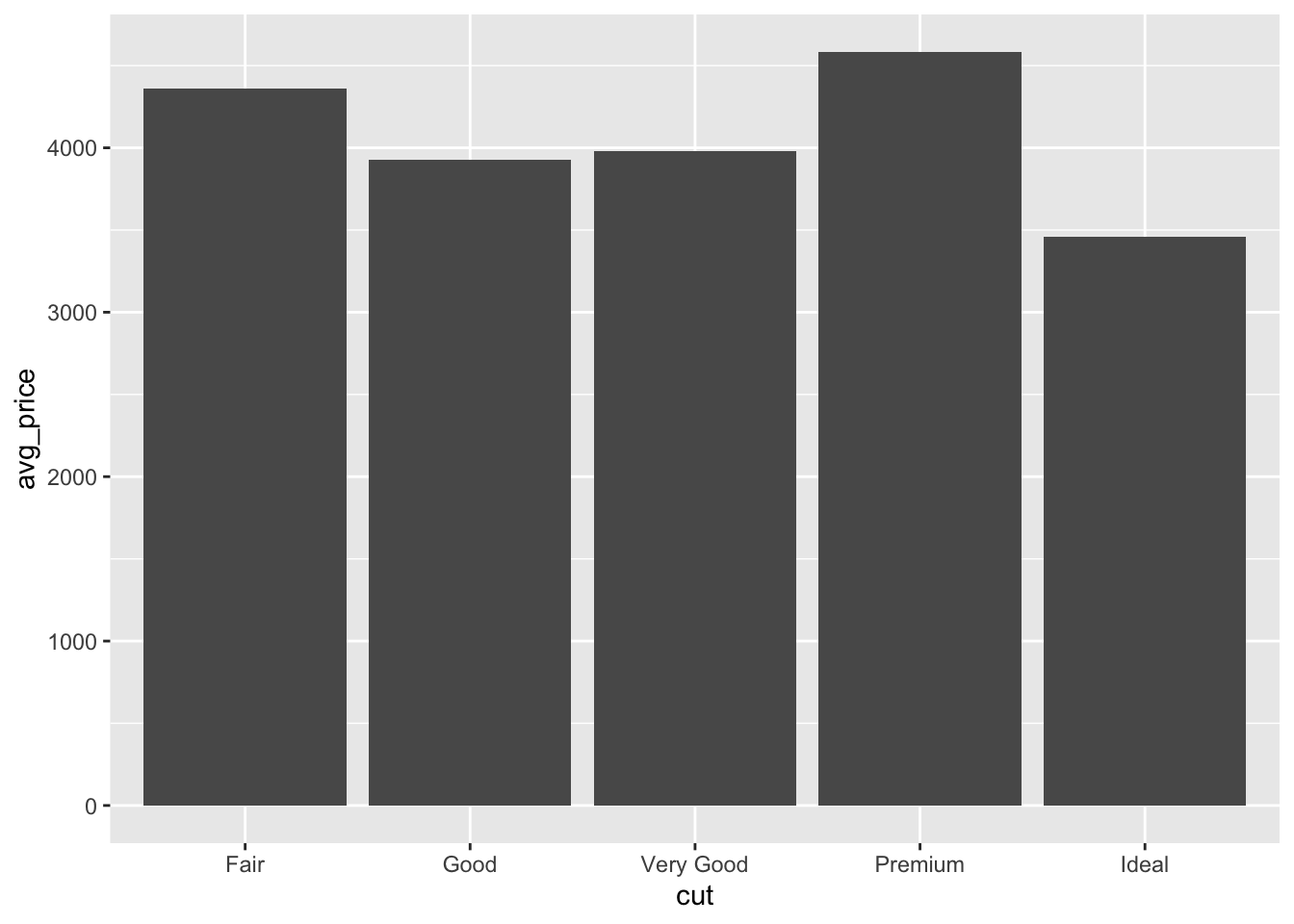
Now that the data is prepared, we can drop it into a bar plot.
plot <- avg_price_cut %>%
  ggplot(
    aes(
      x = cut,
      y = avg_price
    )
  ) +
  geom_bar(stat = "identity")

plot
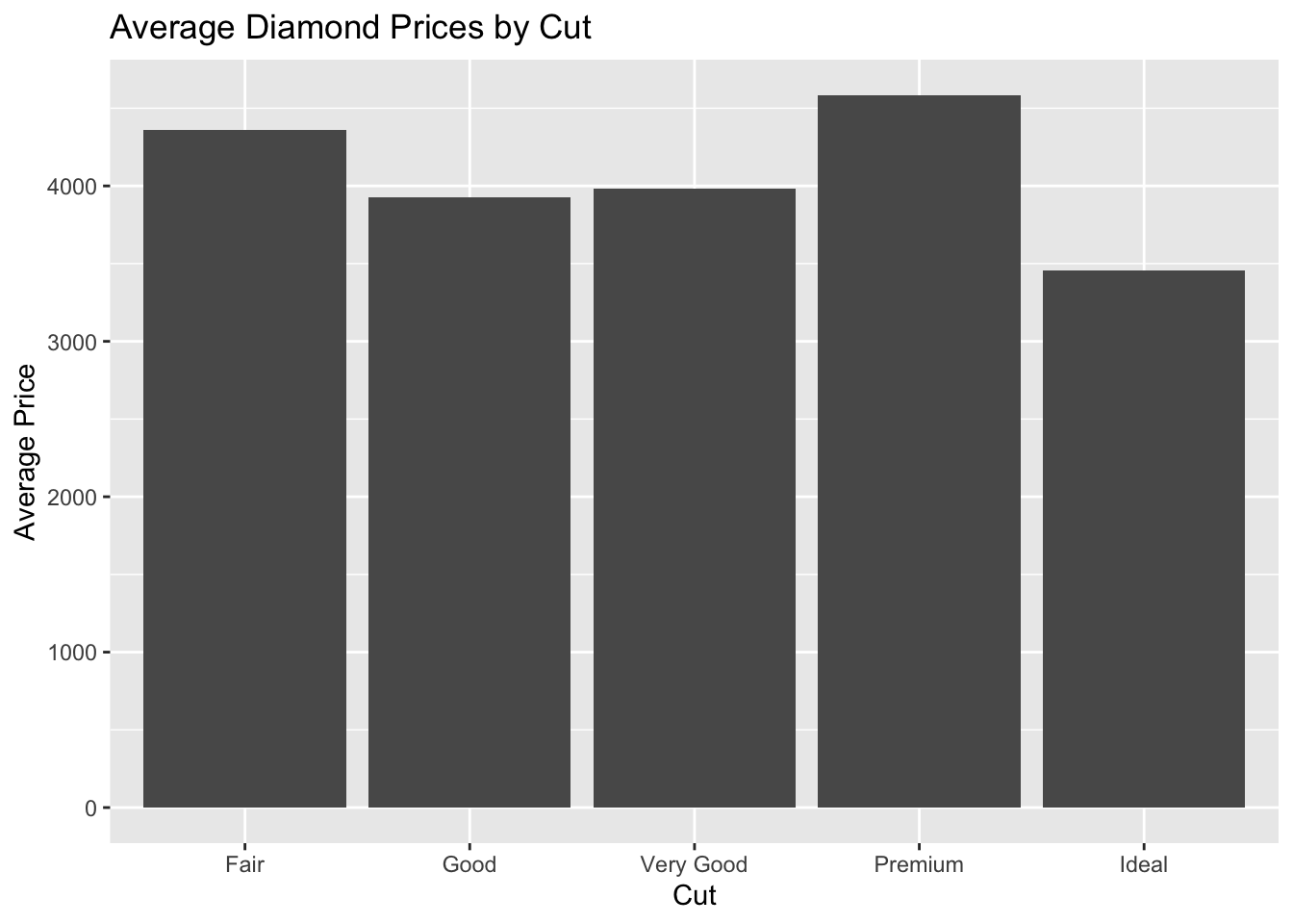
 The default plot is pretty bland. Let’s dress it up a tiny bit.
First, let’s add some labels.
plot <- plot +
  labs(
    title = "Average Diamond Prices by Cut",
    x = "Cut",
    y = "Average Price"
  )

plot

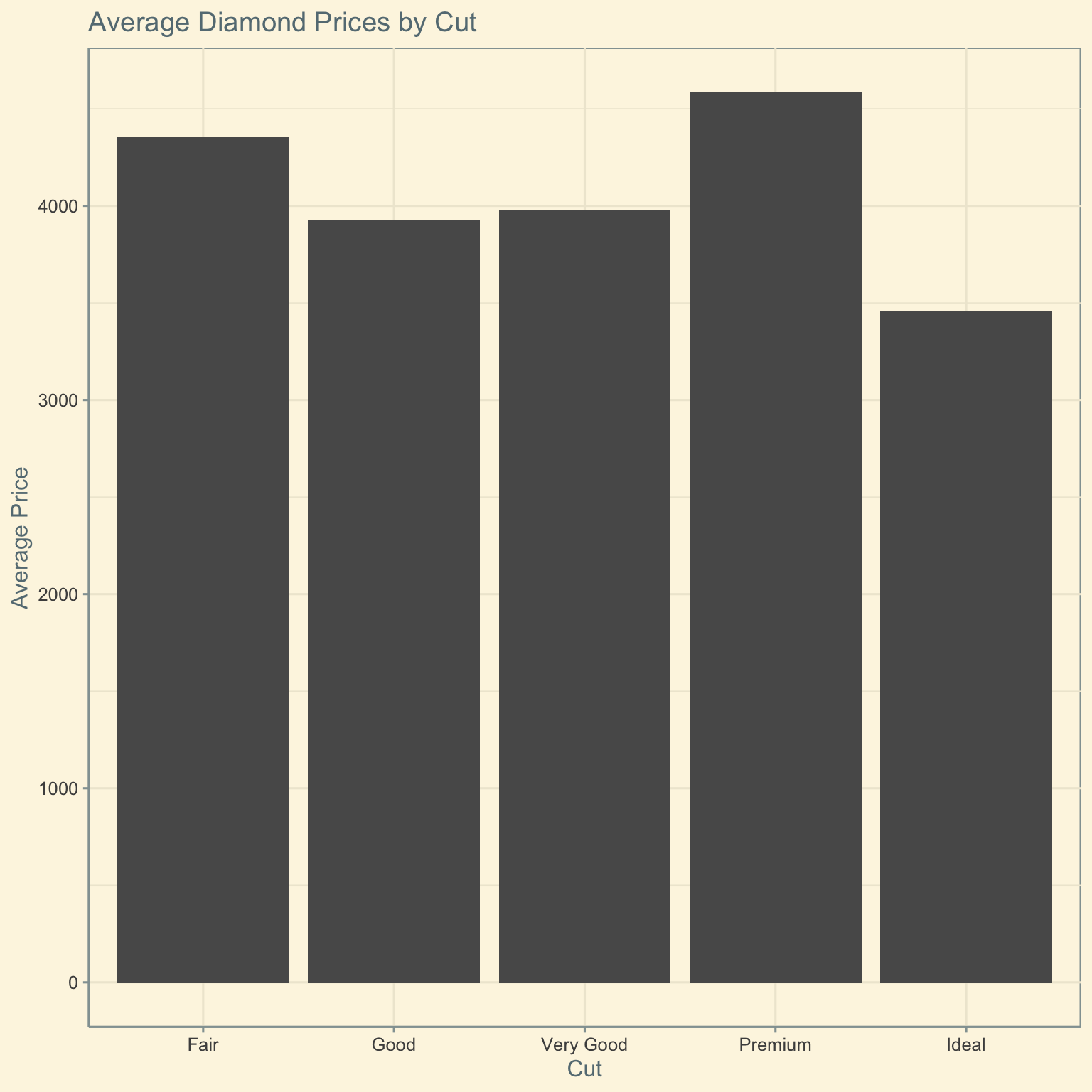
Let’s also replace the theme with something else.
library(ggthemes)

plot +
  ggthemes::theme_solarized()
