Overview #
A beeswarm plot is a way to display the spread of a numerical data field. Think of it as a histogram, but rather than having heights of bars corresponding to the number of points within particular ranges, a beeswarm shows individual data points.
The data points in a beeswarm plot are spread out along a cross section to minimize point overlap so it’s visually easy to identify clusters of data points along a single continuous variable.
This type of plot is referred to as a “beeswarm” because it visually looks like a swarm of bees.
Data #
A beeswarm plot requires at least one numerical field.
Additional categorical fields can be included, which can facilitate comparisons between different categories.
We can use the R tidyverse package to generate and manipulate data:
library(tidyverse)
A super simple one variable example dataset that would be appropriate for a beeswarm might look like this:
set.seed(4567)

numerical <- sample(seq(0,10), 100, replace = TRUE)

numerical
##   [1]  2  2  3  2  1  7  6  9  3  6  5  4  9  1  9  0  6 10  6  6  1  4 10  0  1
##  [26]  8  5  1  6  5  4  8  1  2  0  1  2  6  9  7  9  5  6  1  1  4  0  6  3  1
##  [51]  0  8  2  3 10  2  1  8  9  5  6  8  3 10  7  7  1  6  7  1  6  3  7  8  4
##  [76]  3  5  2  3  3 10  7  2 10  4  3  3  2  1  5  0  5  1  2  9  4  3  3  6  2
In the above example, we’re taking 100 repeated random samples from a range of 0 to 10.
set.seed() is used to ensure that the same set of values are generated consistently using random sampling in R. 4567 in this case is an arbitrary value.
seq() defines a sequence of numbers, from which sample() draws repeated samples from with replacement (note the replace = TRUE bit). 100 represents the number of samples.
We can expand the data by adding on a categorical field, which can be used to display separate categories within a single beeswarm plot.
categorical <- sample(c("A", "B", "C"), 100, replace = TRUE)

categorical
##   [1] "B" "C" "B" "A" "C" "A" "C" "C" "B" "A" "B" "A" "A" "C" "A" "A" "B" "A"
##  [19] "A" "C" "A" "C" "A" "A" "C" "B" "A" "C" "C" "A" "A" "B" "C" "A" "C" "A"
##  [37] "B" "C" "C" "A" "C" "B" "C" "B" "A" "B" "C" "A" "C" "A" "B" "B" "B" "A"
##  [55] "A" "B" "C" "C" "C" "B" "B" "B" "B" "B" "B" "A" "A" "A" "B" "C" "B" "A"
##  [73] "A" "B" "C" "A" "C" "C" "C" "A" "C" "B" "B" "B" "A" "A" "A" "A" "C" "C"
##  [91] "A" "A" "A" "A" "A" "A" "A" "A" "A" "A"
The two fields – numerical and categorical – can be combined into a single dataframe:
example_df <- tibble(numerical, categorical)

example_df
## # A tibble: 100 × 2
##    numerical categorical
##        <int> <chr>
##  1         2 B
##  2         2 C
##  3         3 B
##  4         2 A
##  5         1 C
##  6         7 A
##  7         6 C
##  8         9 C
##  9         3 B
## 10         6 A
## # ℹ 90 more rows
R using the Beeswarm Package #
The R beeswarm package can be used to generate simple but functional beeswarm plots.
# install.packages("beeswarm") # run this if the beeswarm package hasn't already been installed
library(beeswarm)
A super simple beeswarm plot of the super simple numerical data looks like this:
beeswarm(numerical)
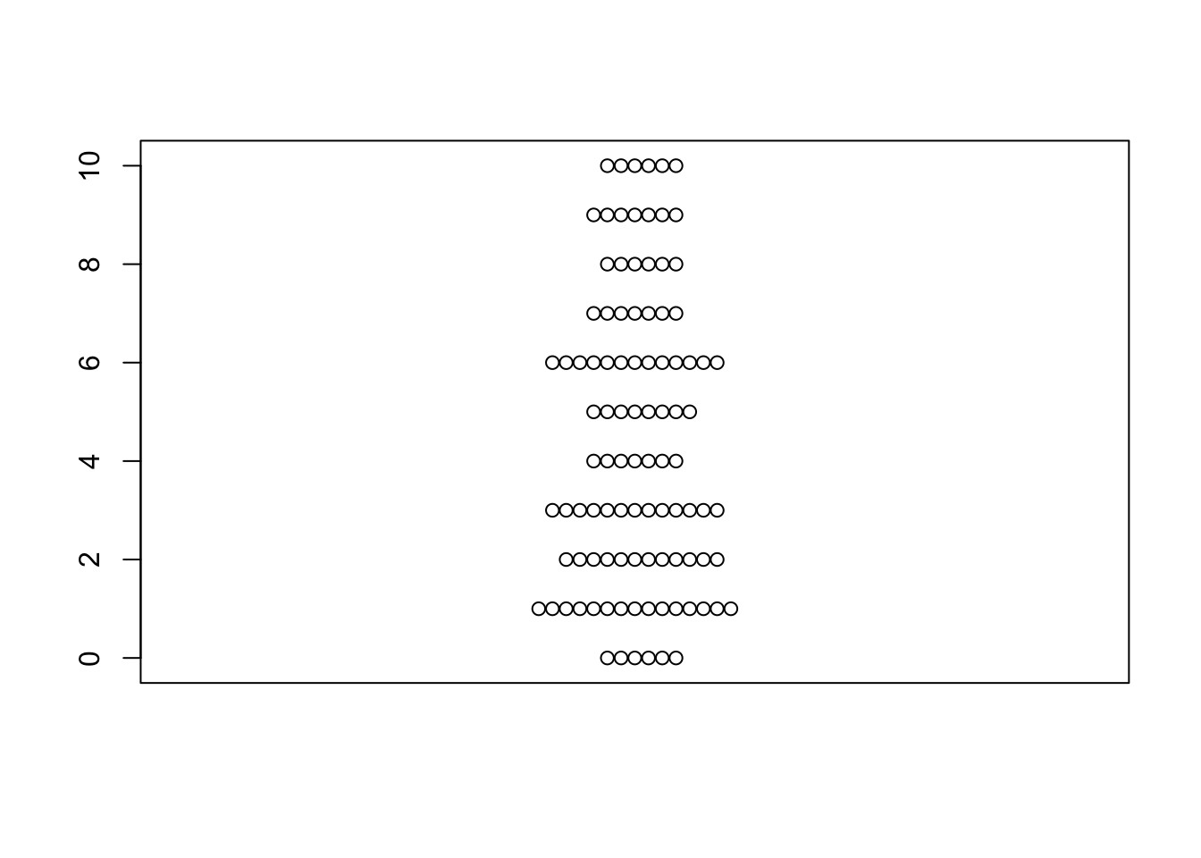 It’s really actually kind of bland, but this visual conveys a sense of the distribution along a single numerical variable.
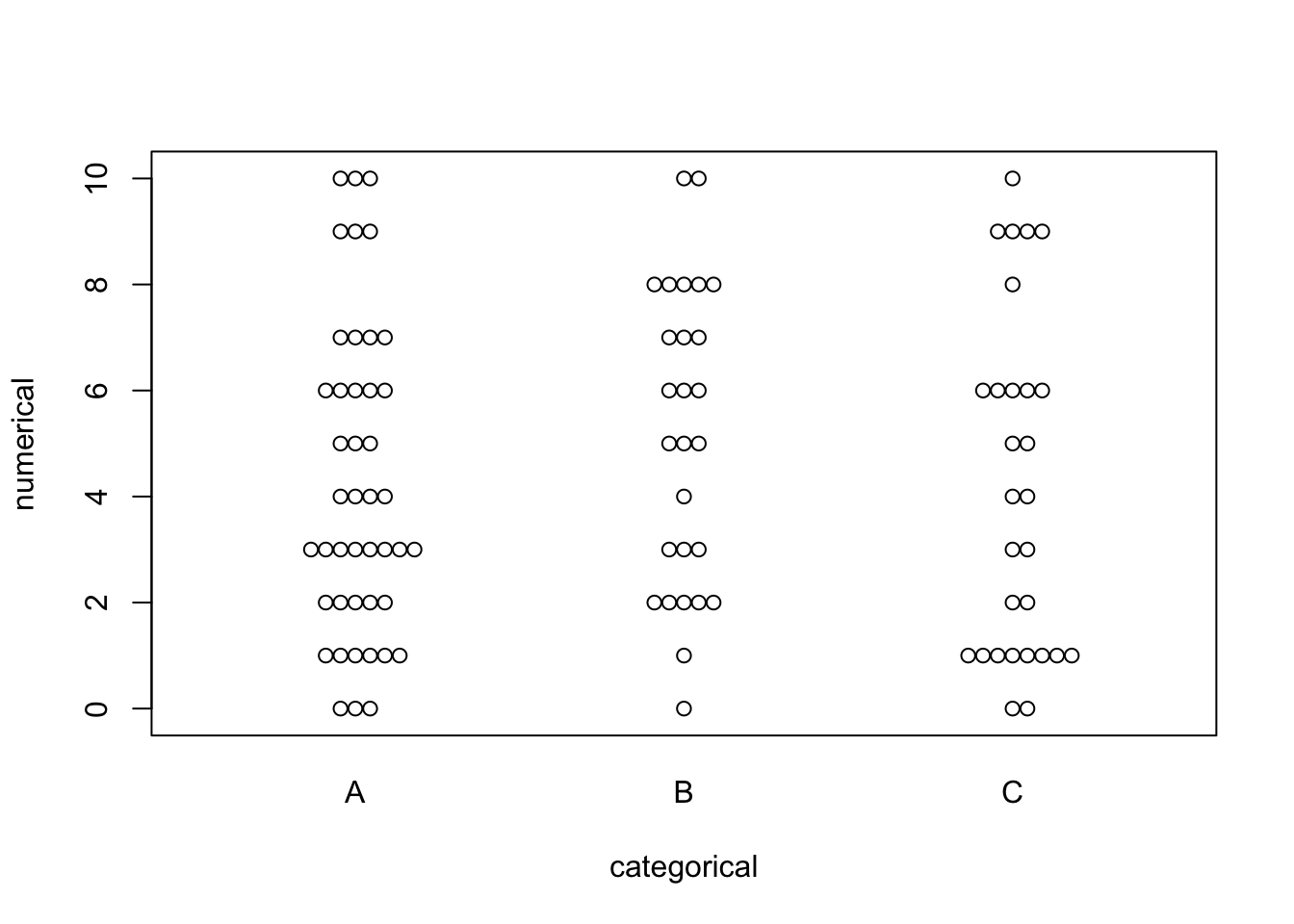
This view can be broken up into separate categories by adding on the categorical field.
beeswarm(numerical ~ categorical)
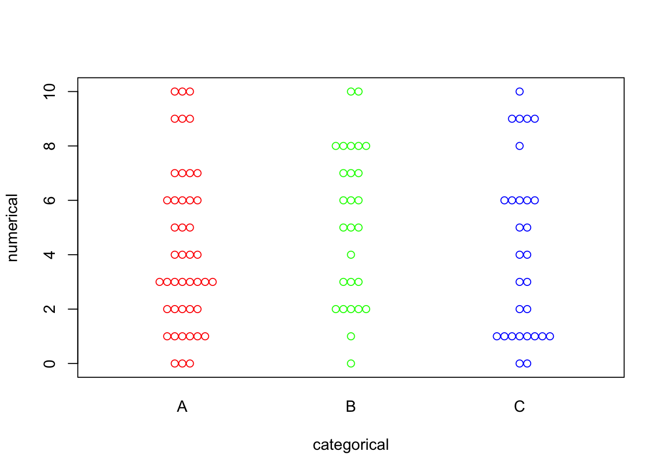
Color can be added to jazz this plot up:
beeswarm(numerical ~ categorical, col = c("Red", "Green", "Blue"))
R using the ggbeeswarm package #
The beeswarm package works, but it can be fairly limiting.
The ggbeeswarm package on the other hand allows for much more flexibility and can generally produce more interesting visuals.
One thing to note about ggbeeswarm is unlike beeswarm, which can take a single variable, ggbeeswarm expects a dataframe with at least one numerical and one categorical field (which we have already generated in the form of example_df).
First, let’s load up the ggbeeswarm package.
# install.packages("ggbeeswarm") # install the package if it's not already installed
library(ggbeeswarm)
Let’s jump right into creating a plot using the categorical field.
example_df %>%
  ggplot() +
  geom_beeswarm(
    aes(
      x = categorical,
      y = numerical
    )
  )
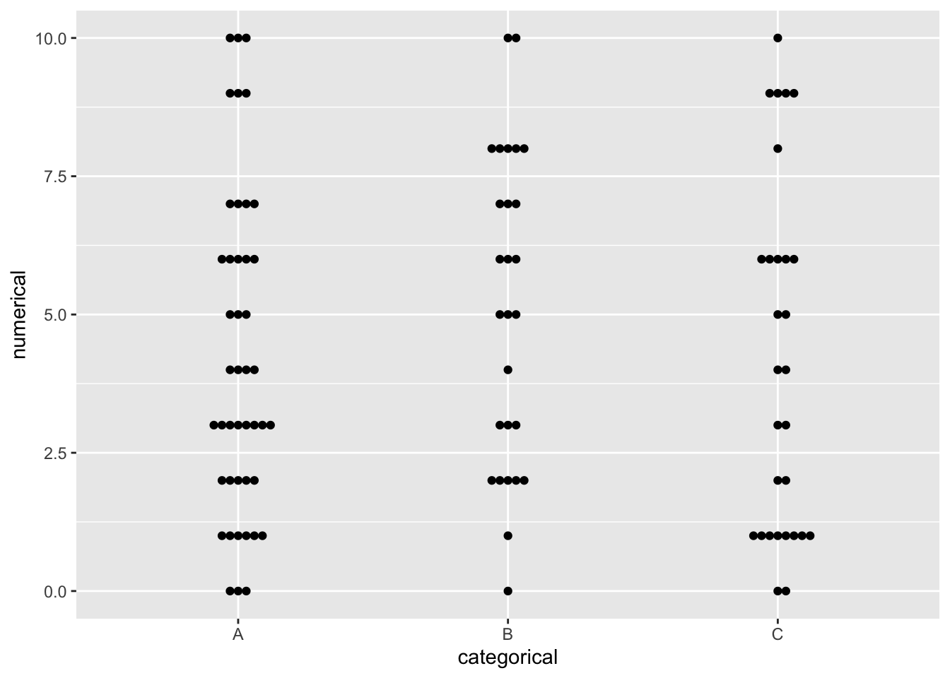
Honestly, that’s still really bland. Let’s dress it up some.
example_df %>%
  ggplot() +
  geom_beeswarm(
    aes(
      x = reorder(categorical, desc(categorical)), # adjust the category order
      y = numerical,
      color = categorical # map the categories to colors
    ),
    cex = 5, # adjust spacing between points
    size = 4, # enlarge the points
    alpha = .5 # make the points halfway transparent
  ) +
  theme(
    legend.position = "none" # remove the legend
  ) +
  scale_y_continuous(breaks = seq(0,10,1)) + # tweak the continuous axis so there are breaks on every whole number
  labs(
    title = "A ggbeeswarm example", # give the overall plot a title
    x = "Categorical", # customize the x-axis label
    y = "Numerical"# customize the y-axis label
  ) +
  coord_flip() # turn the plot sideways
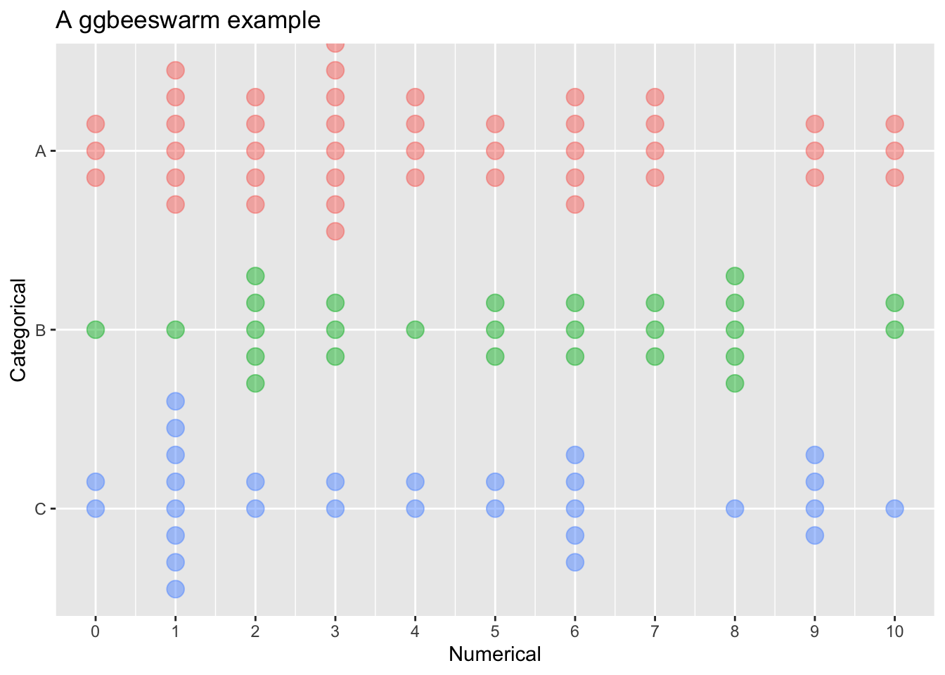
This is still a fairly basic plot, but it does include additional refinements.