Overview #
A box and whisker plot (aka boxplot) is a way to show data distribution.
The dividing lines along the “box” part of box and whisker plot typically represent the median (the middle observation in a sequentially sorted dataset), the upper quartile (the observation that is the middle point of the upper half of the dataset), and the lower quarter (the observation that is the middle in the lower half of the dataset).
The “box” part captures what is known as the interquartile range of the dataset.
The “whisker” part usually extend out to some multiple of the calculated interquartile range, usually 1.5x the interquartile range.
Outliers beyond the extreme ends of the whiskers are typically represented as individual points.

For instance, in the sequence 1, 2, 5, 7, 9:
5is the median7is the upper quartile2is the lower quartile1is the lower end of one of the whiskers9is the end of the the other whisker- The interquartile range is the difference between 7 (the upper quartile) and 2 (the lower quartile), or 5 (7-2).
Each group of data is shown within its own box and whisker block. On a single plot, there can be many groups of data shown.
Advantages #
A box and whisker plot is extremely simple when compared to something like a histogram or a density plot.
In fact, the concept underlying a box and whisker plot lends itself well to simplification. Edward Tufte takes the simplification to an extreme by reducing the classic box and whisker plot further to line-dot-line plot (The Visual Display of Quantitative Information, p. 123-124), or what he refers to as a quartile plot.

Disadvantages #
Due to the simplification in representation of a box and whisker plot, a lot of the underlying detail is lost. This may be a bad thing depending on the context.
Data #
At a very minimum, a box and whisker plot requires one continuous numerical data field.
| continuous |
|---|
| 1 |
| 2 |
| 5 |
| 7 |
| 9 |
A discrete categorical variable can be added to enable the display of separate box and whisker plots for different groups of data.
| continuous | group |
|---|---|
| 1 | A |
| 2 | A |
| 5 | A |
| 7 | A |
| 9 | A |
| 2 | B |
| 4 | B |
| 5 | B |
| 8 | B |
R #
Box and whisker plots can be rendered in R using the base R language and with ggplot2.
Base R #
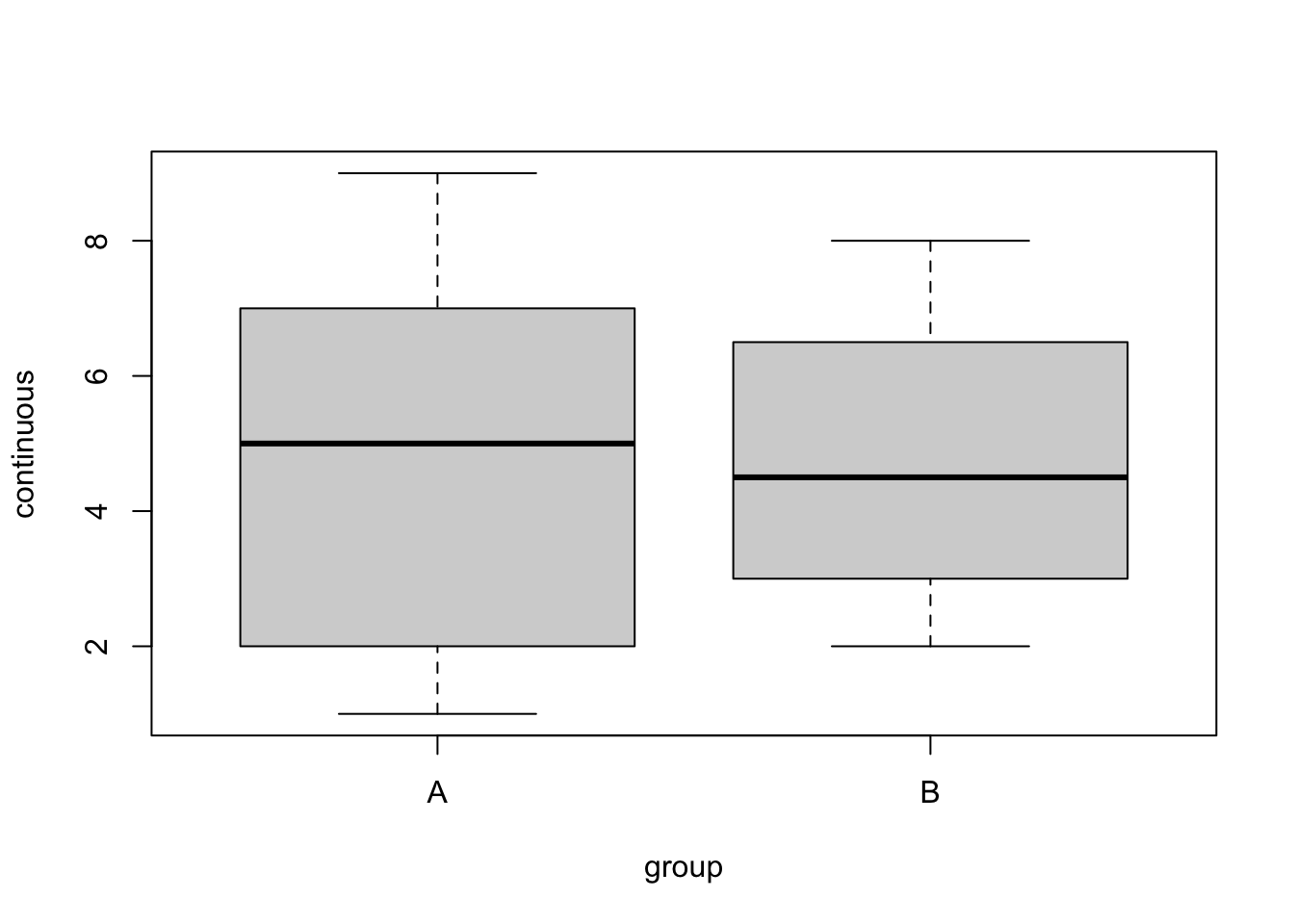
In base R, a simple boxplot can be generated using the boxplot(x, data) command, where x refers to a formula that specifies what goes into the boxplot and is of the form continuous~group, and data refers to the source dataframe.
example_dat
## # A tibble: 9 × 2
##   continuous group
##        <dbl> <chr>
## 1          1 A
## 2          2 A
## 3          5 A
## 4          7 A
## 5          9 A
## 6          2 B
## 7          4 B
## 8          5 B
## 9          8 B
boxplot(continuous~group, data = example_dat)
ggplot2 #
The ggplot2 package can also be used to generate more refined box and whisker plots.
library(ggplot2)
A basic box and whisker plot using the synthetic data from above:
ggplot(example_dat) +
  geom_boxplot(
    aes(
      x = group,
      y = continuous
    )
  )
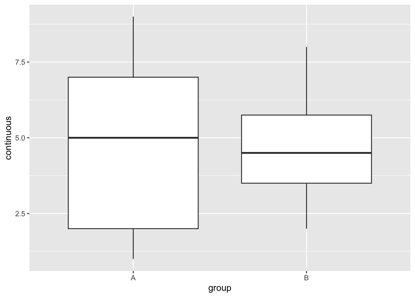
Great! We now have a box and whisker plot in ggplot2, but that’s not really stretching the potential of the ggplot2 package. Let’s challenge ourselves a bit.
Let’s try making another, more sophisticated plot using the built in sample iris dataset.
# generate a preview of the iris dataset, limited to 10 records
head(iris, 10) %>% kable()
| Sepal.Length | Sepal.Width | Petal.Length | Petal.Width | Species |
|---|---|---|---|---|
| 5.1 | 3.5 | 1.4 | 0.2 | setosa |
| 4.9 | 3.0 | 1.4 | 0.2 | setosa |
| 4.7 | 3.2 | 1.3 | 0.2 | setosa |
| 4.6 | 3.1 | 1.5 | 0.2 | setosa |
| 5.0 | 3.6 | 1.4 | 0.2 | setosa |
| 5.4 | 3.9 | 1.7 | 0.4 | setosa |
| 4.6 | 3.4 | 1.4 | 0.3 | setosa |
| 5.0 | 3.4 | 1.5 | 0.2 | setosa |
| 4.4 | 2.9 | 1.4 | 0.2 | setosa |
| 4.9 | 3.1 | 1.5 | 0.1 | setosa |
There’s a Species categorical field, and a few other continuous numerical fields. For simplicity, let’s pick one numerical field - Sepal.Length.
ggplot(data = iris) +
  geom_boxplot(
    aes(
      x = Species,
      y = Sepal.Length
    )
  )
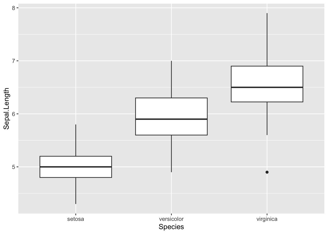
I think we can do better.
ggplot(data = iris) +
  geom_boxplot(
    aes(
      x = Species,
      y = Sepal.Length,
      fill = Species # color the boxes by species
    )
  ) +
  coord_flip() + # turn it sideways
  labs( # give the plot some labels
    title = "Box and whisker plot of Iris Species",
    x = "Species",
    y = "Sepal Length"
  ) +
  theme(
    legend.position = "none" # remove the legend since it doesn't really convey any real useful information
  )
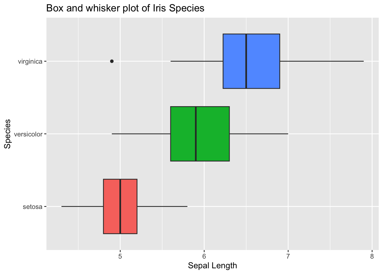
Let’s enhance that even more by adding the individual data points. We’ll use the geom_jitter() function in ggplot2 for the points to give the point positions some random variation.
ggplot(
  data = iris,
  aes( # note that the aes() aesthetic mappings were moved out from geom_boxplot() to ggplot(). This is now being shared across other mappings, namely geom_jitter()
    x = Species,
    y = Sepal.Length,

  )
) +
  geom_boxplot(
    aes(
      fill = Species # fill the boxes with by species
    ),
    alpha = .5 # make the box and whisker plots semi-transparent
  ) +
  geom_jitter(
    aes(
      color = Species, # color the points by species
      alpha = .9
    )
  ) +
  coord_flip() + # turn it sideways
  labs( # give the plot some labels
    title = "Box and whisker plot of Iris Species",
    x = "Species",
    y = "Sepal Length"
  ) +
  theme(
    legend.position = "none" # remove the legend since it doesn't really convey any real useful information
  )
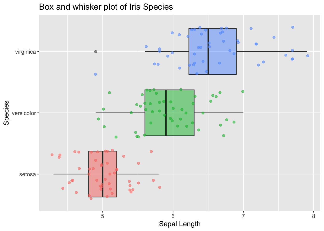
This is still a fairly basic plot, but it’s much richer in detail than what we started with.