Overview #
A bubble plot is simply an enhanced version of a scatter plot.
A simple, flat scatter plot typically only utilizes two numerical fields and conveys data based on the position of points.
A bubble plot on the other hand utilizes a third numerical field. In a bubble plot, the size of the points change based on the value of the third numerical field.
Data #
A bubble plot requires at least three numerical fields:
- A numerical field for the horizontal x-axis
- A numerical field for the vertical y-axis
- A numerical field for the size of the point (or in this case, the bubble)
R #
Let’s mock up a simple example using the tribble function in R’s tidyverse package:
library(tidyverse)
A simple dataset example that would work with a bubble plot could look like this:
example_dat <- tribble(
  ~age, ~"years of work", ~income,
  20, 3, 50000,
  30, 5, 60000,
  35, 7, 100000
)

example_dat
## # A tibble: 3 × 3
##     age `years of work` income
##   <dbl>           <dbl>  <dbl>
## 1    20               3  50000
## 2    30               5  60000
## 3    35               7 100000
A simple scatter plot using that example data would merely be points plotted along an x- and y-axis with no size scaling.
example_dat %>%
  ggplot(
    aes(
      x = age,
      y = `years of work` # not that these are back-ticks, not commas. Necessary because of the spaces in the field name
    )
  ) +
  geom_point()
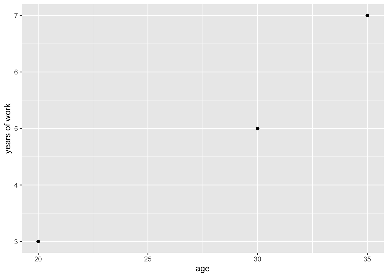
This view actually doesn’t tell a reader anything all that useful. All a reader can take from this is that there are three data points representing individuals, with details about their age and the years of work experience.
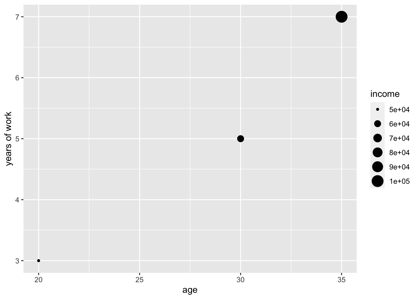
We can add map the size of the points to income to convey a sense of how income changes with different combinations of age and years of work experience:
example_dat %>%
  ggplot(
    aes(
      x = age,
      y = `years of work`, # not that these are back-ticks, not commas. Necessary because of the spaces in the field name
      size = income
    )
  ) +
  geom_point()
A more interesting example #
The late Hans Rosling gave a very inspiring Ted Talk about different countries, life expectancy, population size, and GDP per capita. In his presentation, he heavily features bubble plots.
The same dataset that he used can be accessed through the Gapminder package.
# install.packages("gapminder") # if you don't already have the package installed
library(gapminder)
Let’s take a look at the dataset.
gapminder
## # A tibble: 1,704 × 6
##    country     continent  year lifeExp      pop gdpPercap
##    <fct>       <fct>     <int>   <dbl>    <int>     <dbl>
##  1 Afghanistan Asia       1952    28.8  8425333      779.
##  2 Afghanistan Asia       1957    30.3  9240934      821.
##  3 Afghanistan Asia       1962    32.0 10267083      853.
##  4 Afghanistan Asia       1967    34.0 11537966      836.
##  5 Afghanistan Asia       1972    36.1 13079460      740.
##  6 Afghanistan Asia       1977    38.4 14880372      786.
##  7 Afghanistan Asia       1982    39.9 12881816      978.
##  8 Afghanistan Asia       1987    40.8 13867957      852.
##  9 Afghanistan Asia       1992    41.7 16317921      649.
## 10 Afghanistan Asia       1997    41.8 22227415      635.
## # ℹ 1,694 more rows
Rosling’s presentation includes animated bubble plots, where time is featured as another dimension. For now, we’ll focus on a simpler, non-animated plot that only shows one year. Let’s arbitrarily focus on 2007, the final year in the included gapminder dataset. The plot we’ll make is one that utilizes three numerical dimensions from the dataset:
- GDP per capita
- life expectancy
- population size
As a bonus, let’s throw in the continent field, which can be mapped to color.
gapminder %>%
  filter(year == 2007) %>%
  ggplot() +
  geom_point(
    aes(
      x = pop,
      y = gdpPercap,
      size = lifeExp,
      color = continent
    )
  )
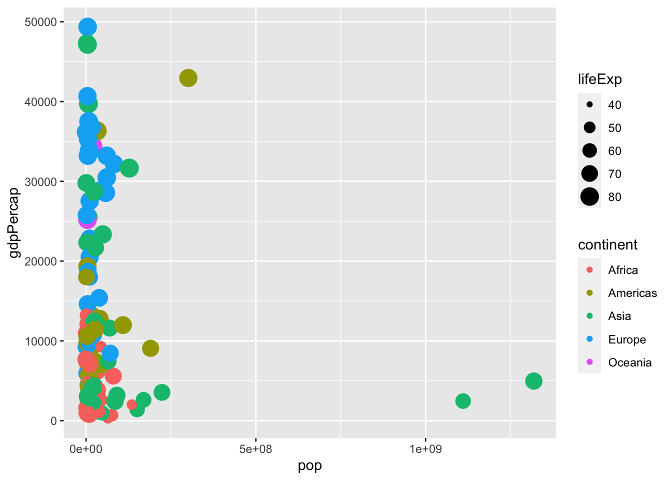
That works, but it’s difficult to read - there’s a lot of point overlap, there’s a huge cluster in the bottom right that makes separation difficult, the labels are not readily human-readable, and without labels there’s really no good contextual framing for a reader. Let’s fix those issues.
gapminder %>%
  filter(year == 2007) %>%
  ggplot() +
  geom_point(
    aes(
      x = pop,
      y = gdpPercap,
      size = lifeExp,
      color = continent
    ),
    alpha = .4 # makes points transparent. Values can be set between 0 to 1
  ) +
  scale_x_continuous(label = scales::comma) +
  scale_y_continuous(label = scales::comma) +
  labs(
    title = "Life Expectancy by GDP Per Capita and Population Size in 2007",
    x = "Population",
    y = "GDP Per Capita",
    caption = "Source: Gapminder"
  )
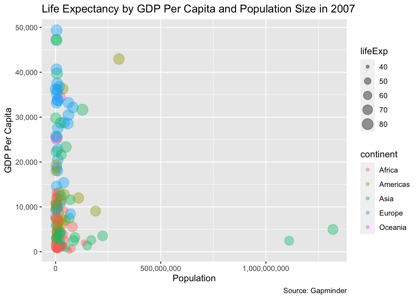
That’s better, but there’s still a huge cluster towards the left. The issue is there are many points that are pretty similar, and then there are some population size outliers that sit pretty far away - India and China. We can fix this by replacing a standard x-axis linear scale with a logarithmic scale. Logarithmic scales are useful for displaying data with hugely divergent scales.
In this case, we’ll use a log10 transformation. Specially, we’ll replace scale_x_continuous(label = scales::comma) with scale_x_log10(label = scales::comma) to change the x-axis scale.
gapminder %>%
  filter(year == 2007) %>%
  ggplot() +
  geom_point(
    aes(
      x = pop,
      y = gdpPercap,
      size = lifeExp,
      color = continent
    ),
    alpha = .4 # makes points transparent. Values can be set between 0 to 1
  ) +
  scale_x_log10(label = scales::comma) +
  scale_y_continuous(label = scales::comma) +
  labs(
    title = "Life Expectancy by GDP Per Capita and Population Size in 2007",
    x = "Population",
    y = "GDP Per Capita",
    caption = "Source: Gapminder"
  )
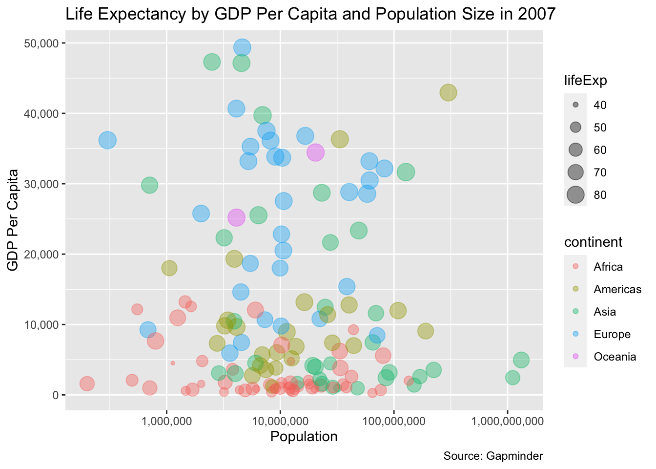
There’s more that we can do with this plot, including faceting, labeling, and applying some more theming, but what we know have is a minimum viable plot that is readable and conveys useful information with.