Overview #
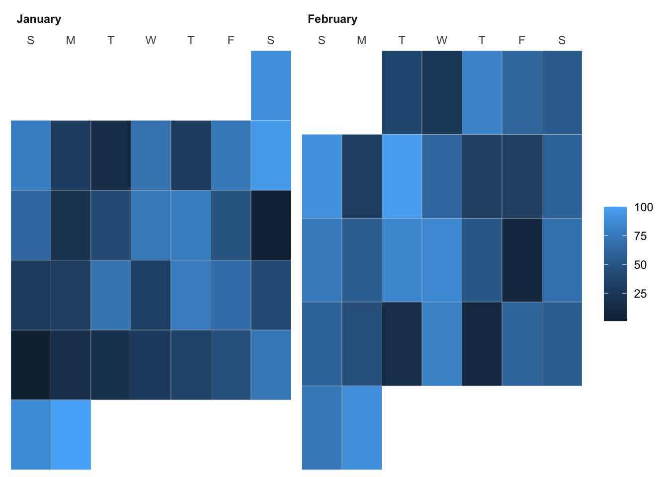
Sometimes, it’s handy to visualize daily data in the familiar form of a calendar.
The data itself is usually mapped to a color scale, so that different colors represent different values of data.
Data #
The data should include at least two values:
- A date
- A numerical value
R #
A simple way to create calendar plots in R is with the ggcal package by Jay Jacobs. As the name suggests, this package builds upon the ggplot2 tooling.
First, install and load the package. At present, ggcal is not on CRAN and needs to be installed directly from the Github repository.
# devtools::install_github("jayjacobs/ggcal") # run this if the package needs to be installed

library(tidyverse)
library(ggcal)
Let’s mock up some data.
dates <- seq(as.Date("2022-01-01"), as.Date("2022-02-28"), by="1 day") # create a range of dates
values <- sample(x = 0:100, size = length(dates), replace = TRUE) # randomly sample from range 0-100, drawing a number of samples equal to the number of days, with replacement

df <- data.frame(dates, values)

head(df)
##        dates values
## 1 2022-01-01     90
## 2 2022-01-02     78
## 3 2022-01-03     28
## 4 2022-01-04     14
## 5 2022-01-05     71
## 6 2022-01-06     28
Now we can visualize that data.
ggcal(df$dates, df$values)

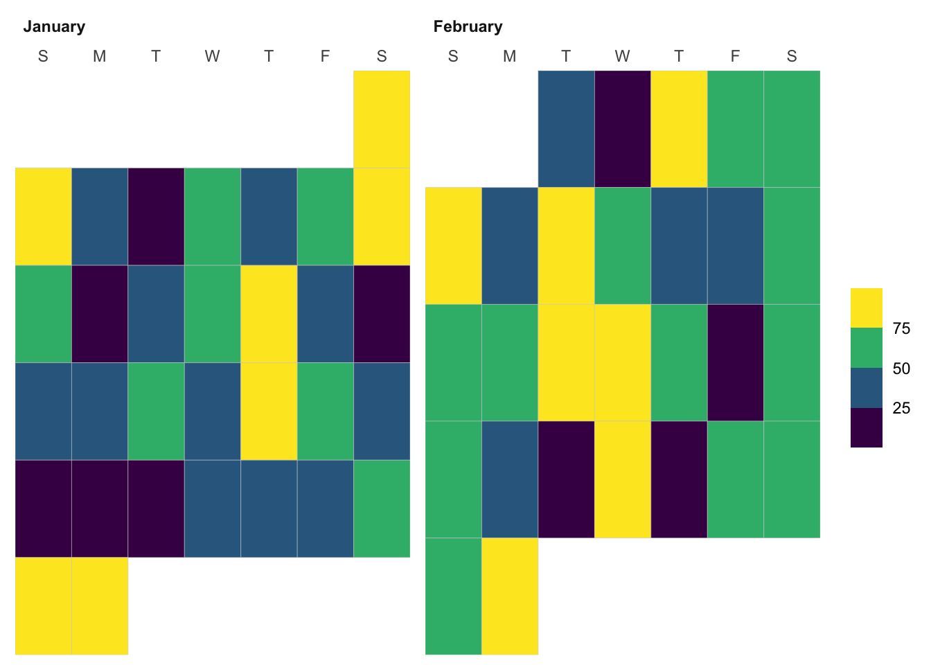
It’s fairly bland, but we can dress it up.
ggcal(df$dates, df$values) +
  scale_fill_viridis_b() # make the coordinate plane equal along the x and y axis
