Overview #
Candlestick charts are primarily used in trading, such as for stocks or commodities.
They are designed to convey a few pieces of financial information in a very compact form:
- Opening price
- Closing price
- High price
- Low price
A candlestick chart is made of a larger section called the real body, and two lines called wicks on either of the top and bottom of the real body.
The top end and the low end of the real body represents the opening and closing price.
The real body may be colored or shaded, depending on whether the close price is lower or higher than open price.
The tip of the upper wick represents the high price, and the tip of the lower wick represents the low price.

If the close price is higher than the open price, then the value went up and is generally considered a good thing.
(Traders in a short position might disagree).
Data #
For a candlesetick chart, the data must include:
- Opening price
- Closing price
- High price
- Low price
If a series of candlestick charts are desired, then there needs to be some sort of time dimension as well, such as date.
R:quantmod #
A candlestick chart can be plotted in R using the quantmod package.
# install.packages("quantmod")
library(quantmod)
The quantmod package includes a getSymbols function that can be used to retrieve data for a publicly traded company.
I could use this to grab information for my employer, Rapid7, which is publicly traded under the RPD symbol.
getSymbols("RPD", from = "2022-01-01", to = "2022-02-01", src = "yahoo")
## [1] "RPD"
This creates a data object named the symbol that was provided.
RPD
##            RPD.Open RPD.High RPD.Low RPD.Close RPD.Volume RPD.Adjusted
## 2022-01-03   117.86  117.950 113.320    117.75     280500       117.75
## 2022-01-04   117.53  118.420 110.500    113.89     535600       113.89
## 2022-01-05   113.16  114.125 107.230    108.24     477400       108.24
## 2022-01-06   105.52  107.860 104.150    104.78     777100       104.78
## 2022-01-07   104.49  105.250  99.760    100.70     826200       100.70
## 2022-01-10    98.22  102.970  96.350    102.79     653800       102.79
## 2022-01-11   102.79  106.680 101.580    106.46     667200       106.46
## 2022-01-12   107.66  109.130 101.340    101.84     489700       101.84
## 2022-01-13   101.79  101.790  97.350     97.56     467000        97.56
## 2022-01-14    96.38   98.130  94.320     96.45     446400        96.45
## 2022-01-18    93.25   95.460  91.836     93.43     646400        93.43
## 2022-01-19    94.45   96.460  91.580     91.70     589700        91.70
## 2022-01-20    92.49   96.850  92.490     93.80     677000        93.80
## 2022-01-21    92.71   95.920  91.565     91.91     573600        91.91
## 2022-01-24    89.00   94.910  87.846     94.36     774300        94.36
## 2022-01-25    92.25   93.050  88.540     88.72     670600        88.72
## 2022-01-26    91.31   93.810  88.960     89.79     649800        89.79
## 2022-01-27    90.70   92.510  86.430     87.49     511200        87.49
## 2022-01-28    88.09   92.030  85.560     92.03     711800        92.03
## 2022-01-31    92.22   96.580  91.430     96.33     715700        96.33
Now let’s plot the data. quantmod provides a simple chartSeries function to plot the data.
chartSeries(RPD)
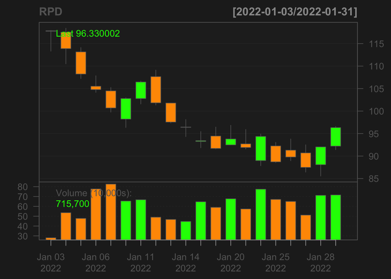
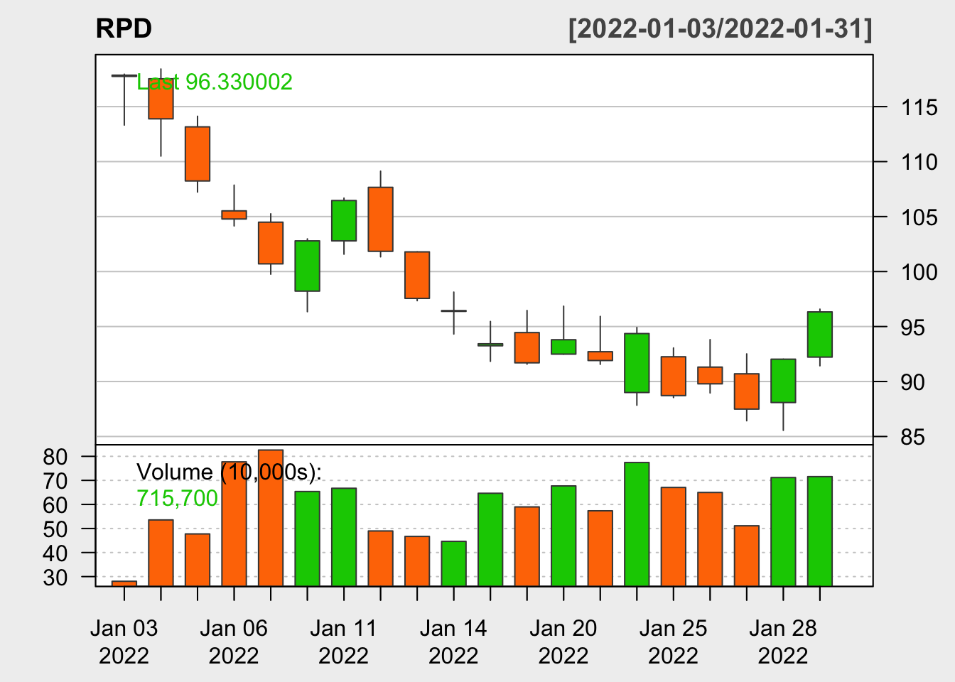
The color of the plot can be changed.
chartSeries(
  RPD,
  theme = chartTheme("white")
)
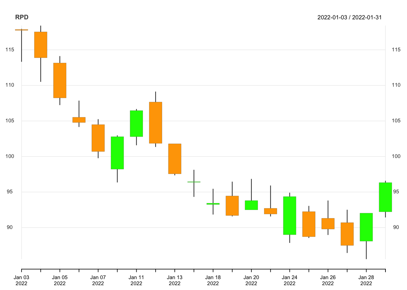
There’s also a slight plotting variant called chart_Series (note the underscore), which comes with a different default theme.
chart_Series(RPD)
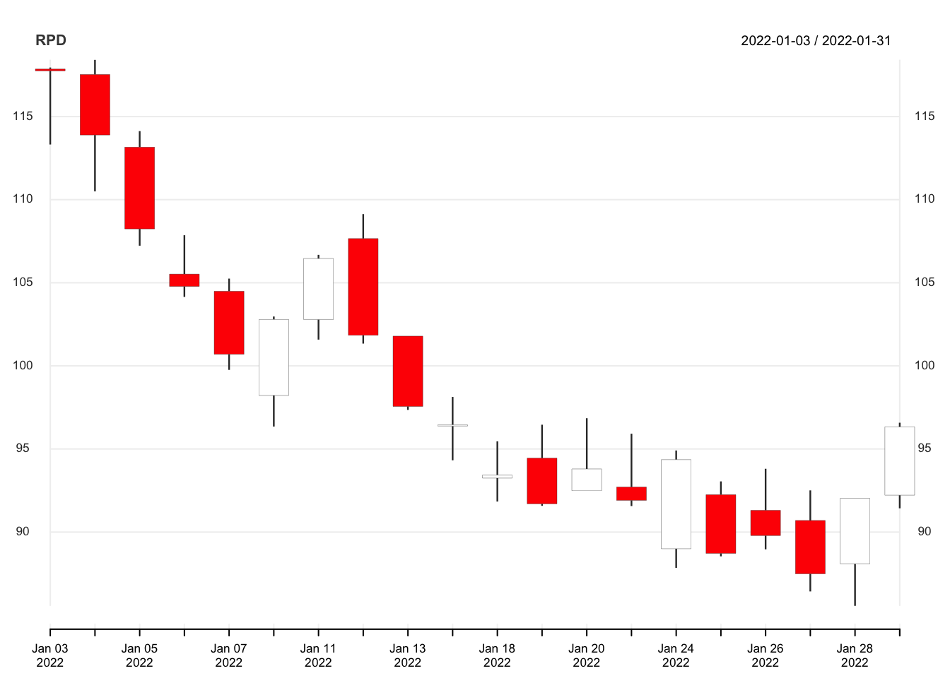
This too can be customized with some parameters.
custom_theme <- chart_theme()
custom_theme$col$dn.col <- "orange"
custom_theme$col$up.col <- "green"

chart_Series(
  RPD,
  theme = custom_theme
  )
R:tidyquant #
Another R package that can be used to put together candlestick charts is tidyquant, which builds upon quantmod and incorporates a bunch of features from the tidyverse and ggplot2.
# install.packages("tidyquant")
library(tidyquant)
The tq_get() function can be used to retrieve stock data.
rpd_stock <- tq_get("RPD", get = "stock.prices", from = "2022-01-01", to = "2022-02-01")

kable(rpd_stock)
| symbol | date | open | high | low | close | volume | adjusted |
|---|---|---|---|---|---|---|---|
| RPD | 2022-01-03 | 117.86 | 117.950 | 113.320 | 117.75 | 280500 | 117.75 |
| RPD | 2022-01-04 | 117.53 | 118.420 | 110.500 | 113.89 | 535600 | 113.89 |
| RPD | 2022-01-05 | 113.16 | 114.125 | 107.230 | 108.24 | 477400 | 108.24 |
| RPD | 2022-01-06 | 105.52 | 107.860 | 104.150 | 104.78 | 777100 | 104.78 |
| RPD | 2022-01-07 | 104.49 | 105.250 | 99.760 | 100.70 | 826200 | 100.70 |
| RPD | 2022-01-10 | 98.22 | 102.970 | 96.350 | 102.79 | 653800 | 102.79 |
| RPD | 2022-01-11 | 102.79 | 106.680 | 101.580 | 106.46 | 667200 | 106.46 |
| RPD | 2022-01-12 | 107.66 | 109.130 | 101.340 | 101.84 | 489700 | 101.84 |
| RPD | 2022-01-13 | 101.79 | 101.790 | 97.350 | 97.56 | 467000 | 97.56 |
| RPD | 2022-01-14 | 96.38 | 98.130 | 94.320 | 96.45 | 446400 | 96.45 |
| RPD | 2022-01-18 | 93.25 | 95.460 | 91.836 | 93.43 | 646400 | 93.43 |
| RPD | 2022-01-19 | 94.45 | 96.460 | 91.580 | 91.70 | 589700 | 91.70 |
| RPD | 2022-01-20 | 92.49 | 96.850 | 92.490 | 93.80 | 677000 | 93.80 |
| RPD | 2022-01-21 | 92.71 | 95.920 | 91.565 | 91.91 | 573600 | 91.91 |
| RPD | 2022-01-24 | 89.00 | 94.910 | 87.846 | 94.36 | 774300 | 94.36 |
| RPD | 2022-01-25 | 92.25 | 93.050 | 88.540 | 88.72 | 670600 | 88.72 |
| RPD | 2022-01-26 | 91.31 | 93.810 | 88.960 | 89.79 | 649800 | 89.79 |
| RPD | 2022-01-27 | 90.70 | 92.510 | 86.430 | 87.49 | 511200 | 87.49 |
| RPD | 2022-01-28 | 88.09 | 92.030 | 85.560 | 92.03 | 711800 | 92.03 |
| RPD | 2022-01-31 | 92.22 | 96.580 | 91.430 | 96.33 | 715700 | 96.33 |
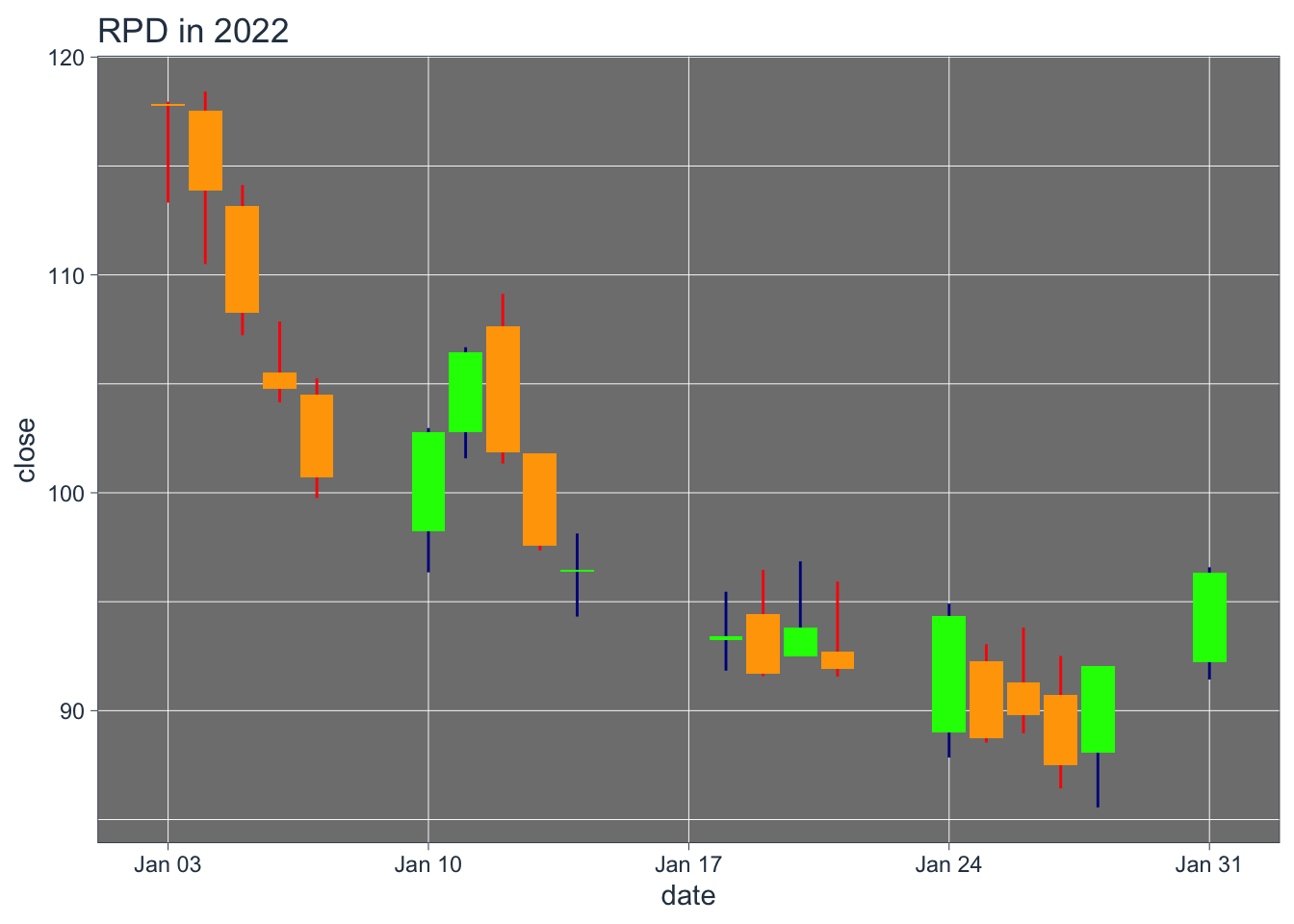
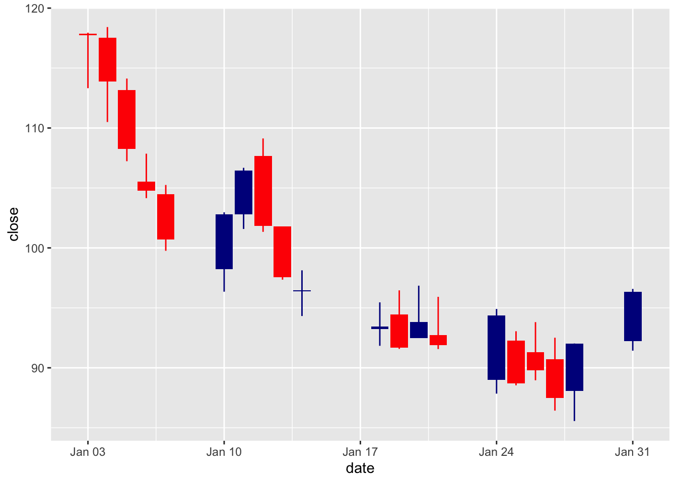
A candlestick chart can be prepared using the geom_candlestick() function.
rpd_stock %>%
  ggplot(
    aes(
      x = date,
      y = close
    )
  ) +
  geom_candlestick(
    aes(
      open = open,
      high = high,
      low = low,
      close = close
    )
  )
## Warning: The following aesthetics were dropped during statistical transformation: open,
## high, low, close, y
## ℹ This can happen when ggplot fails to infer the correct grouping structure in
##   the data.
## ℹ Did you forget to specify a `group` aesthetic or to convert a numerical
##   variable into a factor?
## Warning: The following aesthetics were dropped during statistical transformation: x,
## open, high, low, close, y
## ℹ This can happen when ggplot fails to infer the correct grouping structure in
##   the data.
## ℹ Did you forget to specify a `group` aesthetic or to convert a numerical
##   variable into a factor?
## Warning: Using the `size` aesthetic in this geom was deprecated in ggplot2 3.4.0.
## ℹ Please use `linewidth` in the `default_aes` field and elsewhere instead.
## This warning is displayed once every 8 hours.
## Call `lifecycle::last_lifecycle_warnings()` to see where this warning was
## generated.
Let’s dress it up some.
rpd_stock %>%
  ggplot(
    aes(
      x = date,
      y = close
    )
  ) +
  geom_candlestick(
    aes(
      open = open,
      high = high,
      low = low,
      close = close
    ),
    color_up = "green", fill_up = "green",
    color_down = "orange", fill_down = "orange"
  ) +
  theme_tq_dark() + # assign a new theme
  labs(
    title = "RPD in 2022"
  )
