Overview #
A chord diagram is a way to graphically show relationships between things in a circular form, with links (also referred to as arcs or bands) within the circle connecting the different things.
The links can be mapped to some value. The scale of the value can be represented by width, color, shape, or some combination of features.

The scale of the links is most commonly represented by width, and the directionality of the links is often represented by color.
A chord diagram is essentially a graph (or network) diagram, where the nodes are arranged in a circle, and links connect the different nodes.

Data #
Because a chord diagram is is essentially a graph diagram, the data it requires needs to be structured as if it is for a graph diagram as well.
Graph diagrams require data to be in the form of an adjacency matrix or an edgelist.
An adjacency matrix for data of only one type of thing is a square data structure, where the rows are equivalent to the columns. The values that appear at the intersection of each row and column represents something about the relationship between each particular row and column.

An edgelist is a dataframe with at least two categorical columns, where the first column is a “from” column, and the second column is a “to” column. The pairing of the “from” and “to” values represents some sort of relationship. There can be additional columns that represent some sort of attribute about the relationship between each pairing.

Note that I used the term “one type of thing” – this is very intentional. Graph data that only refers to one type of thing is referred to as monopartite. When there are two types of things, the graph data and the subsequent visual is referred to as bipartite.
A bipartite matrix would have one type of thing represented on the rows, and another type of thing represented on the columns.
In this post, we’ll only cover monopartite chord diagrams for now.
R #
There are a number of packages that can be used to generate chord diagrams in R.
To start, let’s load up some tooling to enable us to manipulate and display data.
library(tidyverse)
library(knitr)
I mentioned that chord diagrams require data to be in the form of adjacency matrices or edgelists.
Let’s mock up an adjacency matrix mirroring the matrix sketch above.
matrix <- matrix(c(NA, 1, 6, 3, NA, 8, 2, 2, NA),
                 nrow = 3,
                 ncol = 3,
                 byrow = TRUE)

matrix
##      [,1] [,2] [,3]
## [1,]   NA    1    6
## [2,]    3   NA    8
## [3,]    2    2   NA
Now let’s give the matrix some appropriate labels.
things <- c("A", "B", "C")
rownames(matrix) <- things
colnames(matrix) <- things

matrix
##    A  B  C
## A NA  1  6
## B  3 NA  8
## C  2  2 NA
Let’s also mock up an edgelist dataframe mirroring the edgelist sketch.
edgelist <- tribble(
  ~from, ~to, ~value,
  "A", "B", 1,
  "A", "C", 6,
  "B", "A", 3,
  "B", "C", 8,
  "C", "A", 2,
  "C", "B", 2
)

kable(edgelist)
| from | to | value |
|---|---|---|
| A | B | 1 |
| A | C | 6 |
| B | A | 3 |
| B | C | 8 |
| C | A | 2 |
| C | B | 2 |
In this case, let’s assume this data represents the monetary value of exports in billions of dollars between some made up countries, where A is the country of Applestan, B is Banana Repulic, and C is Coconutia.
I personally prefer using edgelists over adjacency matrices. I find that edgelists feel more intuitive and work better with tidyverse tooling.
Static chord diagram with circlize #
The circlize package by Zuguang Gu can be used to generate chord diagrams in a highly customizable manner.
# install.packages("circlize") # run this if the package hasn't already been installed
library(circlize)
First, let’s set a seed to remove the randomness in terms of how the circlize package operates. Without setting a seed, we might find that the outputs will change from run to run.
set.seed(2022)
Let’s use the chordDiagram() function in circlize to generate a chord diagram using our mocked matrix data.
chordDiagram(matrix)
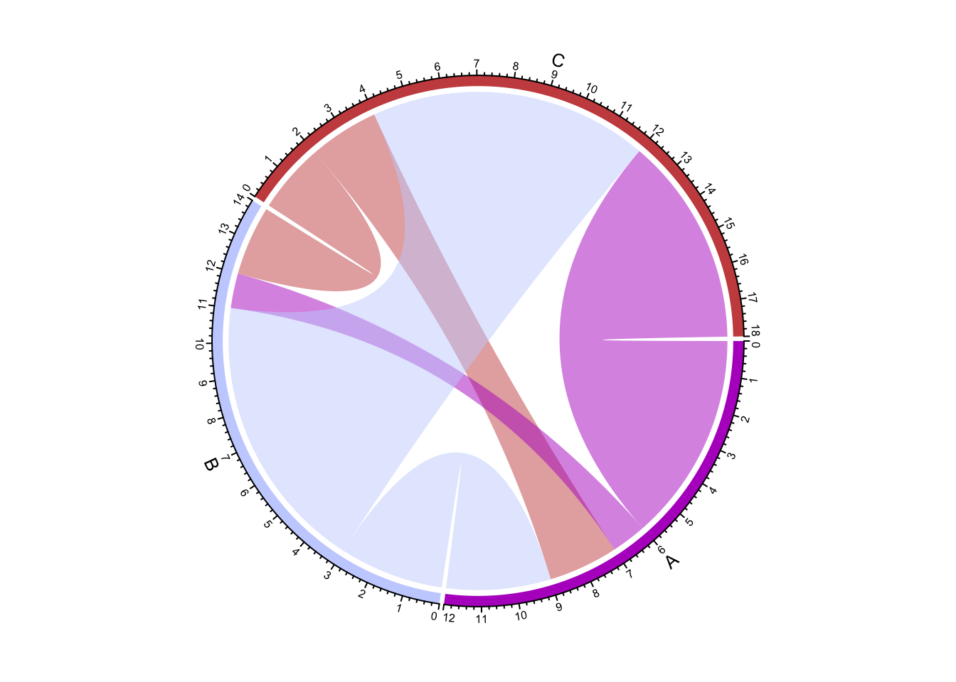
Tada, a chord diagram, where the width the links represent the scale of the value (exports in this case), and the color represents direction. We can do the exact same thing with an edgelist.
chordDiagram(edgelist)
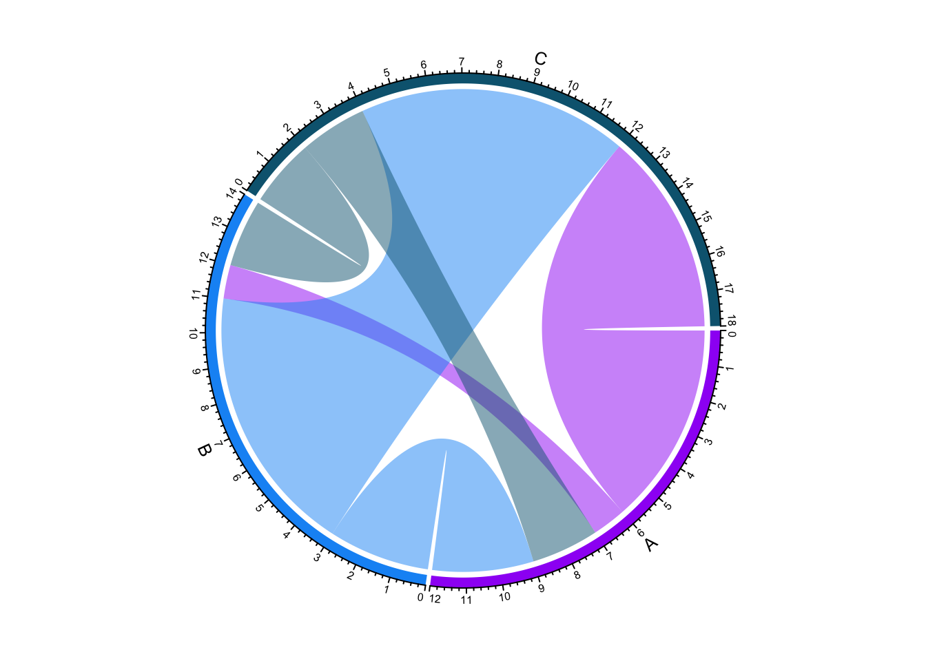
By default, the perimeter of the circle has a bunch of markings. We can get rid of most of it, but let’s keep the grid, which is the curved bar along the circle perimeter that represents a specific thing. In our example, the “thing” would be the country.
chordDiagram(
  edgelist,
  annotationTrack = "grid"
)
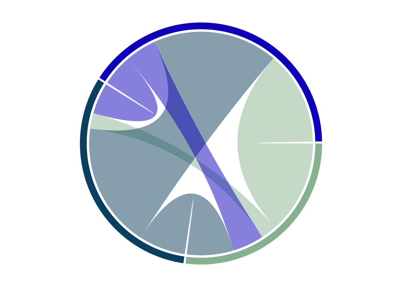
The grid can be removed entirely by setting annotationTrack to NULL, but I find that detracts from the utility of the plot.
Let’s add back in some labels.
chordDiagram(
  edgelist,
  annotationTrack = c("grid", "name")
)
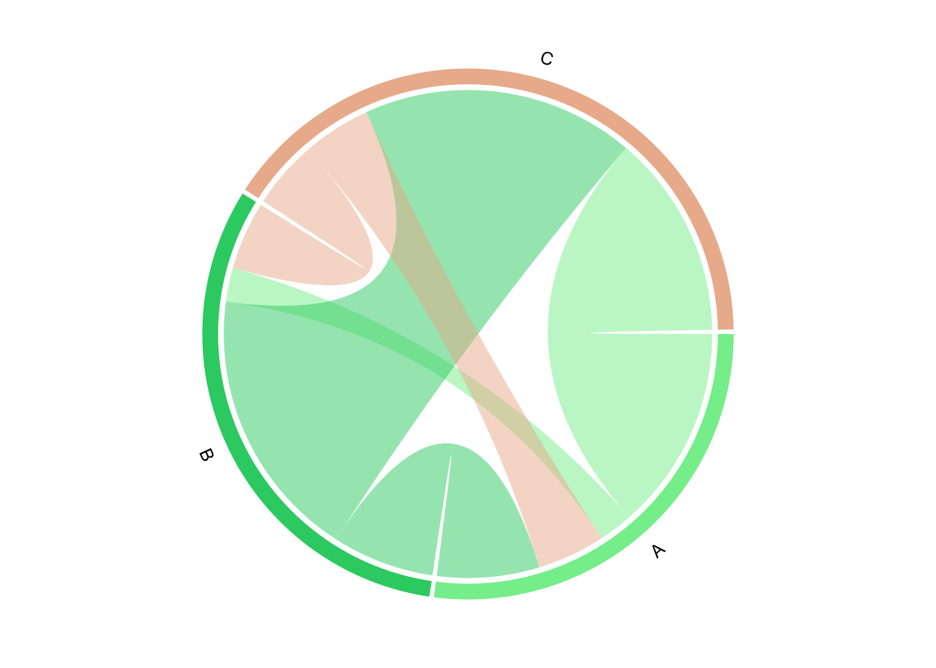 We can change the order. Let’s arbitrarily put A in the top left, and going clockwise, follow that with B, then C. This might require some experimentation.
chordDiagram(
  edgelist,
  annotationTrack = c("grid", "name"),
  order = c("C", "A", "B")
)
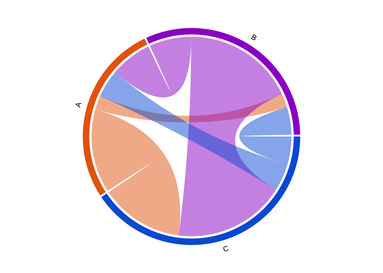
So far, the colors have been all over the place. Let’s assign colors and get that under control.
chordDiagram(
  edgelist,
  annotationTrack = c("grid", "name"),
  order = c("C", "A", "B"),
  grid.col = c("A" = "red", "B" = "blue", "C" = "green")
)

Note that the grid (the perimeter bit) matches the assigned color, and the “from” segment matches the source. For instance, the narrow link in red connecting A to B represents the value of exports going from Applestan to Banana Republic, where the width of the link represents the value of exports.
We can explicitly define the colors of the links, but I like having the links correspond to the source of the connection, so I’ll leave it as is.
We can also control the transparency of the links. Smaller values are more opaque.
chordDiagram(
  edgelist,
  annotationTrack = c("grid", "name"),
  order = c("C", "A", "B"),
  grid.col = c("A" = "red", "B" = "blue", "C" = "green"),
  transparency = .2
)
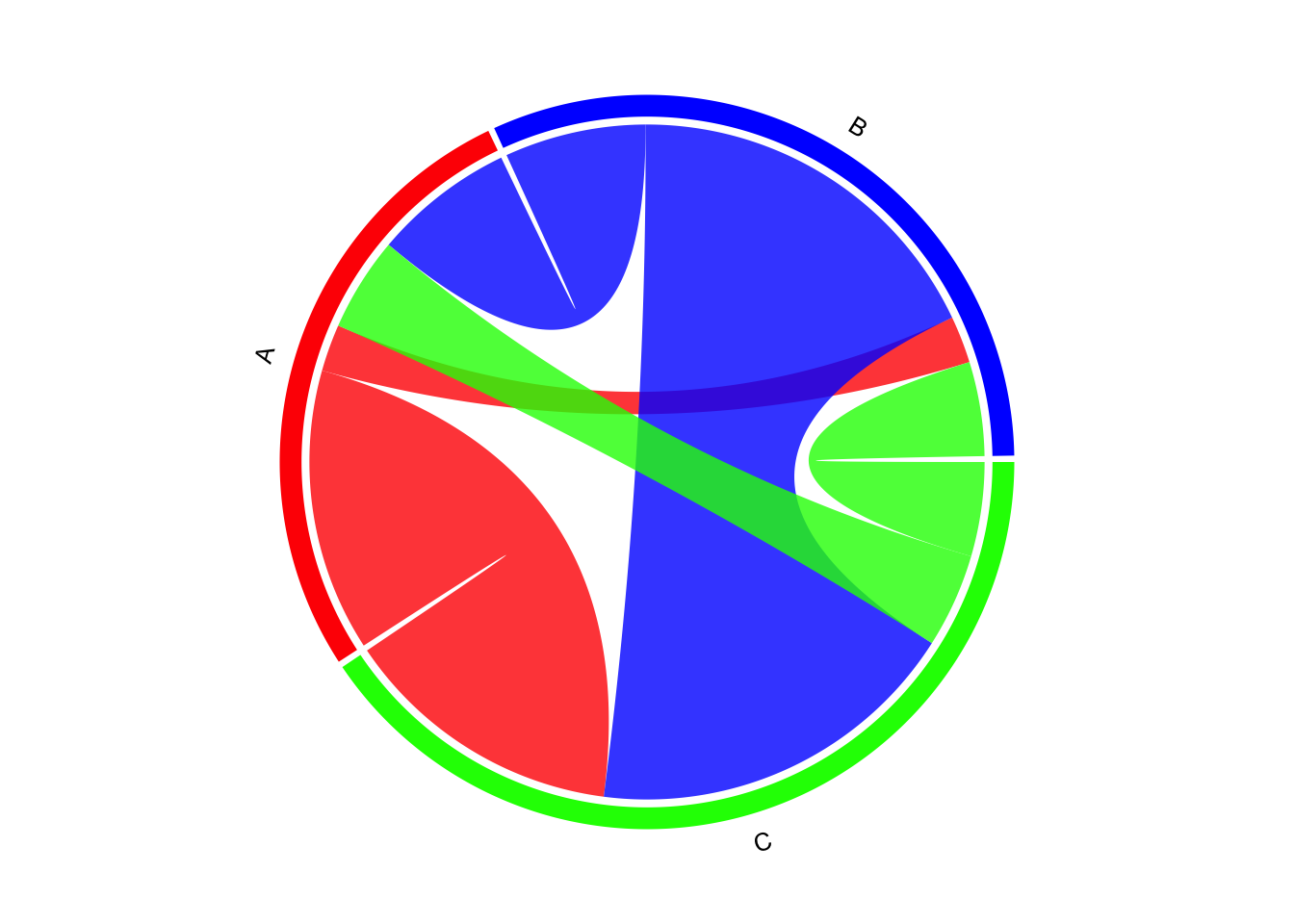
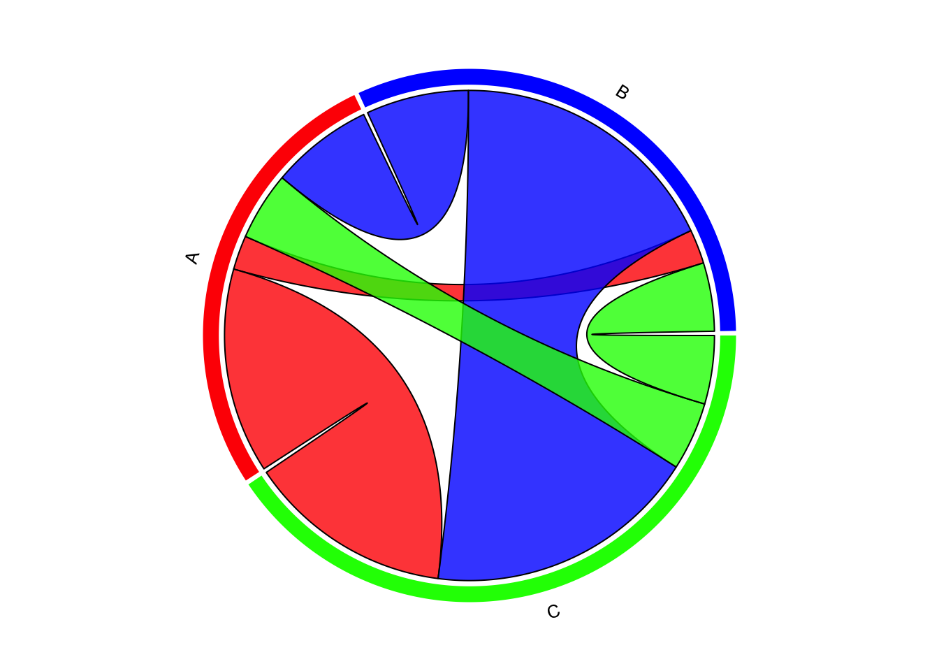
We can also add outlines to the links.
chordDiagram(
  edgelist,
  annotationTrack = c("grid", "name"),
  order = c("C", "A", "B"),
  grid.col = c("A" = "red", "B" = "blue", "C" = "green"),
  transparency = .2,
  link.lty = 1, # type
  link.border = 1, # color
  link.lwd = 1 # width
)
Interactive chord diagram with chorddiag #
An option for generating interactive chord diagrams in R is with the chorddiag package by Mattias Flor. chorddiag builds upon the D3 Javascript visualization library.
The interactivity is especially useful for information-dense chord diagrams. Naturally, this wouldn’t work in static or print form, only on a screen.
chorddiag only works with data in matrix form, not an edgelist dataframe.
chorddiag is not available in CRAN, and needs to be installed directly from its source github repository using the devtools package. It also hasn’t been very actively updated, so do proceed with caution.
# devtools::install_github(repo = "mattflor/chorddiag") # install
library(chorddiag)
Let’s start generating some chord diagrams with the chorddiag() function.
chorddiag(matrix)
Additional details pop up on mouseover.
The default aggregates the bidirectional flow. For instance, the default sums up the flow from A to B and B to A, and only shows a summed value.
Parting thoughts #
I like chord diagrams for their aesthetics. It’s a great way to change up the presentation with something different.
That being said, chord diagrams aren’t great in many situations.
If there are too many things, the multitudes of links on the diagram can get hard to read.
Chord diagrams also aren’t great for communicating values clearly. They’re good for conveying a general sense of scale, but visual precision is lacking.
Feel free to use chord diagrams, but sparingly.
Resources #
- Interactive Chord Diagrams in R/Shiny – focuses on the
chorddiagpackage. - From Data to Viz: Chord Diagram – mostly a general review of chord diagrams
- The chordDiagram() function
- chordiag documentation
- Chord Diagrams in R with chorddiag