Overview #
Correlation refers to the tendency for different data fields (or variables) to move together.
Here’s a simple conceptual example: we typically expect that as a person’s height goes up (such as when the person ages and grows), that person’s weight would go up as well. In this case, we could say there is a strong positive correlation between height and weight.
If the fields move in the same direction (e.g., if field A goes up, then field B also tends to go up), then those fields are said to have a positive correlation.

If the fields move in different directions (e.g., if field A goes up, then field B goes down, and vice versa), then those fields are said to have a negative correlation.

If there is no clear pattern between the fields, then there is no correlation.

The correlation relationship is often reflected using a measure referred to as a correlation coefficient, which we won’t go into too much detail here. There are several ways to calculate this, but in general the value ranges from -1 to 1, where -1 implies a very negative correlation, 1 implies a very positive correlation, and 0 right in the middle implies no correlation.
Correlation plots (or correlograms) are used to visually explore the relationship between different pieces of continuous data. By “continuous”, we’re referring to data fields that are numerical and measurable, as opposed to discrete categories.
Correlation plots can be pretty sophisticated and can be used to show the relationships between multiple pairings of continous variables.
Data #
A correlation plot requires at least two continuous numerical fields of data.
Here’s an example of a minimally sufficient dataset for a correlation plot (though we can actually get by with fewer records):
| A | B |
|---|---|
| 1 | 4 |
| 12 | 3 |
| 2 | 7 |
A correlation plot is not used to compare categorical fields of data, at least not without faceting (a topic to be discussed another time).
R #
For the R examples, we’ll use the built-in iris dataset, which provides measures in centimeteres of the sepal length and width as well as the petal length and width of 50 iris flower samples, drawn from 3 different species.
| Sepal.Length | Sepal.Width | Petal.Length | Petal.Width | Species |
|---|---|---|---|---|
| 5.1 | 3.5 | 1.4 | 0.2 | setosa |
| 4.9 | 3.0 | 1.4 | 0.2 | setosa |
| 4.7 | 3.2 | 1.3 | 0.2 | setosa |
| 4.6 | 3.1 | 1.5 | 0.2 | setosa |
| 5.0 | 3.6 | 1.4 | 0.2 | setosa |
| 5.4 | 3.9 | 1.7 | 0.4 | setosa |
Base R #
Base R includes some functionality to generate correlation plots.
pairs(iris[, 1:4])
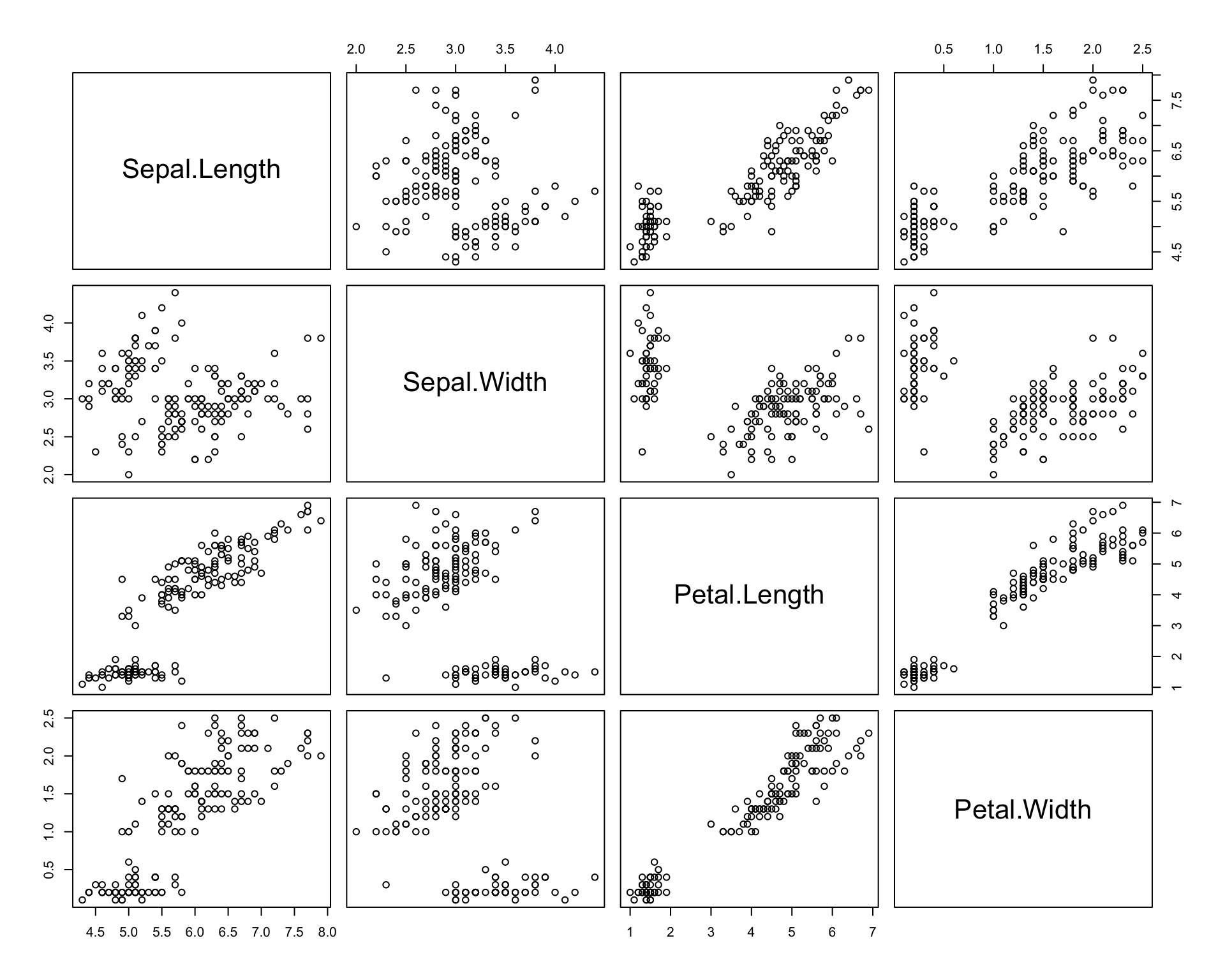
The pairs function creates a matrix of scatterplots of the available numerical fields.
In this case, we had subset the complete iris dataset to only include the numerical fields with iris[,1:4]. Colloquially, this can be read as, “Grab me all the rows and only columns 1 through 4 from the iris dataset”.
R corrgram package #
The corrgram provides some more sophisticated correlation calculations and visualizations.
# install.packages("corrgram") # run this if you don't already have the package installed
library(corrgram)
We’ll use the tidyverse package to manipulate the data as needed.
library(tidyverse)
Basic Plot #
Here’s a super simple correlation plot with the corrgram package, using the corrgram() function which takes as input a data frame or a matrix of data.
iris %>%
  select(-Species) %>% # drop the categorical species field
  corrgram()
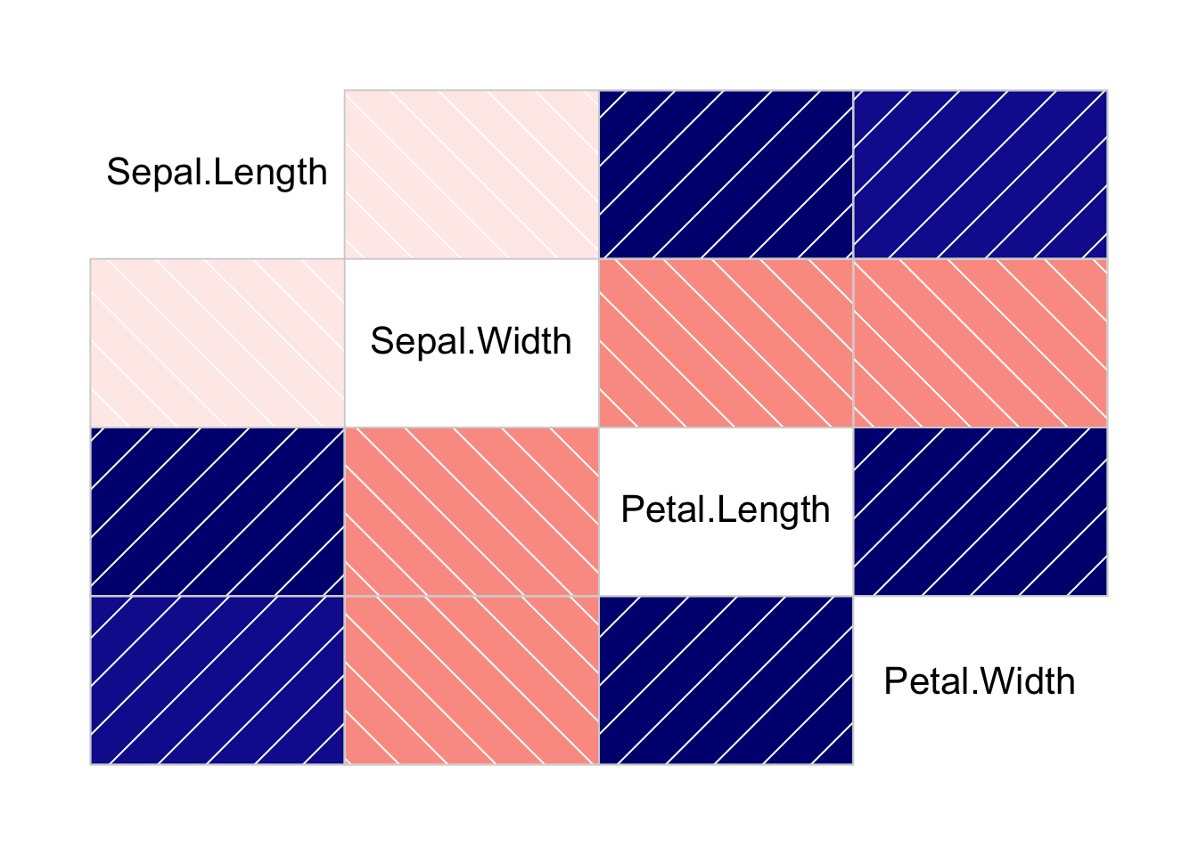
In the above visual, positive correlations are shown in blue, negative correlations are show in red. The direction of the lines helps as a reminder of the direction of correlation. The shade reflects the degree of correlation.
Lower Triangle #
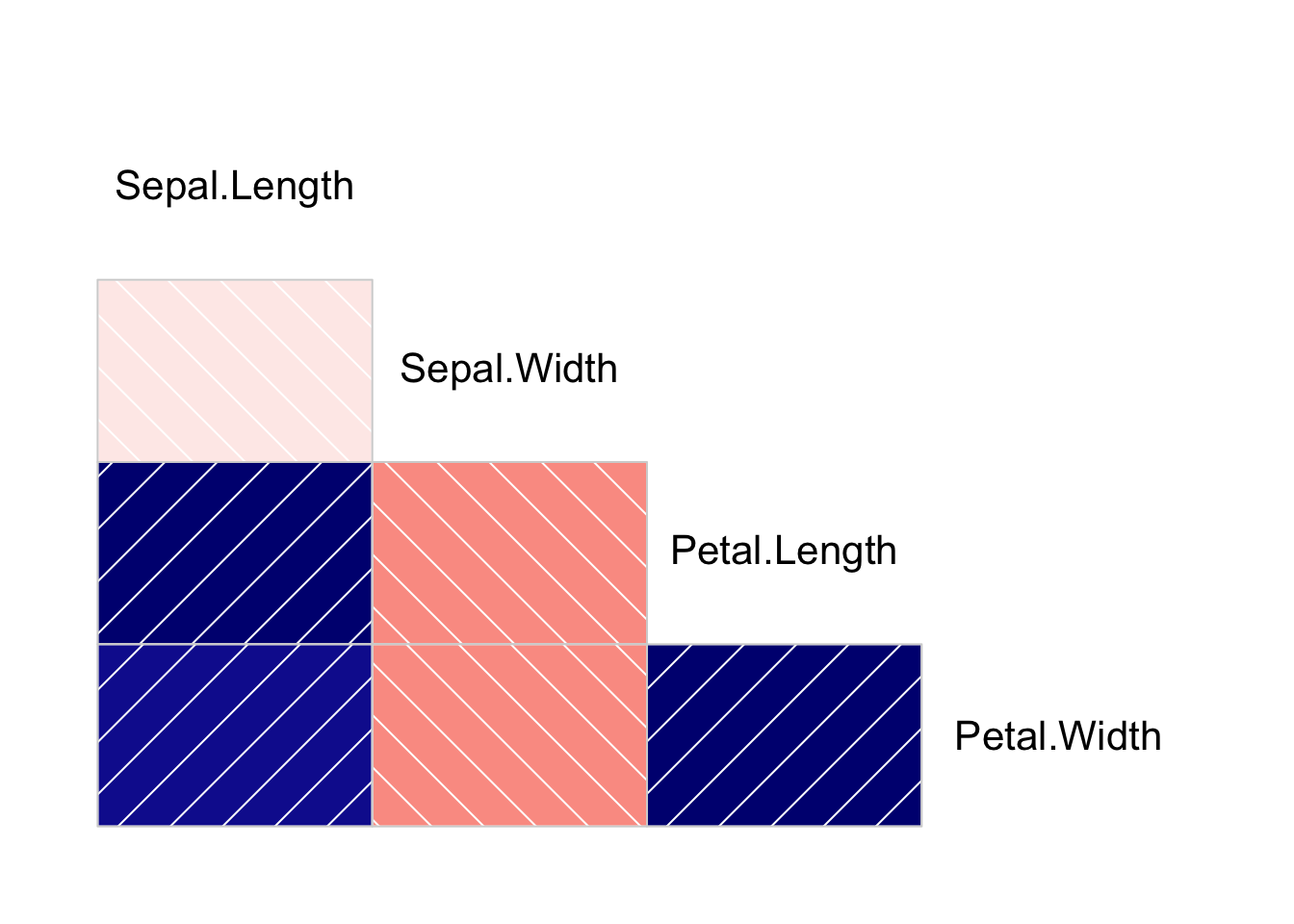
You might notice that in these correlation plots, the lower triange and the upper triangle effectively convey the same information. We can simplify this to only showing one of the two triangles, which conveys just as much information in the visual with less visual clutter.
We can reduce the plot to only show the lower triangle using some arguments in the corrgram function:
iris %>%
  select(-Species) %>% # drop the categorical species field
  corrgram(
    upper.panel = NULL # wipe out the upper triangle
  )
Pie Charts #
We can also display correlations using pie charts, where the wedges convey degrees of correlation, and the color again reflects the direction of correlation.
iris %>%
  select(-Species) %>% # drop the categorical species field
  corrgram(
    lower.panel = panel.pie,
    upper.panel = NULL # wipe out the upper triangle
  )

R corrplot package #
The corrplot provides another set of visualization tools for correlation.
# install.packages("corrplot") # run this if you don't already have the package installed
library(corrplot)
One major difference with this package is the input data is expected to be a correlation matrix, which can be generated using the cor function.
cor_isis <- cor(iris[, 1:4])

cor_isis
##              Sepal.Length Sepal.Width Petal.Length Petal.Width
## Sepal.Length    1.0000000  -0.1175698    0.8717538   0.8179411
## Sepal.Width    -0.1175698   1.0000000   -0.4284401  -0.3661259
## Petal.Length    0.8717538  -0.4284401    1.0000000   0.9628654
## Petal.Width     0.8179411  -0.3661259    0.9628654   1.0000000
For detailed examples of how to use the corrplot package, check out its vignettes.
Basic Plot #
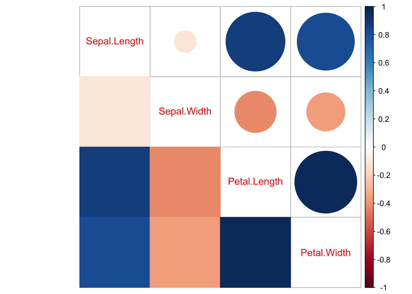
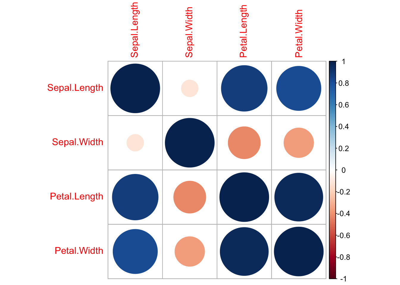
Here’s a basic correlation plot using the corrplot function, where the color and shade respectively reflect the direction of correlation and the degree of correlation. The size of the circles also reflects the degree of correlation.
corrplot(cor_isis)
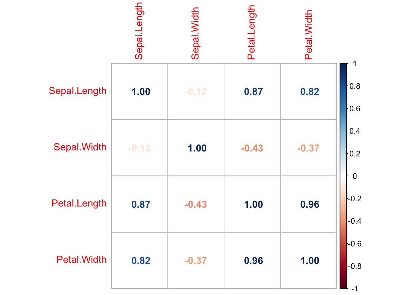
Alternatively, this same visual can be presented in numerical form.
corrplot(cor_isis, method = 'number')
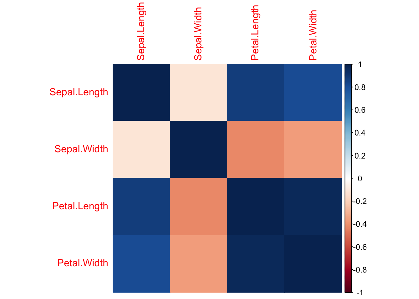
Or more simply with coloration.
corrplot(cor_isis, method = 'color')
Lower triangle #
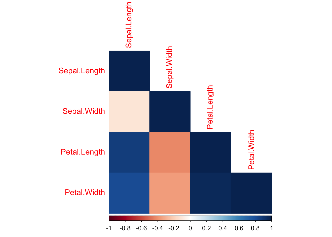
We can also reduce the visual noise by reducing the image to just the lower triangle.
corrplot(cor_isis, method = 'color', type = 'lower')
Mixed #
We can also mix things up so the lower triangle presents correlation in one form, and the upper triangle presents correlation in another form.
corrplot.mixed(cor_isis, lower = "color", upper = "circle")