Overview #
Divergent bar plots show bars extending from either side of an axis.

The bars can be arranged vertically or horizontally.
The side of the axis that the bars extend from can be a result of:
- The value, such as when there are positive and negative values
- The category, such as when there are two types of things that you want to show, clearly separated
For a specific type of divergent bar plot where the same observations appear across the two classes, check out the pyramid plot.
When to use #
Use a divergent bar plot when there are two broad classes to the data. In other words, the data can be thought of in binary terms.
The binary separations for instance might be:
- Positive vs. negative
- Male vs. female
- Adult vs. child
- Team 1 vs. Team 2
Data #
The data must include at least a numerical value and a categorical value.
The numerical value is some sort of measure. This is what the length of the bars get mapped to.
The categorical value is what gets used to distinguish the different bars.
Oftentimes, there is another categorical field to group the different observations.
Here’s a simple dataset that would work well with a divergent bar plot:
| observation | measure | class |
|---|---|---|
| A | 10 | class1 |
| B | 3 | class1 |
| C | 2 | class1 |
| D | 7 | class2 |
| E | 3 | class2 |
| F | 12 | class2 |
R #
I usually put together divergent bar plots in R using ggplot2.
library(tidyverse) # this includes ggplot2, along with other data manipulation tools
Let’s use the example data from above.
example
## # A tibble: 6 × 3
##   observation measure class
##   <chr>         <dbl> <chr>
## 1 A                10 class1
## 2 B                 3 class1
## 3 C                 2 class1
## 4 D                 7 class2
## 5 E                 3 class2
## 6 F                12 class2
We’ll first drop this into a regular bar plot.
example %>%
  ggplot() +
  geom_bar(
    stat = "identity",
    aes(
      x = observation,
      y = measure,
      fill = class
    )
  )
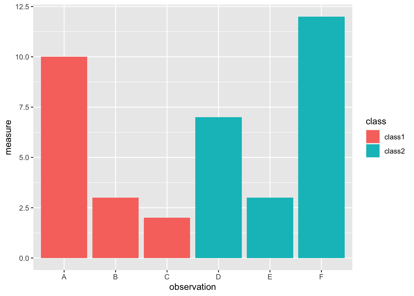
Well that’s not very divergent.
Given what the original data is, we’ll have to force divergence with some data manipulation.
I’ll set class2 to negative initially.
example %>%
  mutate(measure = ifelse(class == "class2", -1*measure, measure)) %>%
  ggplot() +
  geom_bar(
    stat = "identity",
    aes(
      x = observation,
      y = measure,
      fill = class
    )
  )
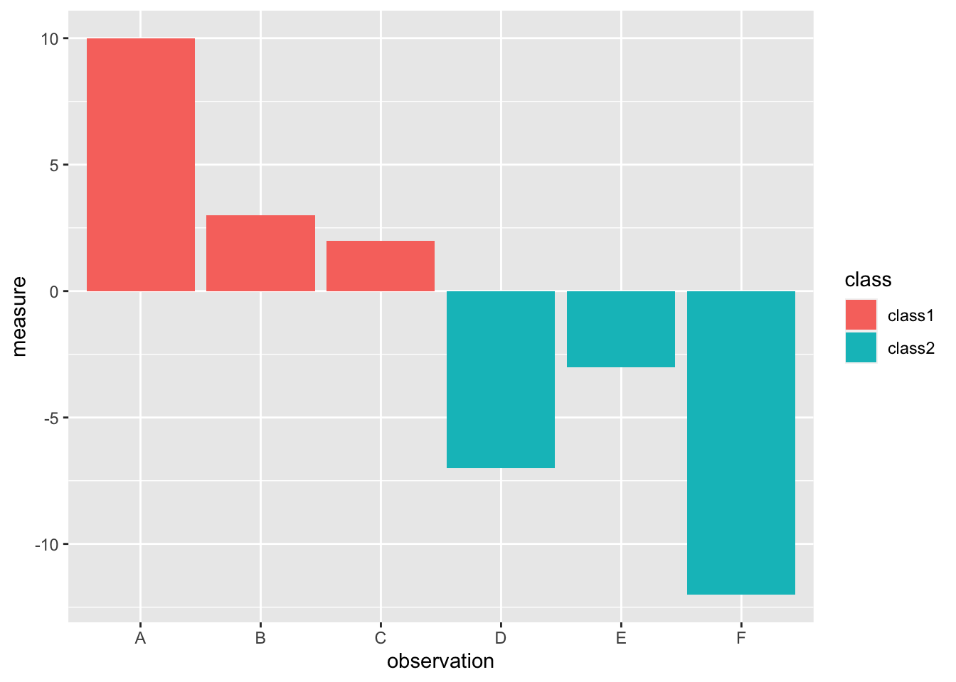
Let’s also order the bars by length.
example %>%
  mutate(measure = ifelse(class == "class2", -1*measure, measure)) %>%
  ggplot() +
  geom_bar(
    stat = "identity",
    aes(
      x = reorder(observation, measure),
      y = measure,
      fill = class
    )
  )
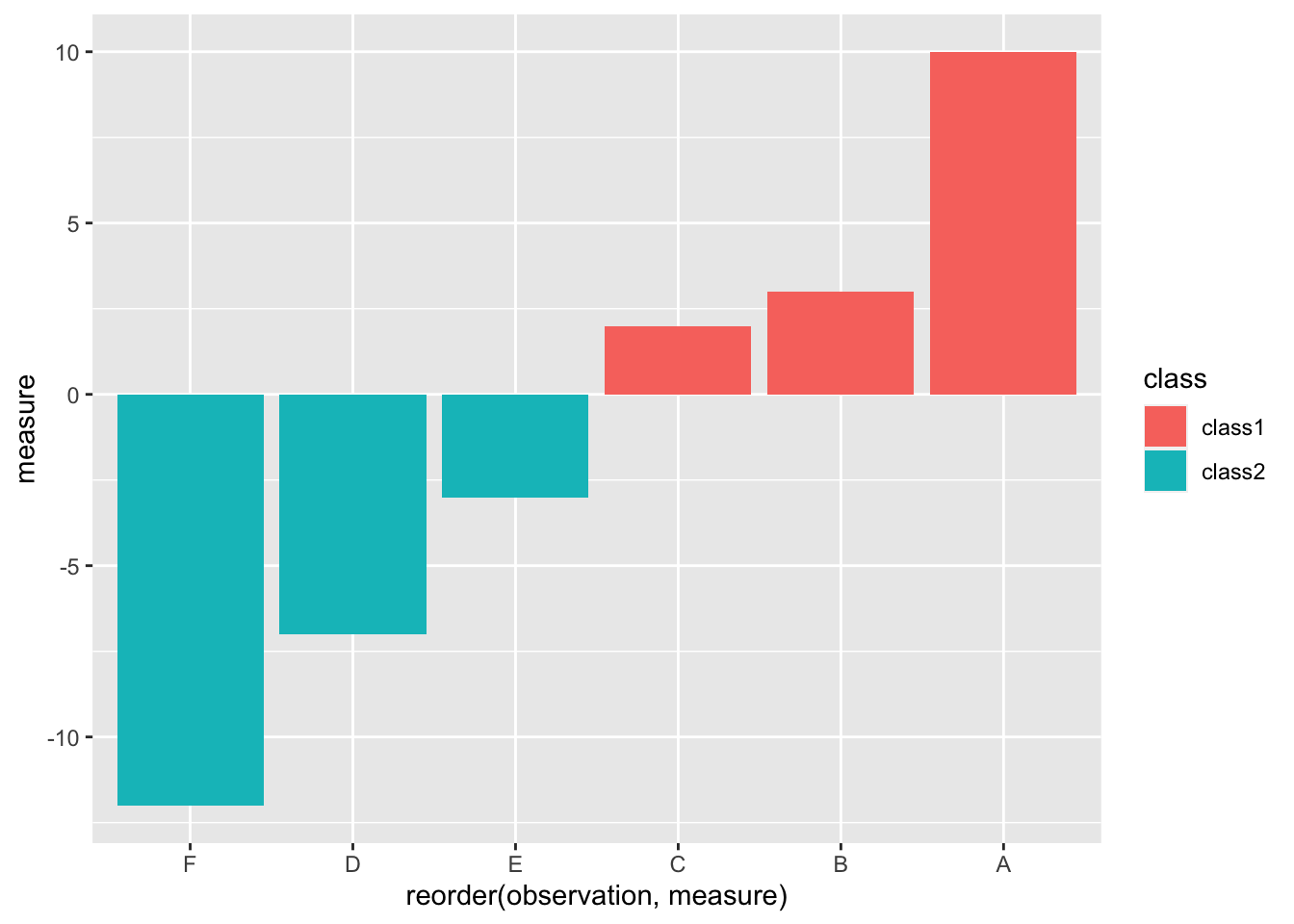
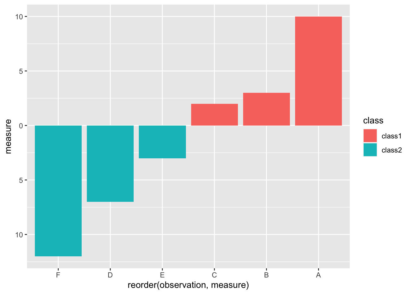
Assuming the measure is always something positive, having negative measures showing up on the plot is a bit nonsensical.
We can fix that by changing the labels to be absolute values.
example %>%
  mutate(measure = ifelse(class == "class2", -1*measure, measure)) %>%
  ggplot() +
  geom_bar(
    stat = "identity",
    aes(
      x = reorder(observation, measure),
      y = measure,
      fill = class
    )
  ) +
  scale_y_continuous(labels = abs)
I’m personally a fan of horizontal divergent bar plots.
example %>%
  mutate(measure = ifelse(class == "class2", -1*measure, measure)) %>%
  ggplot() +
  geom_bar(
    stat = "identity",
    aes(
      x = reorder(observation, measure),
      y = measure,
      fill = class
    )
  ) +
  scale_y_continuous(labels = abs) +
  coord_flip()
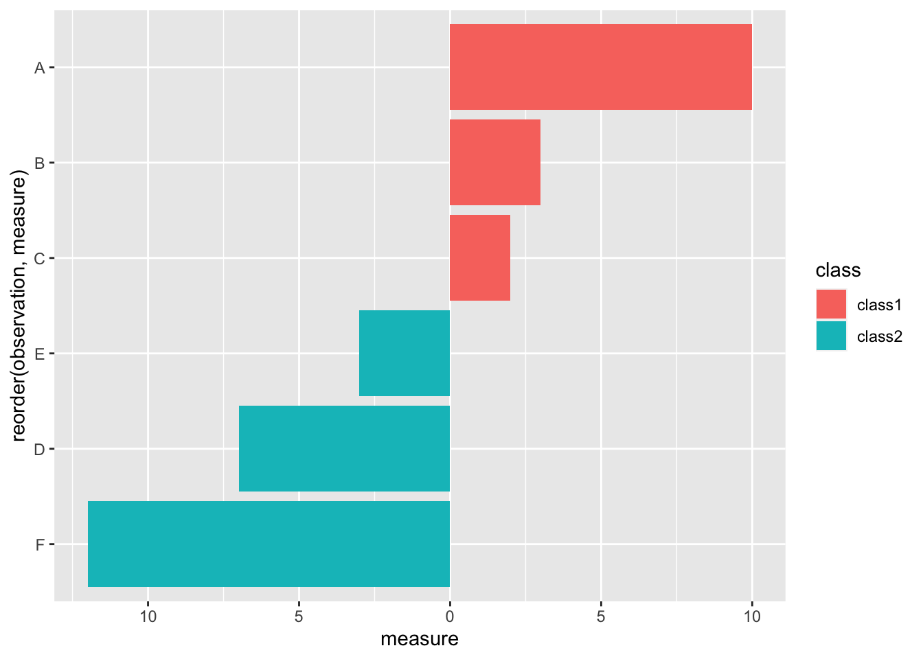
And there we have it – a simple divergent bar plot.
Resources #
- Gender Roles with Text Mining and N-grams – an excellent demonstration of divergent
barslollipops (but lollipops are close enough to bars).