Overview #
A donut chart is more or less a pie chart.
Similar to a pie chart, a donut chart conveys a senses of relative proportions of different categories or groups.
Like a pie chart, a donut chart suffers from the same major flaw: its design makes it inherently difficult for people to visually draw clear comparisons between categories.
Data #
Donut charts require a categorical field and a numerical field.
An example datasset:
| category | value |
|---|---|
| A | 40 |
| B | 10 |
| C | 27 |
| D | 23 |
R #
library(tidyverse)
ggplot2 #
A donut chart can easily be generated using the ggplot2 package.
It starts off essentially the same as a pie chart.
ggplot(
  dat_example,
  aes(
    x = "",
    y = value,
    fill = category # color the bars based on the category
  )
) +
  geom_bar(stat = "identity", color = "white") +
  geom_text(aes(label = value),
            position = position_stack(vjust = 0.5)) +
  theme_void() +
  coord_polar(theta = "y") +
  labs(
    title = "A Simple Pie Chart"
  )
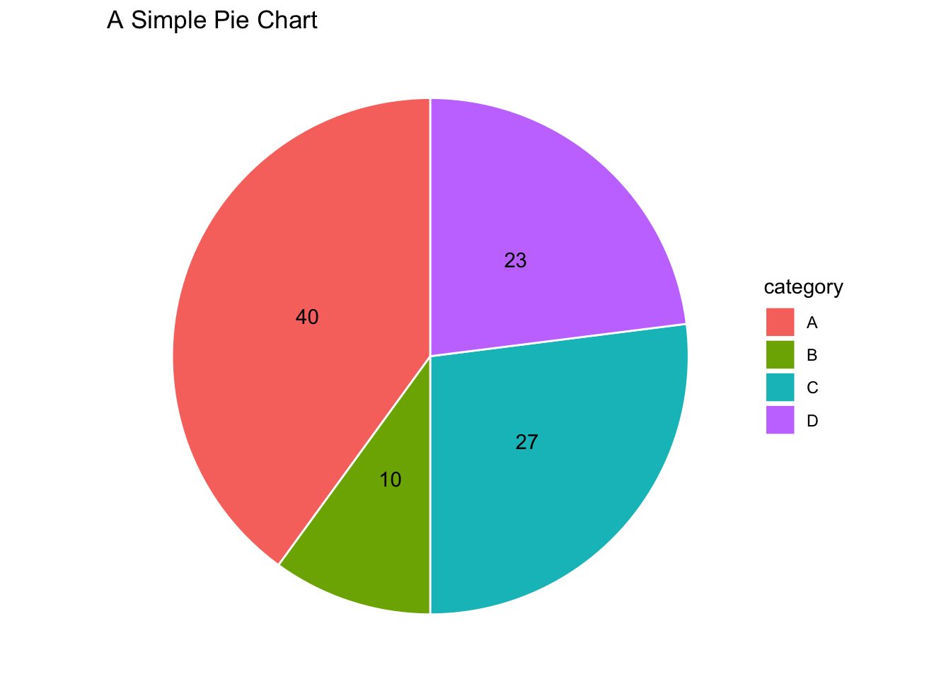
Then, two minor tweaks are added: specify an x-value and an x-axis limit that relates to the x-value. The x-value effectively controls the size of the hole of the donut.
Because the x-axis limit is dependent on the x-value, it’s often helpful to define single variable that is called for the x-value and the x-axis limit. In the below example, we define a variable arbitrarily called donut_hole and set it to a value of 2.
donut_hole = 2

ggplot(
  dat_example,
  aes(
    x = donut_hole, # note that the x-value has been set to the newly created variable
    y = value,
    fill = category # color the bars based on the category
  )
) +
  geom_bar(stat = "identity", color = "white") +
  geom_text(aes(label = value),
            position = position_stack(vjust = 0.5)) +
  theme_void() +
  coord_polar(theta = "y") +
  xlim(c(0.2, donut_hole + 0.5)) + # here's an addition
  labs(
    title = "A Simple Donut Chart"
  )
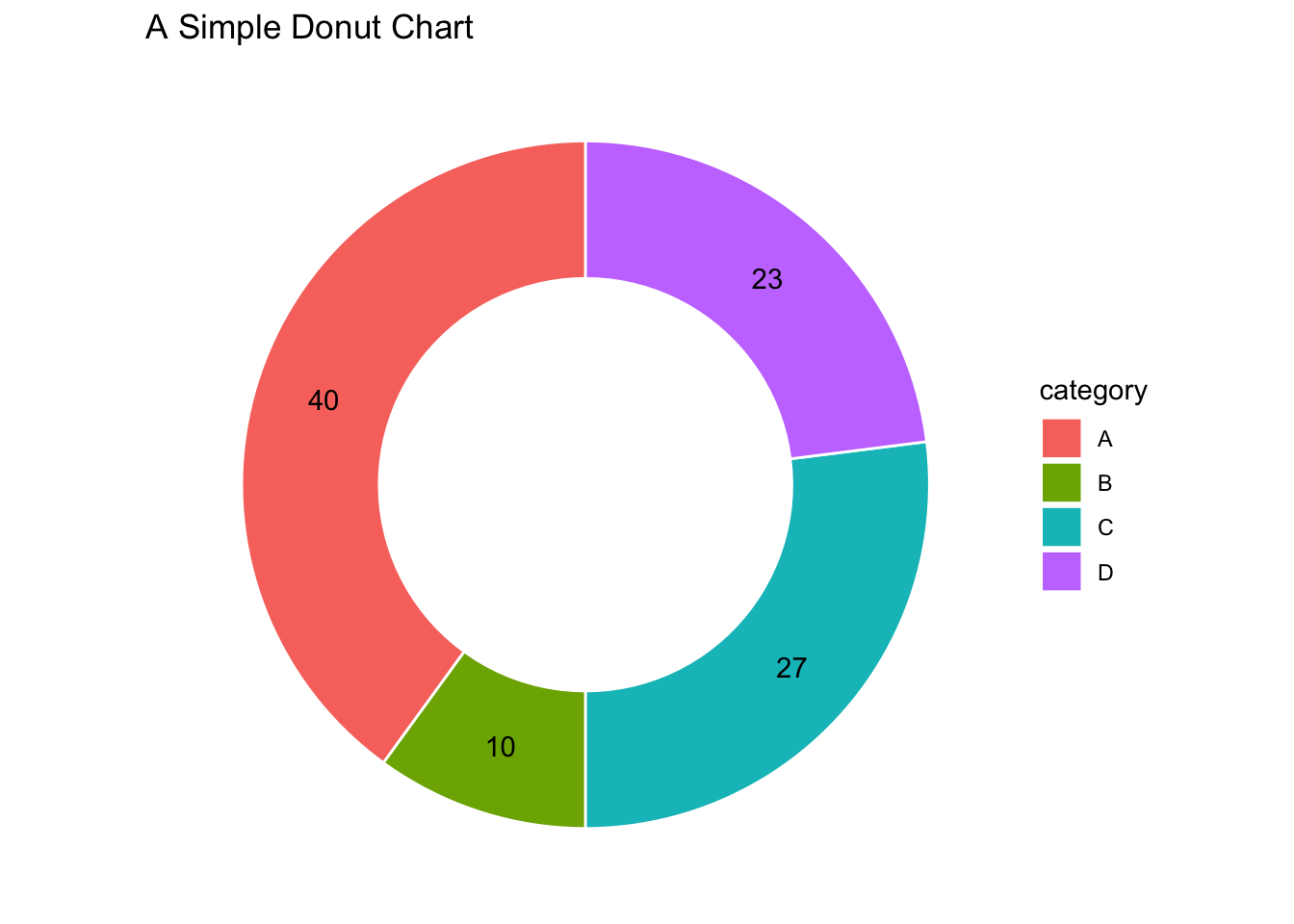
This is what happens when we reduce the x-value:
donut_hole = 1

ggplot(
  dat_example,
  aes(
    x = donut_hole, # note that the x-value has been set to the newly created variable
    y = value,
    fill = category # color the bars based on the category
  )
) +
  geom_bar(stat = "identity", color = "white") +
  geom_text(aes(label = value),
            position = position_stack(vjust = 0.5)) +
  theme_void() +
  coord_polar(theta = "y") +
  xlim(c(0.2, donut_hole + 0.5)) + # here's an addition
  labs(
    title = "A Simple Donut Chart (with a smaller hole)"
  )
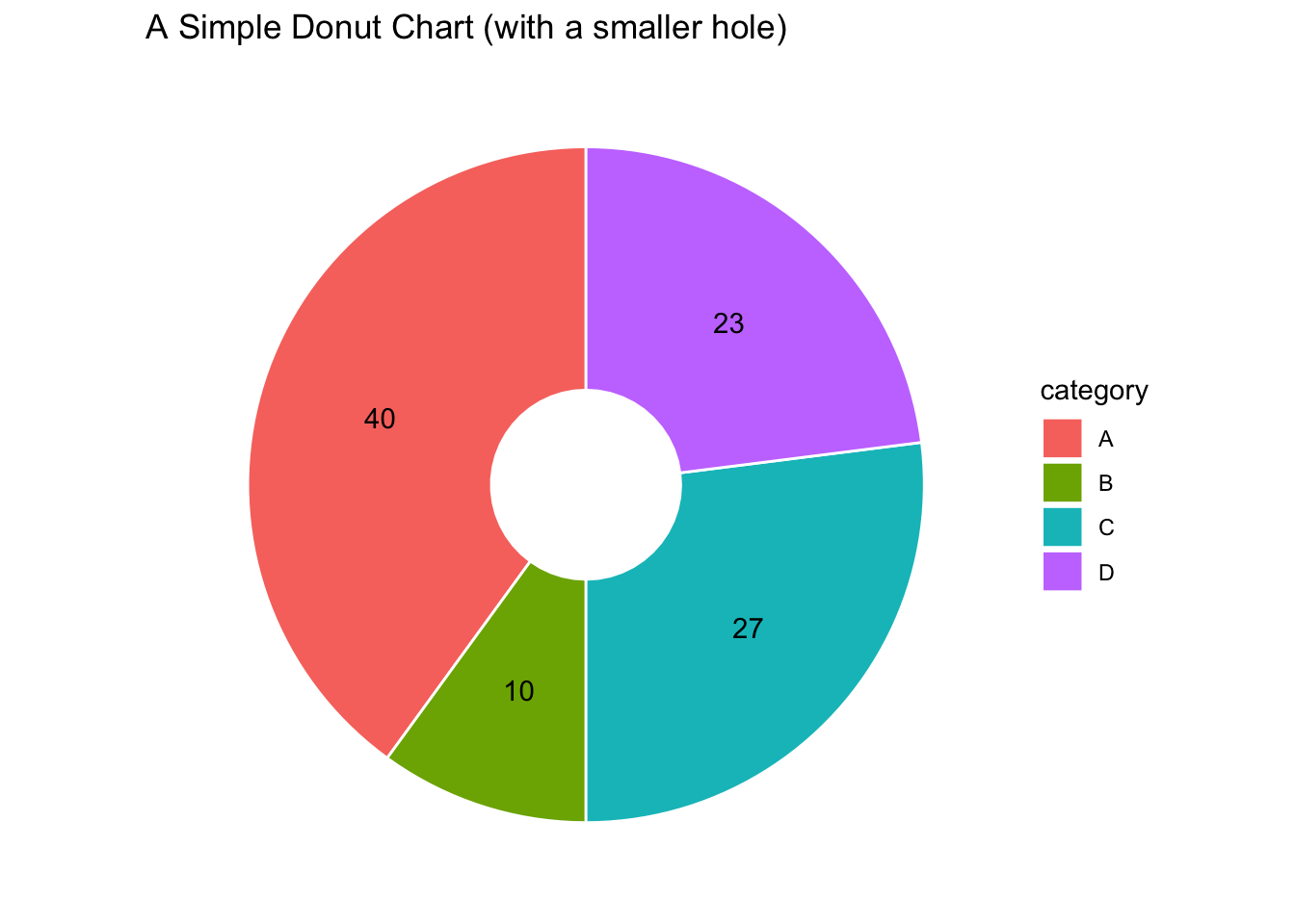
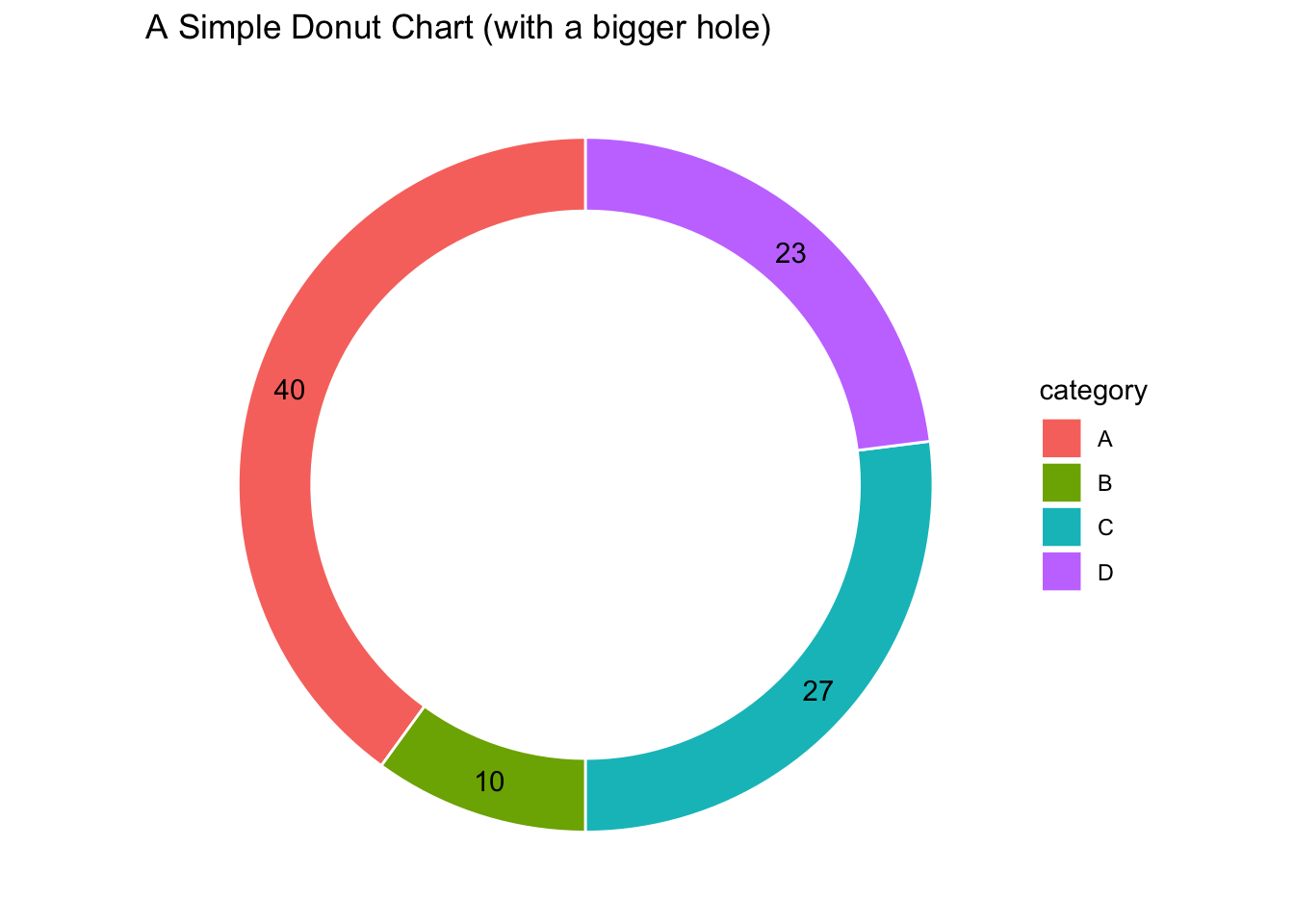
And this is what happens when we increase the x-value:
donut_hole = 4

ggplot(
  dat_example,
  aes(
    x = donut_hole, # note that the x-value has been set to the newly created variable
    y = value,
    fill = category # color the bars based on the category
  )
) +
  geom_bar(stat = "identity", color = "white") +
  geom_text(aes(label = value),
            position = position_stack(vjust = 0.5)) +
  theme_void() +
  coord_polar(theta = "y") +
  xlim(c(0.2, donut_hole + 0.5)) + # here's an addition
  labs(
    title = "A Simple Donut Chart (with a bigger hole)"
  )
ggpubr #
Donut charts can also be generated using the ggpubr package.
# install.packages("ggpubr") # run this if the package hasn't already been installed
library(ggpubr)
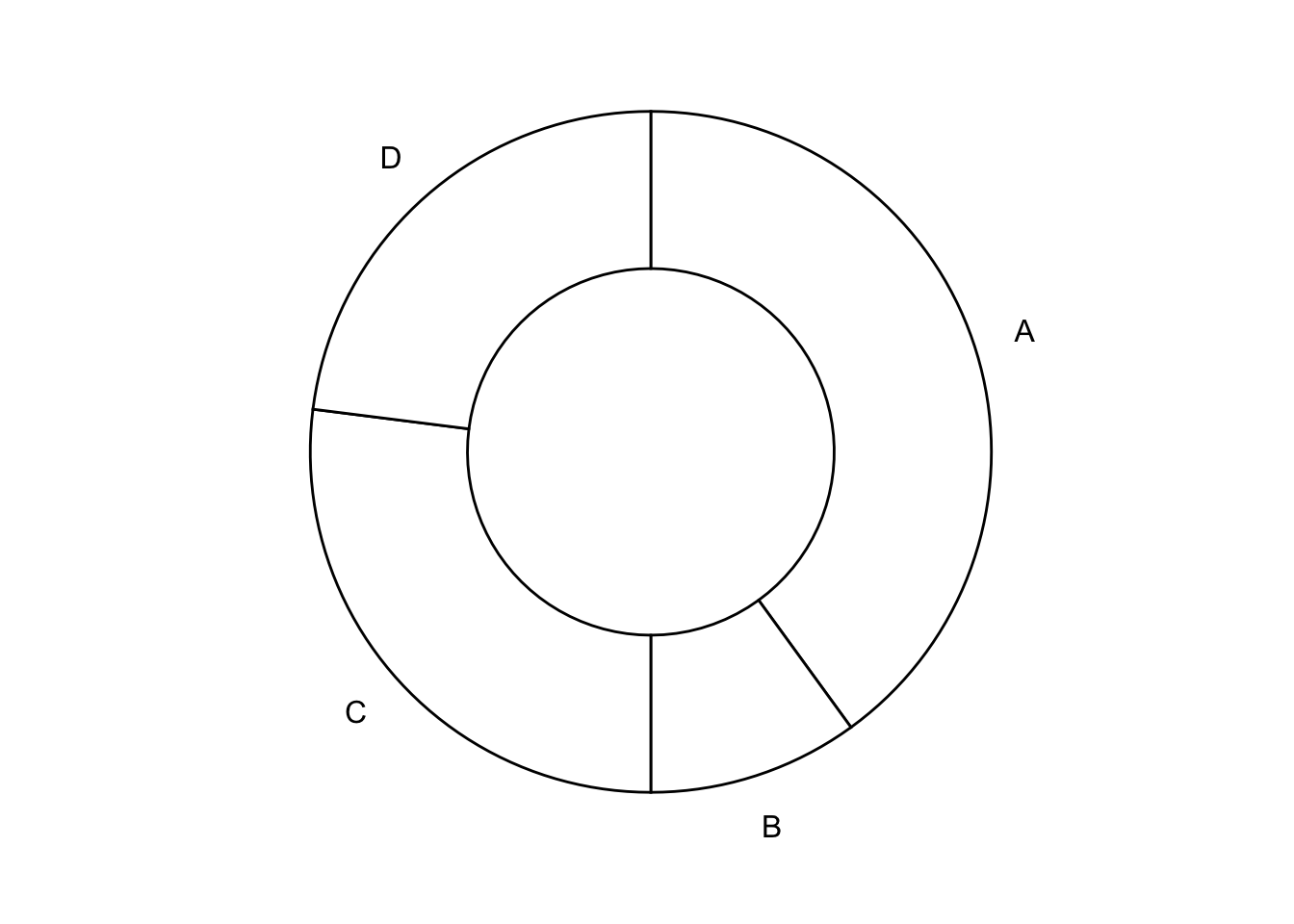
Here’s a super basic donut using the ggdonutchart() function from ggpubr.
ggdonutchart(
  dat_example,
  x = "value",
  label = "category"
)
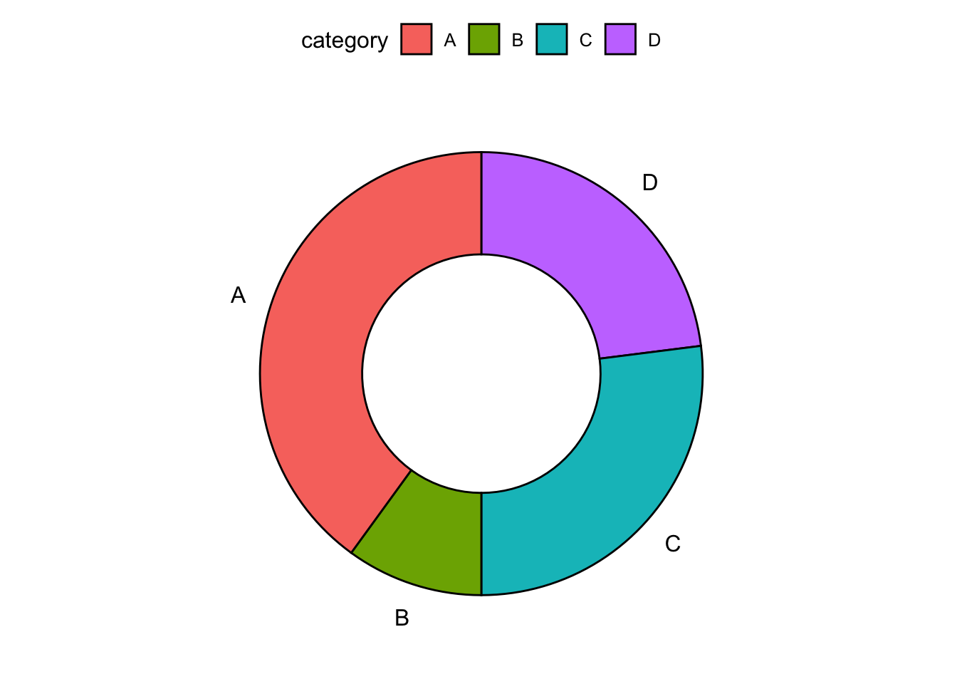
It can be made a bit more visually interesting with colors.
ggdonutchart(
  dat_example,
  x = "value",
  label = "category",
  fill = "category"
)
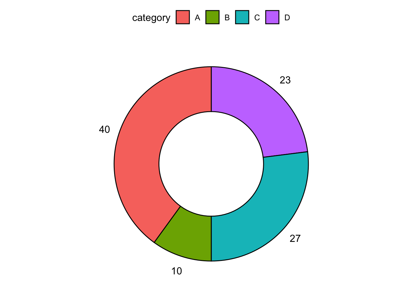
It can also be made more useful with a more informative label.
ggdonutchart(
  dat_example,
  x = "value",
  label = "value",
  fill = "category"
)
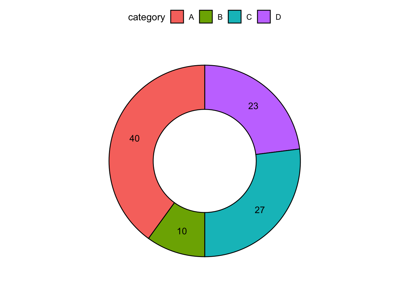
We can conserve on space by moving the labels into the donut.
ggdonutchart(
  dat_example,
  x = "value",
  label = "value",
  fill = "category",
  lab.pos = "in"
)
For more details about the ggdonutchart() function, check out its referece.