Overview #
A dumbbell plot can show changes or differences within a given observation, grouping, or category along some numerical dimension.
That numerical dimension can be a measure of some sort or a point in time (which really is just a measure of time).
Visually, a dumbbell plot looks like… a dumbbell.

An individual dumbbell plot is really nothing more than a line segment connecting distinct points on a plot.
Usually there are only two points at either end of the line segment, but there could be more points.
Data #
The data for a dumbbell plot should have at least one categorical field and at least two numerical fields, where the numerical fields are really measures of the same type of thing.
The categorical field gets used as one of the axis mappings, and is what separates the different dumbbells on the plot.
The numerical fields get used as either ends of the dumbbell.
For example, a categorical field might include babies, and the numerical fields might be a measure of their weight at birth and and their weight after one year. The dataset in a scenario like this might look like:
| baby | weight0 | weight1 |
|---|---|---|
| Arnold | 5.3 | 10.9 |
| Bob | 6.2 | 9.9 |
| Charlie | 8.5 | 15.2 |
Where baby is the baby’s name, weight0 is the weight at birth measured in pounds, and weight1 is the weight after one year.
R #
Dumbbell plots can be made using the ggalt package by hrbrmstr.
First, load up the package.
# install.packages("ggalt") # run this first to install the package
library(ggalt)
Use the geom_dumbell() function to generate a dumbbell plot. The function requires three aesthetic mappings:
- y – the categorical field
- x – the first measure for each category
- xend – the second measure for each category. I read this as “x end”.
This arrangement will generate a plot where the categories are on the vertical y-axis, and the measure runs along the horizontal x-axis.
Let’s try it out with the example data from above.
## # A tibble: 3 × 3
##   baby    weight0 weight1
##   <chr>     <dbl>   <dbl>
## 1 Arnold      5.3    10.9
## 2 Bob         6.2     9.9
## 3 Charlie     8.5    15.2
Here, baby maps to y, weight0 maps to x, and weight1 maps to xend.
baby_dat %>%
  ggplot() +
  geom_dumbbell(
    aes(
      y = baby,
      x = weight0,
      xend = weight1
    )
  )
## Warning: Using the `size` aesthetic with geom_segment was deprecated in ggplot2 3.4.0.
## ℹ Please use the `linewidth` aesthetic instead.
## This warning is displayed once every 8 hours.
## Call `lifecycle::last_lifecycle_warnings()` to see where this warning was
## generated.
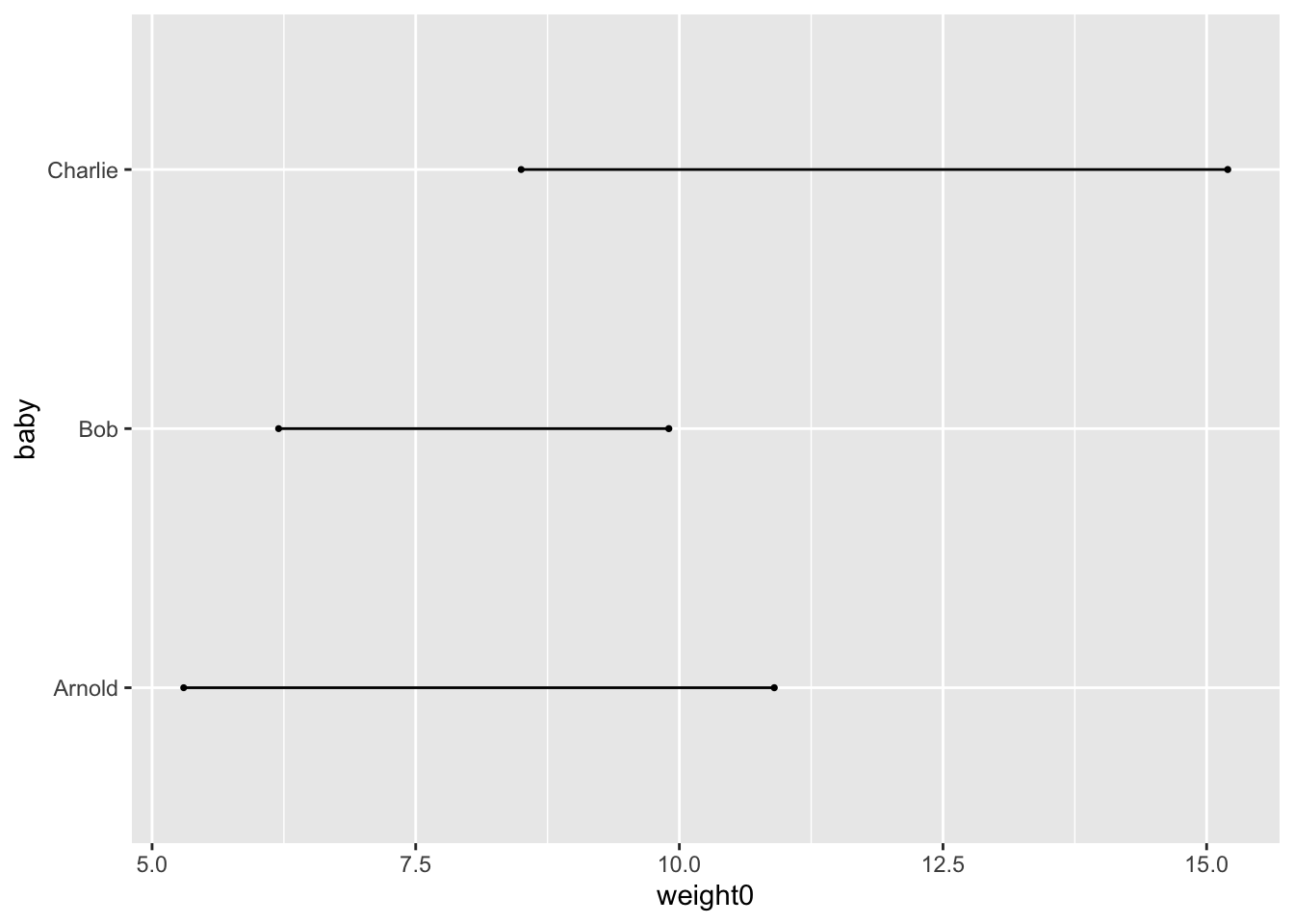
And there we have it: a bare dumbbell plot.
We can do better.
First, let’s clean up the labels and reorder the names.
baby_dat %>%
  ggplot() +
  geom_dumbbell(
    aes(
      y = reorder(baby, desc(baby)),
      x = weight0,
      xend = weight1
    )
  ) +
  labs( # add some labels
    title = "A bunch of babies and their weights at birth and after 1 year",
    x= "Weight (pounds)",
    y = NULL # I think in this case, we don't need extra text here
  ) +
  theme(
    plot.title.position = "plot" # align the title to the left of the whole plot
  )
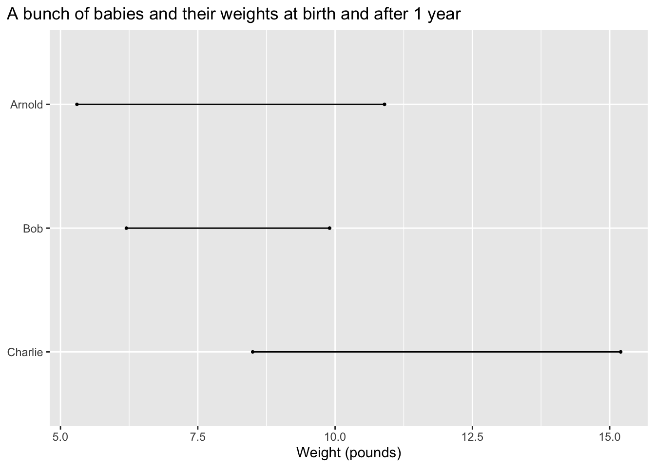
Let’s adjust the range of the x-axis. Starting at values other than 0 can sometimes be misleading or confusing.
baby_dat %>%
  ggplot() +
  geom_dumbbell(
    aes(
      y = reorder(baby, desc(baby)),
      x = weight0,
      xend = weight1
    )
  ) +
  expand_limits(x = 0) +
  labs( # add some labels
    title = "A bunch of babies and their weights at birth and after 1 year",
    x= "Weight (pounds)",
    y = NULL # I think in this case, we don't need extra text here
  ) +
  theme(
    plot.title.position = "plot" # align the title to the left of the whole plot
  )
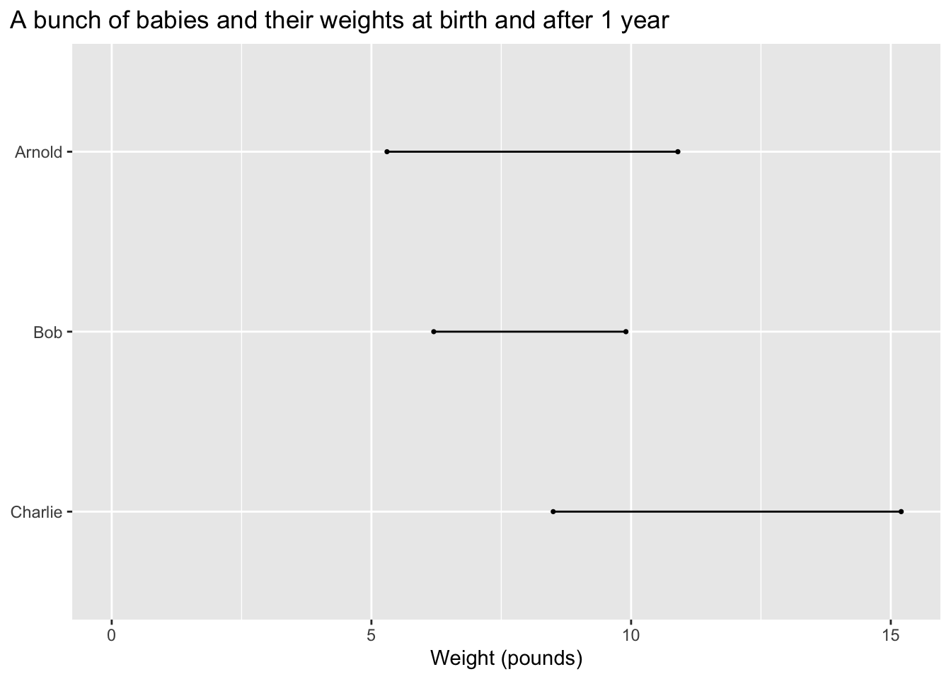
Let’s remove some of that empty space next to x=0.
baby_dat %>%
  ggplot() +
  geom_dumbbell(
    aes(
      y = reorder(baby, desc(baby)),
      x = weight0,
      xend = weight1
    )
  ) +
  expand_limits(x = 0) +
  scale_x_continuous(expand = c(0,0)) +
  labs( # add some labels
    title = "A bunch of babies and their weights at birth and after 1 year",
    x= "Weight (pounds)",
    y = NULL # I think in this case, we don't need extra text here
  ) +
  theme(
    plot.title.position = "plot" # align the title to the left of the whole plot
  )

Let’s also apply a theme other than the default.
The ggthemes package includes a bunch.
# install.packages("ggthemes")
library(ggthemes)
Let’s use the theme_economist() theme, which borrows design cues from The Economist. Let’s also break the title across two lines.
baby_dat %>%
  ggplot() +
  geom_dumbbell(
    aes(
      y = reorder(baby, desc(baby)),
      x = weight0,
      xend = weight1
    )
  ) +
  expand_limits(x = 0) +
  scale_x_continuous(expand = c(0,0)) +
  labs( # add some labels
    title = "A bunch of babies and their weights\nat birth and after 1 year",
    x= "Weight (pounds)",
    y = NULL # I think in this case, we don't need extra text here
  ) +
  theme_economist() +
  theme(
    plot.title.position = "plot" # align the title to the left of the whole plot
  )
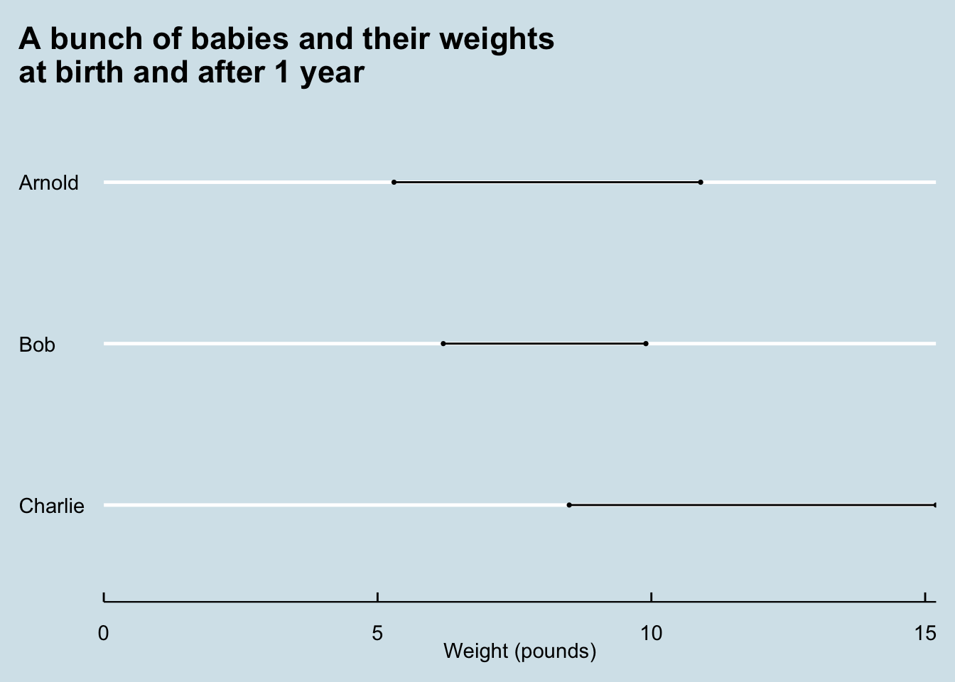
The dumbbells don’t look all that prominent here. We can adjust that by changing the size.
baby_dat %>%
  ggplot() +
  geom_dumbbell(
    size_x = 3,
    size_xend = 3,
    aes(
      y = reorder(baby, desc(baby)),
      x = weight0,
      xend = weight1
    )
  ) +
  expand_limits(x = 0) +
  scale_x_continuous(expand = c(0,0)) +
  labs( # add some labels
    title = "A bunch of babies and their weights\nat birth and after 1 year",
    x= "Weight (pounds)",
    y = NULL # I think in this case, we don't need extra text here
  ) +
  theme_economist() +
  theme(
    plot.title.position = "plot" # align the title to the left of the whole plot
  )
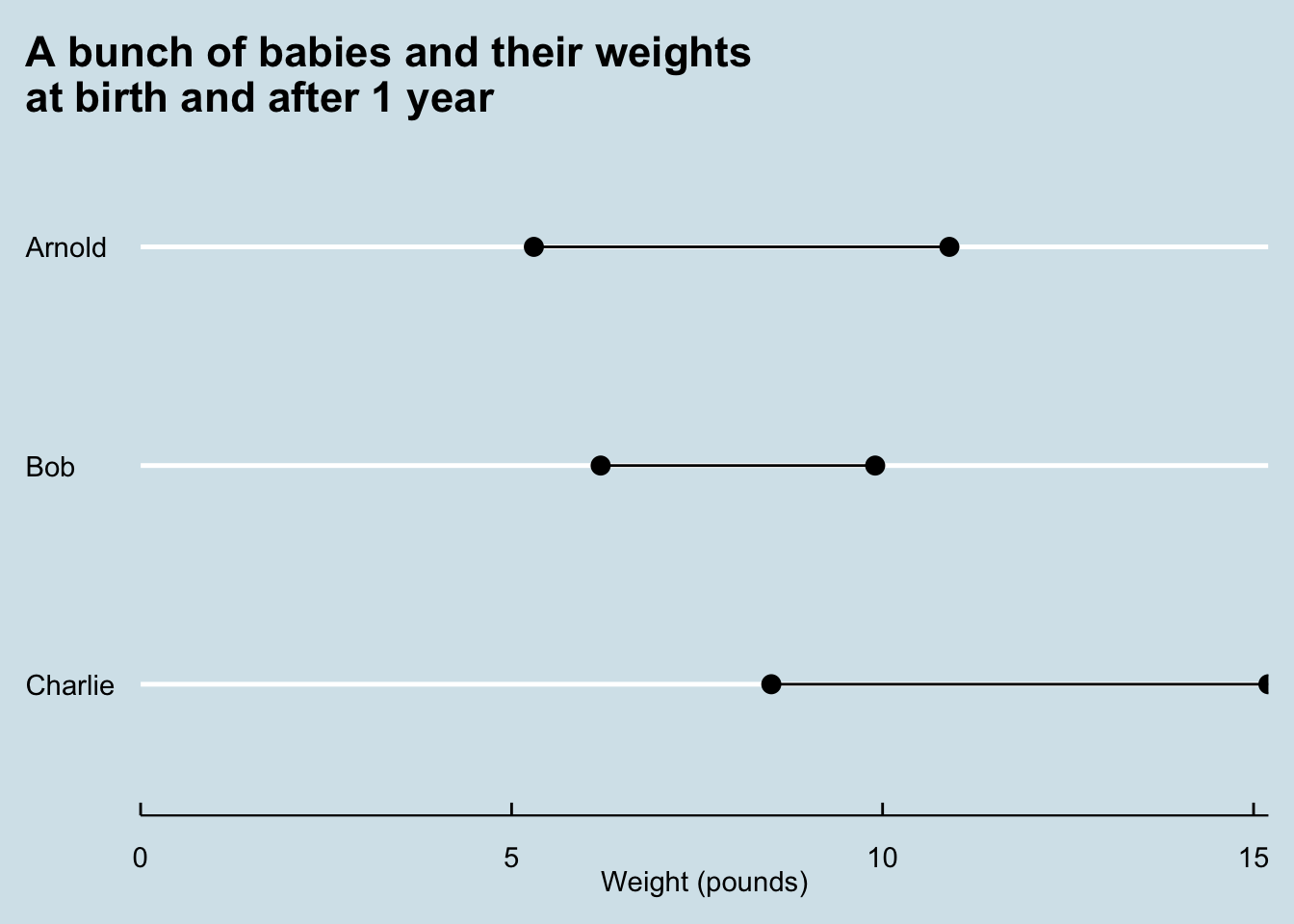
One of the ends is getting cut off. Let’s clean that up by tweaking the scale_x_continuous element.
baby_dat %>%
  ggplot() +
  geom_dumbbell(
    size_x = 3,
    size_xend = 3,
    aes(
      y = reorder(baby, desc(baby)),
      x = weight0,
      xend = weight1
    )
  ) +
  expand_limits(x = 0) +
  scale_x_continuous(expand = c(0,0.2)) +
  labs( # add some labels
    title = "A bunch of babies and their weights\nat birth and after 1 year",
    x= "Weight (pounds)",
    y = NULL # I think in this case, we don't need extra text here
  ) +
  theme_economist() +
  theme(
    plot.title.position = "plot" # align the title to the left of the whole plot
  )
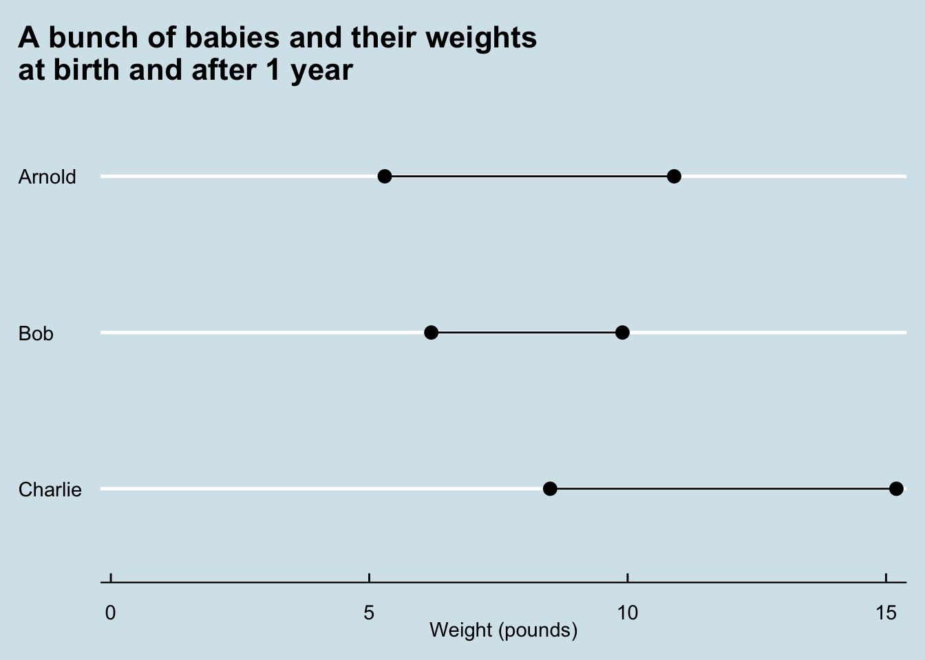
We can also change the colors of the different ends of the dumbbells with colour_x and colour_xend parameters.
baby_dat %>%
  ggplot() +
  geom_dumbbell(
    size_x = 3,
    size_xend = 3,
    colour_x = "red",
    colour_xend = "green",
    aes(
      y = reorder(baby, desc(baby)),
      x = weight0,
      xend = weight1
    )
  ) +
  expand_limits(x = 0) +
  scale_x_continuous(expand = c(0,0.2)) +
  labs( # add some labels
    title = "A bunch of babies and their weights\nat birth and after 1 year",
    x= "Weight (pounds)",
    y = NULL # I think in this case, we don't need extra text here
  ) +
  theme_economist() +
  theme(
    plot.title.position = "plot" # align the title to the left of the whole plot
  )
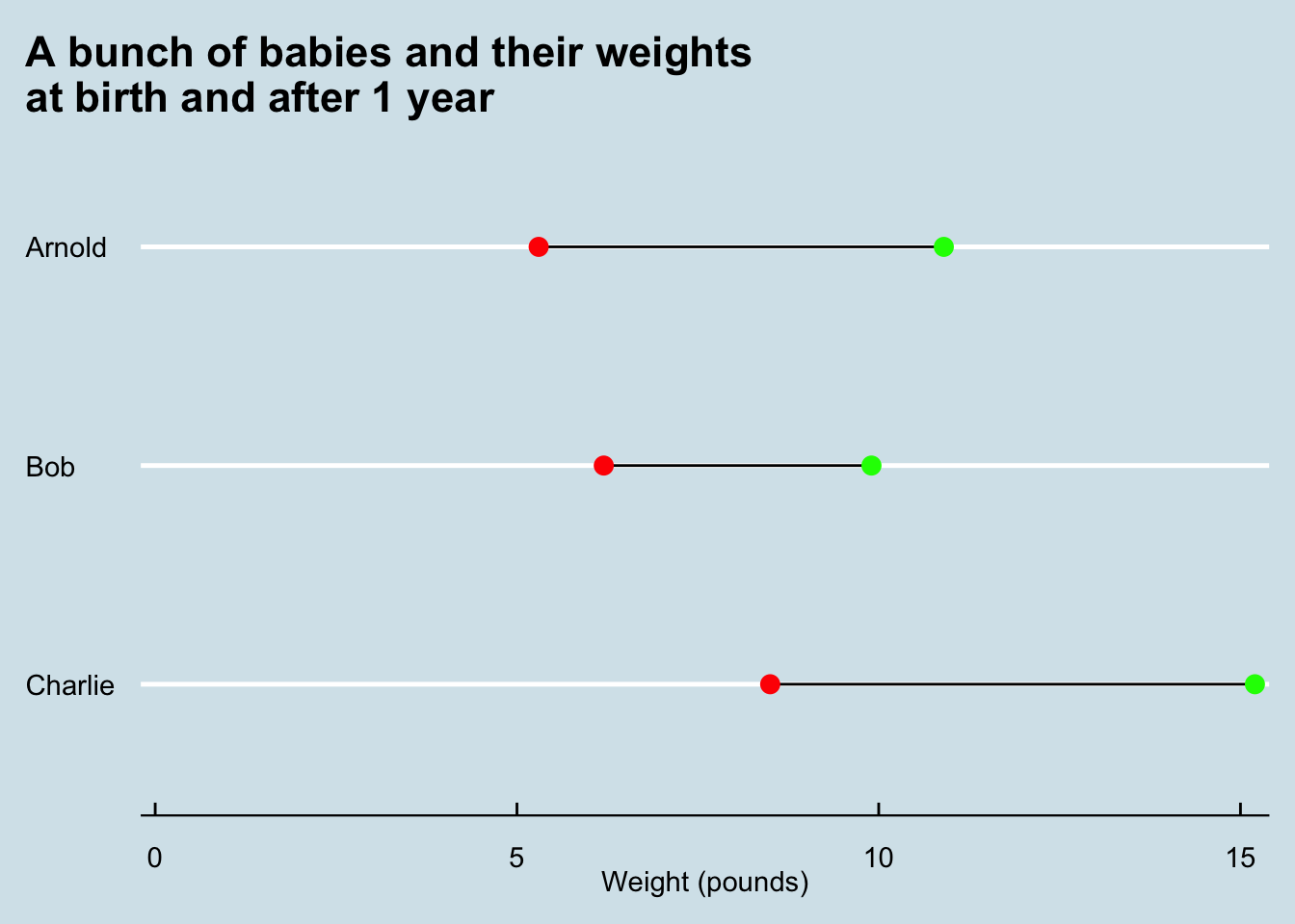
It’s still fairly simple, but we now have a complete and functional dumbbell plot.
Resources #
Here are some additional resources on generating dumbbell plots in R.
- Dumbbell Plots in ggplot2 and How To Make Dumbbell Plot in R with ggplot2?– these posts show how to make dumbbell plots without using
ggaltand itsgeom_dumbbellfunction. - Make Multi-point “dumbbell” Plots in ggplot2