Overview #
An error bar is a visual element that can be added on top of a plot to show spread or uncertainty in the underlying data.
The error bars usually represent things like standard deviation, standard error, or margin of error.

Visually, an error bar looks like a line crossing through a feature on the plot. The bar moves along a quantitative (measured) value.
The number of error bars used depends on the number of numerical value types there are.
Error bars are commonly used with scatter plots:


and bar plots.

The shorter the bars, the less uncertainty there is to the data.
If the data is evenly distributed, then the bars will be equivalent in length around a center, but if skewed, the bars will be of different length on either side of the center.
Alternatives #
The same set of details communicated by error bars can be shown with lines, lines with points, and crossbars.

When to use #
Add error bars to your plots when there is a need to communicate spread or uncertainty in the data.
Data #
An error bar utilizes the data underlying the plot data.
So if a bar plot is built on top of a numerical field and a categorical field for instance, then the error bar will use that data as well.
An additional piece of data that an error bar does require though is a measure of spread or uncertainty along the numerical field. It could be something like a standard deviation for instance. This can be calculated from the source data.
Here’s a simple example dataset that might be used to produce both a bar plot and an error bar to accompany that bar plot.
| Category | Measure | Standard Deviation |
|---|---|---|
| A | 10 | 0.5 |
| B | 6 | 1.2 |
| C | 3 | 1.0 |
R #
We can put together an error bar in R using the geom_errorbar() function in ggplot2.
library(ggplot2)
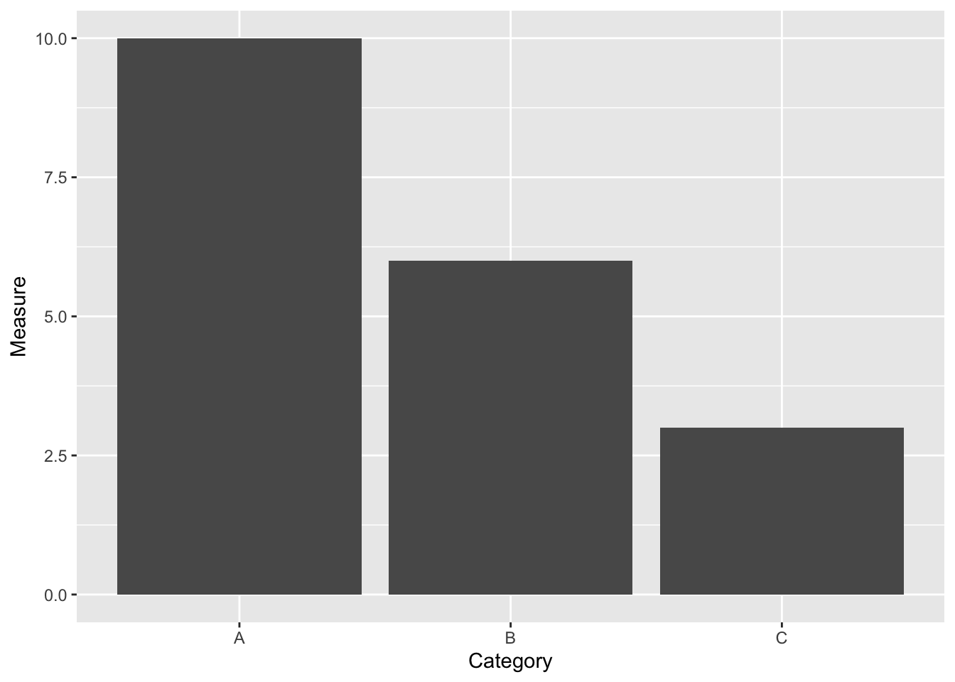
Let’s put together a bar chart with error bars using the mock data above.
example
## # A tibble: 3 × 3
##   Category Measure `Standard Deviation`
##   <chr>      <dbl>                <dbl>
## 1 A             10                  0.5
## 2 B              6                  1.2
## 3 C              3                  1
ggplot(example) +
  geom_bar(stat = "identity", aes(x = Category, y = Measure))

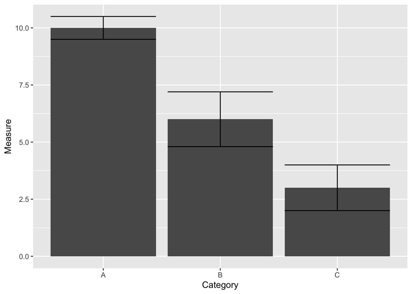
Now let’s add the error bars.
If we assume the data is normally distributed, we can treat the top of the bars as the center of the error bars with equivalent bars on either side of the centers.
ggplot(example) +
  geom_bar(stat = "identity", aes(x = Category, y = Measure)) +
  geom_errorbar(
    aes(
      x = Category,
      y = Measure,
      ymin = Measure - `Standard Deviation`,
      ymax = Measure + `Standard Deviation`
    )
  )

In this case, the caps are simply the measure of the bar, plus and minus the standard deviation.
This approach entails calculating the error bar ranges within the plotting itself. An alternative way to handle this is to calculate the ranges in the source data before the data gets to the plotting.
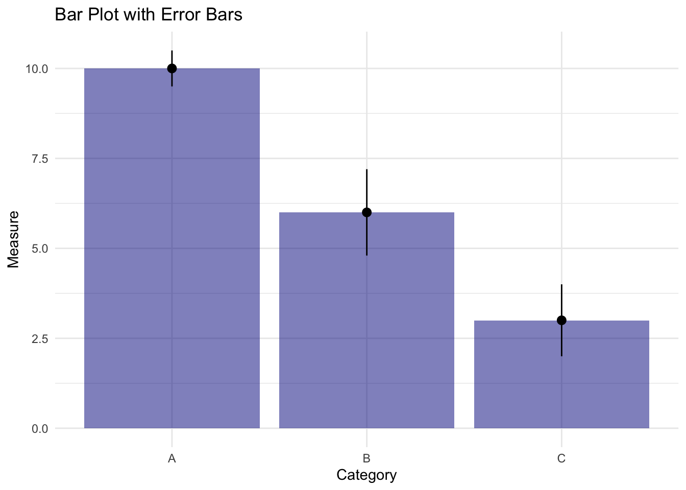
Let’s polish that up a tiny bit.
ggplot(example) +
  geom_bar(stat = "identity", aes(x = Category, y = Measure), alpha = .5, fill ="darkblue") + #added some transparency and color
  geom_errorbar(
    aes(
      x = Category,
      y = Measure,
      ymin = Measure - `Standard Deviation`,
      ymax = Measure + `Standard Deviation`
    ),
    width = .2 # make the error bar caps less wide
  ) +
  theme_minimal() +
  labs(
    title = "Bar Plot with Error Bars"
  )

We can swap out the error bar for a line.
ggplot(example) +
  geom_bar(stat = "identity", aes(x = Category, y = Measure), alpha = .5, fill ="darkblue") + #added some transparency and color
  geom_linerange(
    aes(
      x = Category,
      y = Measure,
      ymin = Measure - `Standard Deviation`,
      ymax = Measure + `Standard Deviation`
    )
  ) +
  theme_minimal() +
  labs(
    title = "Bar Plot with Error Bars"
  )

Or a point with line.
ggplot(example) +
  geom_bar(stat = "identity", aes(x = Category, y = Measure), alpha = .5, fill ="darkblue") + #added some transparency and color
  geom_pointrange(
    aes(
      x = Category,
      y = Measure,
      ymin = Measure - `Standard Deviation`,
      ymax = Measure + `Standard Deviation`
    )
  ) +
  theme_minimal() +
  labs(
    title = "Bar Plot with Error Bars"
  )

Or a crossbar.
ggplot(example) +
  geom_bar(stat = "identity", aes(x = Category, y = Measure), alpha = .5, fill ="darkblue") + #added some transparency and color
  geom_crossbar(
    aes(
      x = Category,
      y = Measure,
      ymin = Measure - `Standard Deviation`,
      ymax = Measure + `Standard Deviation`
    ),
    width = .2
  ) +
  theme_minimal() +
  labs(
    title = "Bar Plot with Error Bars"
  )
