Overview #
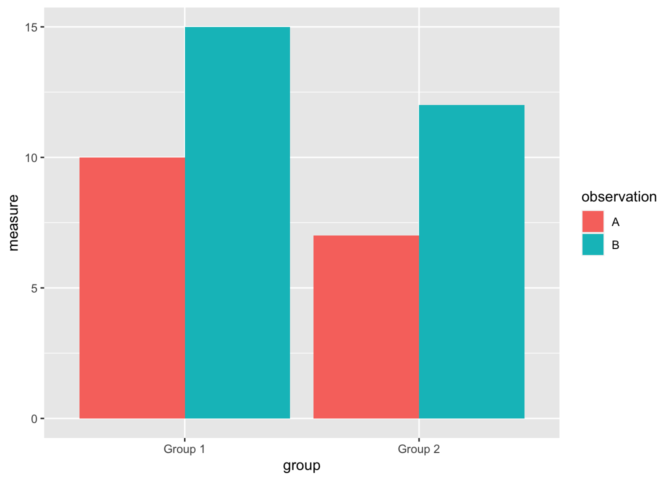
A grouped bar plot is used to compare measures of things across two categorical values.
One of those categorical values is used for grouping, and the other one is used to identify specific observations.

For instance, a grouped bar plot might be used to compare heights of individuals from different countries, separated by gender. A specific case where we might use this sort of plot is in comparing the heights of North Koreans and South Koreans.
Grouped bar plots are also referred to as:
- Grouped bar chart
- Dodged bar plot
- Dodged bar chart
A grouped bar plot is an enhancement on the basic bar plot.
When to use #
Grouped bar plots are great when you need to precisely compare different observations of different groups across those separate groups.
Because of the heights of the bars are only dependent on the measure of the specific observations, it’s very easy to draw precise comparisons between the observations.
This makes grouped bar plots better than stacked bar plots at drawing comparisons across observations. With stacked bar plots, comparisons of the observations within groups can get tricky because the overall bar starting and ending positions can change from stack to stack.
Data #
To assemble a grouped bar plot, the data must include:
- A numerical measure
- A categorical value that identifies the observation
- A categorical value that identifies the group
Here’s an example of what that data might look like:
| measure | observation | group |
|---|---|---|
| 10 | A | Group 1 |
| 15 | B | Group 1 |
| 7 | A | Group 2 |
| 12 | B | Group 2 |
R #
A grouped bar plot can be put together in R using the ggplot2 package.
Let’s recreate the example data from above.
example <- tribble(
  ~measure, ~observation, ~group,
  10, "A", "Group 1",
  15, "B", "Group 1",
  7, "A", "Group 2",
  12, "B", "Group 2"
)

example
## # A tibble: 4 × 3
##   measure observation group
##     <dbl> <chr>       <chr>
## 1      10 A           Group 1
## 2      15 B           Group 1
## 3       7 A           Group 2
## 4      12 B           Group 2
Now let’s pass that to ggplot2.
example %>%
  ggplot() +
  geom_bar(stat = "identity", position = "dodge", aes(x = group, y = measure, fill = observation))

The position = "dodge" is what distinguishes a grouped bar plot from other types of bar plots.
Note that in this particular plot, the height of the bars is mapped to the measure with y = measure.
The distinct groups are mapped to the different groupings with x = group.
The different observations with the groups are identified with a fill color, fill = observation.