Overview #
Heatmaps are used to display variations in numbers across different observations that also have other categorical attributes.
These are also referred to as tile plots.
Data #
At a minimum, a heatmap must have at least one numerical field and one categorical field.
A more common and information rich heatmap can leverage one numerical field and two categorical fields.
R #
A heatmap can be generated in R using the geom_tile() function in the ggplot2 package.
First, load up the required packages.
library(tidyverse)
library(ggplot2)
For this example, we’ll use the built-in diamonds dataset.
## # A tibble: 6 × 10
##   carat cut       color clarity depth table price     x     y     z
##   <dbl> <ord>     <ord> <ord>   <dbl> <dbl> <int> <dbl> <dbl> <dbl>
## 1  0.23 Ideal     E     SI2      61.5    55   326  3.95  3.98  2.43
## 2  0.21 Premium   E     SI1      59.8    61   326  3.89  3.84  2.31
## 3  0.23 Good      E     VS1      56.9    65   327  4.05  4.07  2.31
## 4  0.29 Premium   I     VS2      62.4    58   334  4.2   4.23  2.63
## 5  0.31 Good      J     SI2      63.3    58   335  4.34  4.35  2.75
## 6  0.24 Very Good J     VVS2     62.8    57   336  3.94  3.96  2.48
This dataset includes a number of categorical fields, including:
- cut
- color
- clarity
- depth
It also includes a several numerical fields, including:
- carat
- depth
- table
- price
- x
- y
- z
Let’s make a plot use cut (categorical), color (categorical), and price (numerical).
When I’m working with data and subsetting it, I like to follow a convention of assigning a new variable of the form _sub, where the _sub suffix acts as a marker that it’s a subset of some other data source.
diamonds_sub <- diamonds %>%
  select(
    cut,
    color,
    price
  )

diamonds_sub
## # A tibble: 53,940 × 3
##    cut       color price
##    <ord>     <ord> <int>
##  1 Ideal     E       326
##  2 Premium   E       326
##  3 Good      E       327
##  4 Premium   I       334
##  5 Good      J       335
##  6 Very Good J       336
##  7 Very Good I       336
##  8 Very Good H       337
##  9 Fair      E       337
## 10 Very Good H       338
## # ℹ 53,930 more rows
There are a lot data points for each cut and color combination. What I’ll do here is aggregate it down a bit so working dataset only contains one record for each cut, color, and price combination.
This is where some judgment comes into play: it’s up to the creator to decide what to show. In this example, let’s assume I want to visually display the average price for each cut and color combination.
diamonds_sub_agg <- diamonds_sub %>%
  group_by(cut, color) %>%
  summarize(avg_price = mean(price))
## `summarise()` has grouped output by 'cut'. You can override using the `.groups`
## argument.
diamonds_sub_agg
## # A tibble: 35 × 3
## # Groups:   cut [5]
##    cut   color avg_price
##    <ord> <ord>     <dbl>
##  1 Fair  D         4291.
##  2 Fair  E         3682.
##  3 Fair  F         3827.
##  4 Fair  G         4239.
##  5 Fair  H         5136.
##  6 Fair  I         4685.
##  7 Fair  J         4976.
##  8 Good  D         3405.
##  9 Good  E         3424.
## 10 Good  F         3496.
## # ℹ 25 more rows
Now we have a much shorter dataset with only 35 rows, where each row includes two categorical fields and one numerical field.
There are 35 rows in this aggregated dataset because there are 35 unique combinations of cut and color.
This is the shape of data that is required for a two dimensional heatmap. The data formed this way is now ready for plotting.
diamonds_sub_agg %>%
  ggplot(
    aes(
      x = cut,
      y = color,
      fill = avg_price
    )
  ) +
  geom_tile()

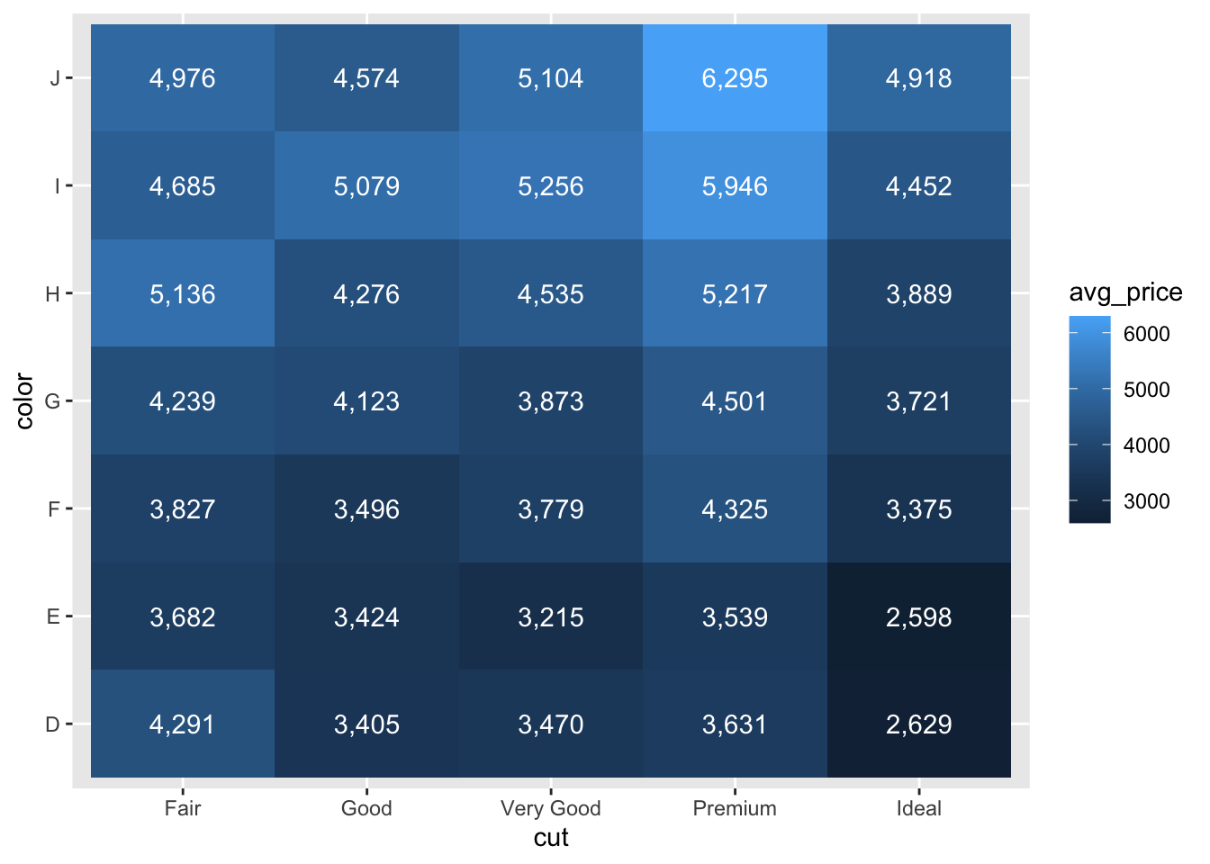
There is a color scale to indicate the populated values. The plot can be further enhanced with text annotation of the values.
diamonds_sub_agg %>%
  ggplot(
    aes(
      x = cut,
      y = color,
      fill = avg_price
    )
  ) +
  geom_tile() +
  geom_text(aes(label = scales::comma(avg_price)), color = "white")

Great! So now we have a minimally functional heatmap with annotations of the values. At this point, we can start dressing it up some.
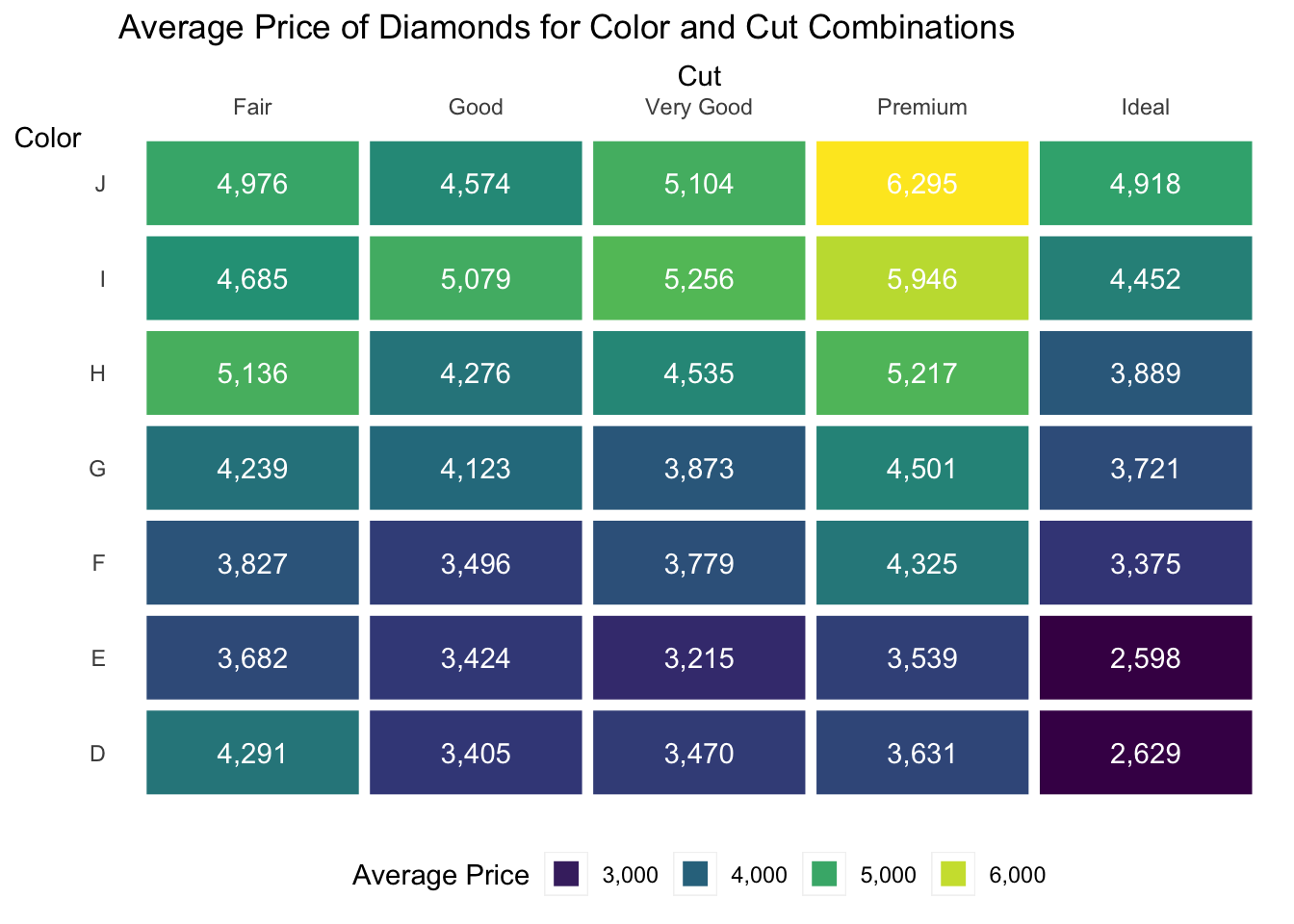
Let’s start with a few changes:
- Add some lines to delineate the different tiles
- Remove the tick marks
- Remove the background
- Move the x-axis labels to the top
- Move the legend to the bottom (frankly, because there are now numerical annotations, the color scale isn’t really necessary, but we’ll leave it for visual interest)
- Add some labels
diamonds_sub_agg %>%
  ggplot(
    aes(
      x = cut,
      y = color,
      fill = avg_price
    )
  ) +
  geom_tile(
    color = "white", size = 2 # make the lines between the tiles white, with a thickness of 2
  ) +
  geom_text(aes(label = scales::comma(avg_price)), color = "white") +
  scale_x_discrete( # modify the x-axis scale, in this case, the Cut
    position = "top" # move the x-axis labels to the top
    ) +
  scale_fill_viridis_c(labels = scales::comma) +
    # replace the continuous color scale with something that works both in color and in black and white.
    #This is good for printing and for color-blind readers
    # We're also adding commas to the color scale labels with the "labels = scales::comma" bit
  theme( # add elements to modify the theme
    axis.title.y = element_text(angle = 0), # rotate the y-axis title to be horizontal so a reader doesn't have to read sideways
    panel.grid = element_blank(), # remove all the grid lines, including the major and minor gird lines
    axis.ticks = element_blank(), # remove the tick marks
    panel.background = element_blank(), # remove the background
    legend.position = "bottom" # move the legend to the bottom
  ) +
  guides(
    fill = guide_legend(title = "Average Price") # change the legend title
  ) +
  labs(
    title = "Average Price of Diamonds for Color and Cut Combinations", # overall plot title
    x = "Cut",
    y = "Color"
  )
## Warning: Using `size` aesthetic for lines was deprecated in ggplot2 3.4.0.
## ℹ Please use `linewidth` instead.
## This warning is displayed once every 8 hours.
## Call `lifecycle::last_lifecycle_warnings()` to see where this warning was
## generated.

There you have it: a visually cleaned up heatmap displaying details about two categories and one numerical field. It’s fairly minimal, but very information-dense.