Overview #
Hexagonal binning (hexbins in short) is a way to communicate density of data with two numerical fields by using position and color gradients rather than just raw points.
Hexbin plots are a type of two-dimensional density plot. Alternative two-dimensional density plots include:
- Square density plots
- Contour plots
- Kernel density plots
Extension of histograms #
A lot of the thinking used to put together histograms applies here. Recall that a histogram is used to show density of one numerical variable. Hexbin plots just takes it up another dimension.
Similar to histograms, bins needs to be defined. A bin is the number of divisions that need to be made of the underlying dataset.
The fewer the bins, the larger the shapes. In the case of a histogram, fewer bins means fewer and wider bars. In the case of a hexbin plot, fewer bins means fewer and larger hexagons.
There’s a sweet spot to the number of bins in a histogram. Too few bins, and hexbin plots don’t show too much variation. Too many bins, and the broad strokes of the data get lost in the excess of detail.
When to use #
Hexbins are an excellent alternative to scatter plots when there are simply too many overlapping points and it’s hard to visually communicate how many points there are within a given space.
For instance, this is what a scatter plot of the diamonds dataset in R looks like:
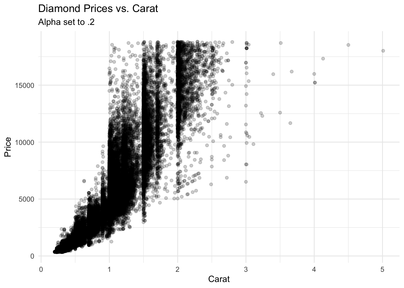 Even with transparency applied, there are certain sections on that scatter plot that look flat black. There’s no visual way to determine what sections of the plot have more or fewer points.
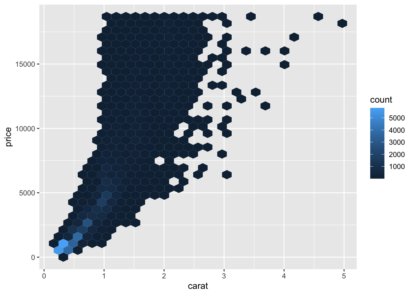
A hexbin can solve that density issue.
Data #
At a minimum, a hexbin requires two numerical fields in the data.
A hexbin is best used when there many records in the dataset. If there are very few records, then a simple scatter plot should suffice.
R #
There are number of different ways to generate hexbins in R.
For demonstration purposes, let’s use the diamonds dataset.
glimpse(diamonds)
## Rows: 53,940
## Columns: 10
## $ carat   <dbl> 0.23, 0.21, 0.23, 0.29, 0.31, 0.24, 0.24, 0.26, 0.22, 0.23, 0.…
## $ cut     <ord> Ideal, Premium, Good, Premium, Good, Very Good, Very Good, Ver…
## $ color   <ord> E, E, E, I, J, J, I, H, E, H, J, J, F, J, E, E, I, J, J, J, I,…
## $ clarity <ord> SI2, SI1, VS1, VS2, SI2, VVS2, VVS1, SI1, VS2, VS1, SI1, VS1, …
## $ depth   <dbl> 61.5, 59.8, 56.9, 62.4, 63.3, 62.8, 62.3, 61.9, 65.1, 59.4, 64…
## $ table   <dbl> 55, 61, 65, 58, 58, 57, 57, 55, 61, 61, 55, 56, 61, 54, 62, 58…
## $ price   <int> 326, 326, 327, 334, 335, 336, 336, 337, 337, 338, 339, 340, 34…
## $ x       <dbl> 3.95, 3.89, 4.05, 4.20, 4.34, 3.94, 3.95, 4.07, 3.87, 4.00, 4.…
## $ y       <dbl> 3.98, 3.84, 4.07, 4.23, 4.35, 3.96, 3.98, 4.11, 3.78, 4.05, 4.…
## $ z       <dbl> 2.43, 2.31, 2.31, 2.63, 2.75, 2.48, 2.47, 2.53, 2.49, 2.39, 2.…
geom_hex #
The most straightforward way to generate hexbin plot is by using the geom_hex() function in ggplot2.
# install.packages("ggplot2") # run this if the package hasn't already been installed
library(ggplot2)
Generate a basic hexbin plot.
diamonds %>%
  ggplot() +
  geom_hex(
    aes(
      x = carat,
      y = price
    )
  )

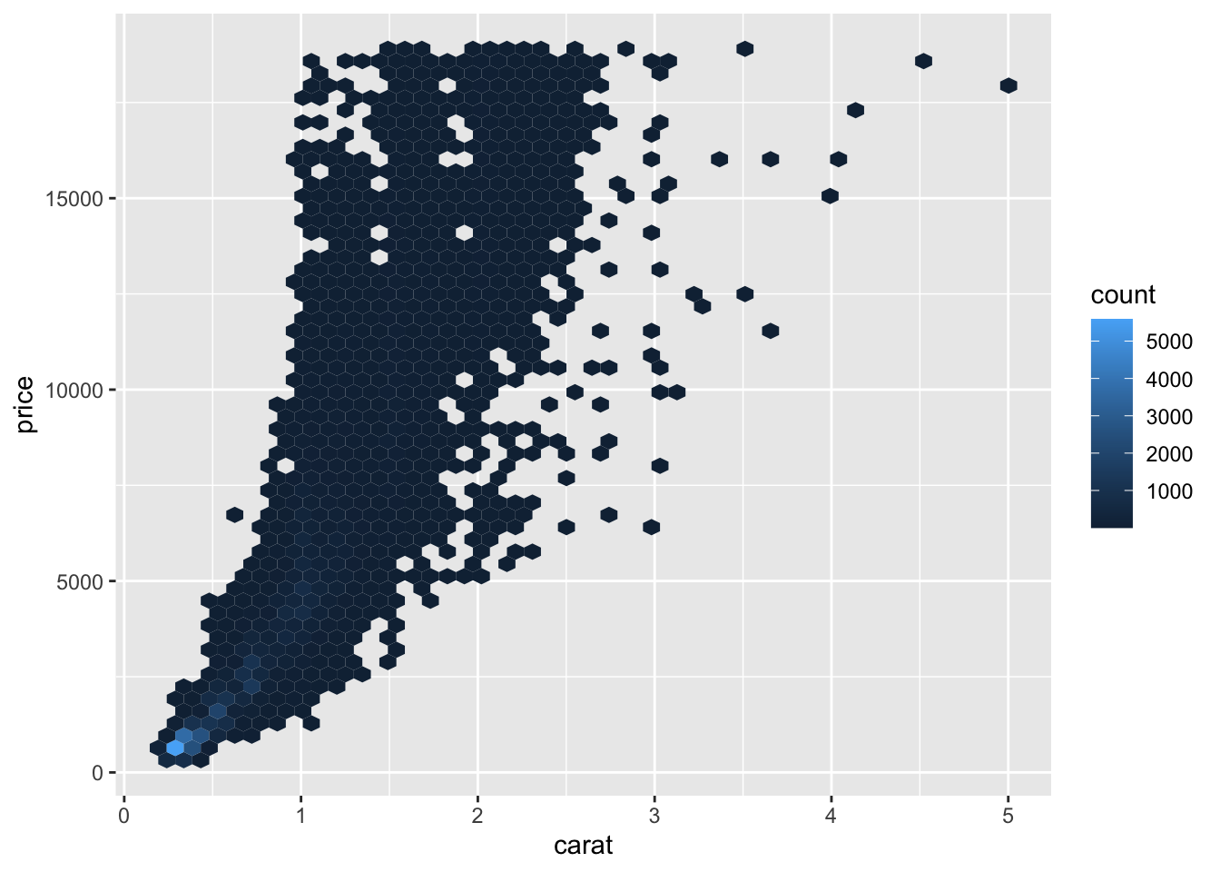
The default number of bins is 30. We’ll want to play with that some to get the right balance of detail to show through.
diamonds %>%
  ggplot() +
  geom_hex(
    aes(
      x = carat,
      y = price
    ),
    bins = 50
  )
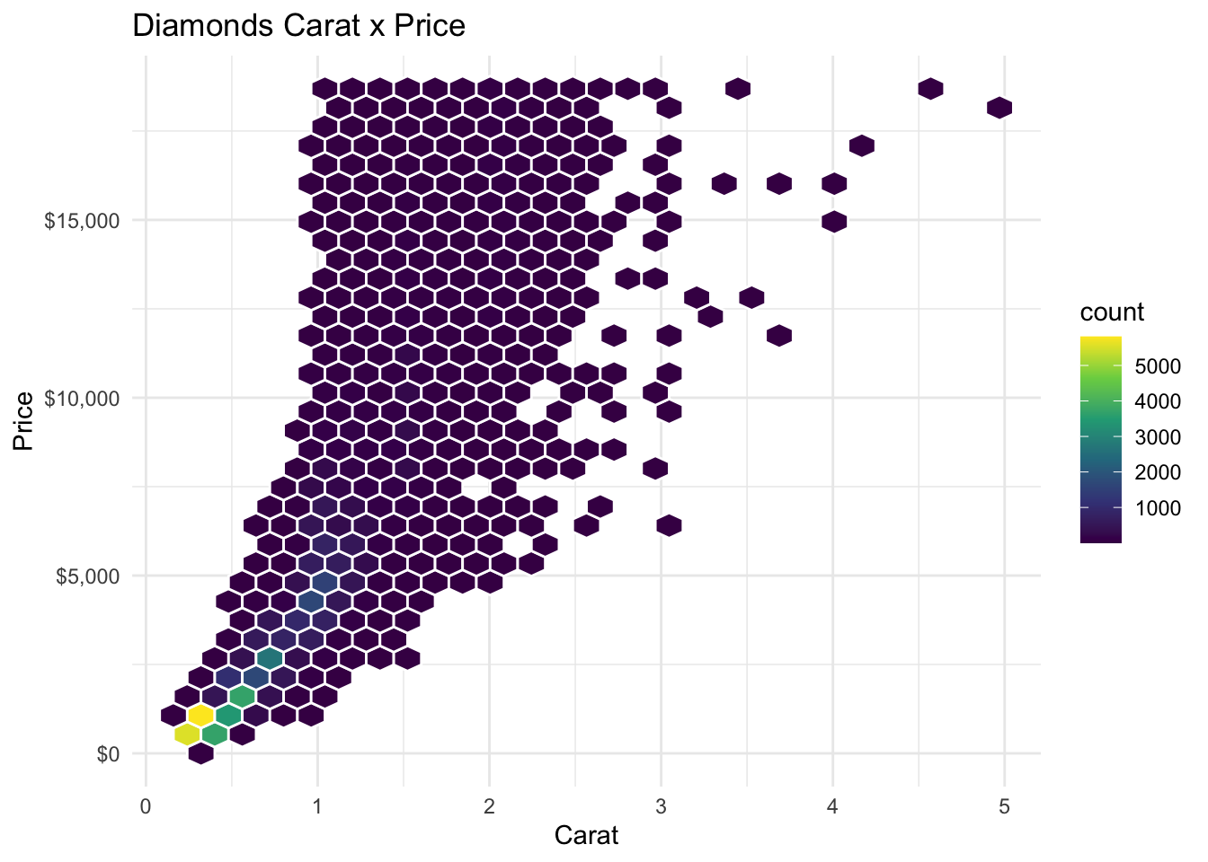
Let’s dress this up some by:
- Changing the color scale to viridis
- Adding a white outline to the hexagons
- Switching out the default theme
- Adding some labels
diamonds %>%
  ggplot() +
  geom_hex(
    aes(
      x = carat,
      y = price
    ),
    color = "white"
  ) +
  scale_fill_viridis_c() +
  theme_minimal() +
  scale_y_continuous(labels = scales::dollar_format(accuracy = 1L)) +
  labs( # add some times
    title = "Diamonds Carat x Price",
    x = "Carat",
    y = "Price"
  )
Hexbin #
Hexbin plots can also be generated using the hexbin package in R.
# install.packages("hexbin")
library(hexbin)
Let’s generate a hexbin using the price and the carat fields.
p <- hexbin(x = diamonds$carat, y = diamonds$price)

plot(p)
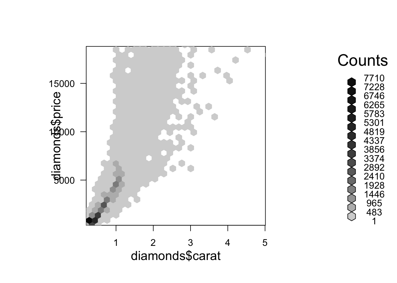
We can adjust the number of bins with the xbins parameter. By default, this is set to 30. The value of xbins determines how much chunks the range of x variable (diamonds$carat in our example) gets partitioned into. The larger the number, the smaller each hexagon.
Let’s bump the number of bins up to 40.
p <- hexbin(x = diamonds$carat, y = diamonds$price, xbins = 40)

plot(p)
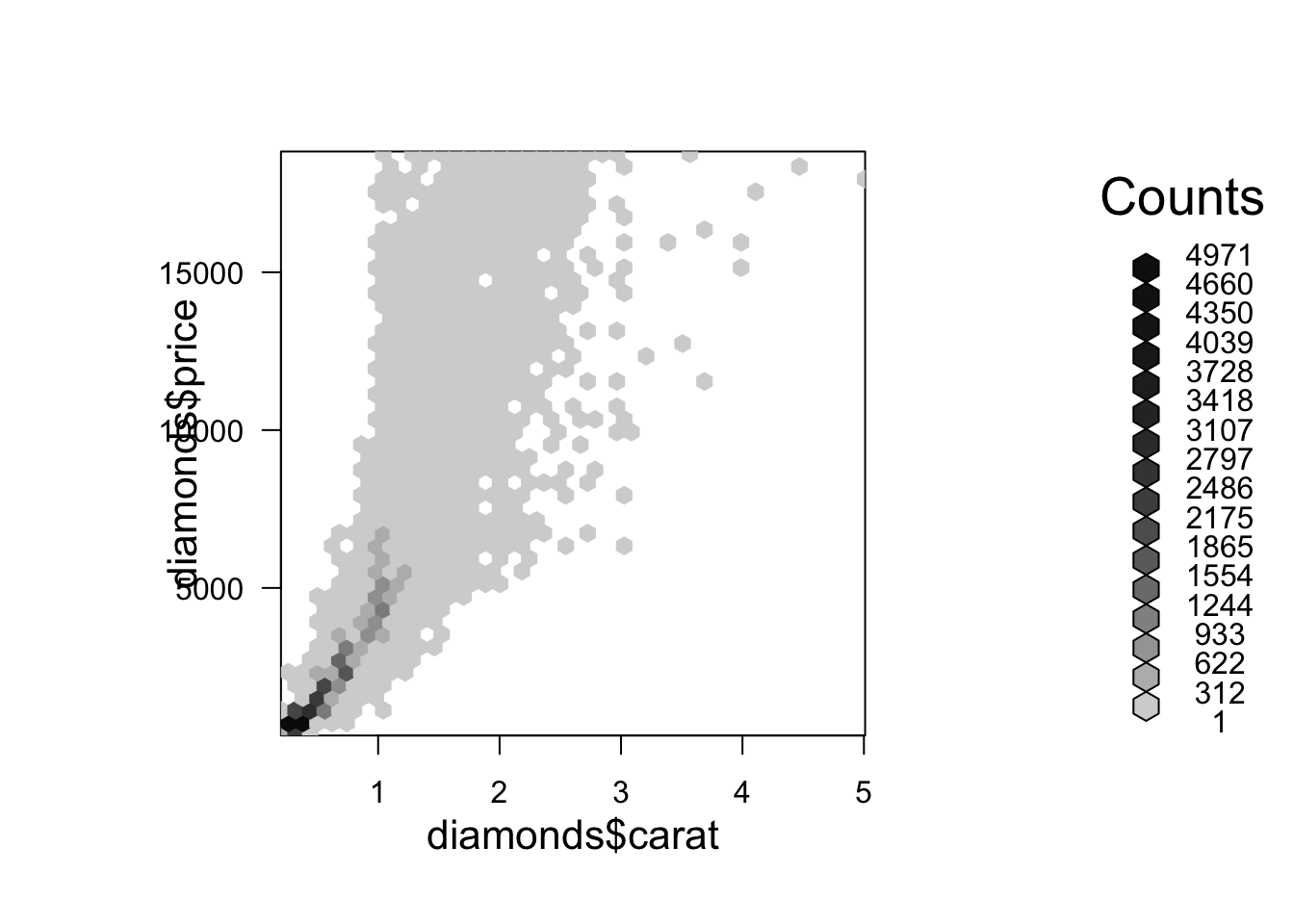
It does take some trial and error to get just the right number of bins.
In this case, the legend is so noisy that it’s not very useful. Let’s drop it.
p <- hexbin(x = diamonds$carat, y = diamonds$price, xbins = 40)

plot(p, legend=FALSE)
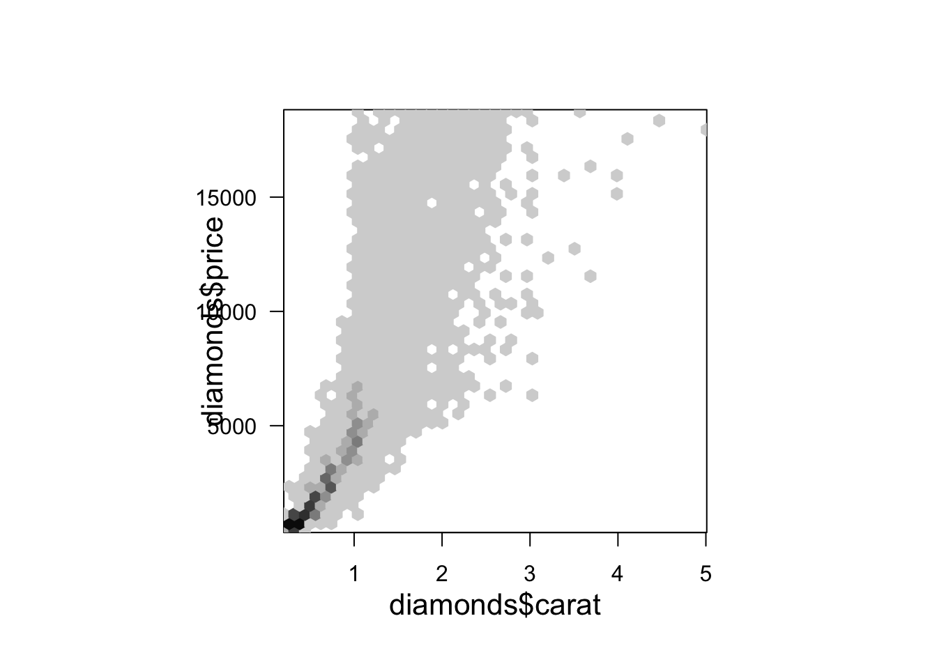
Let’s also throw in some borders around each hexagon.
p <- hexbin(x = diamonds$carat, y = diamonds$price, xbins = 40)

plot(p, legend=FALSE, border = 8)
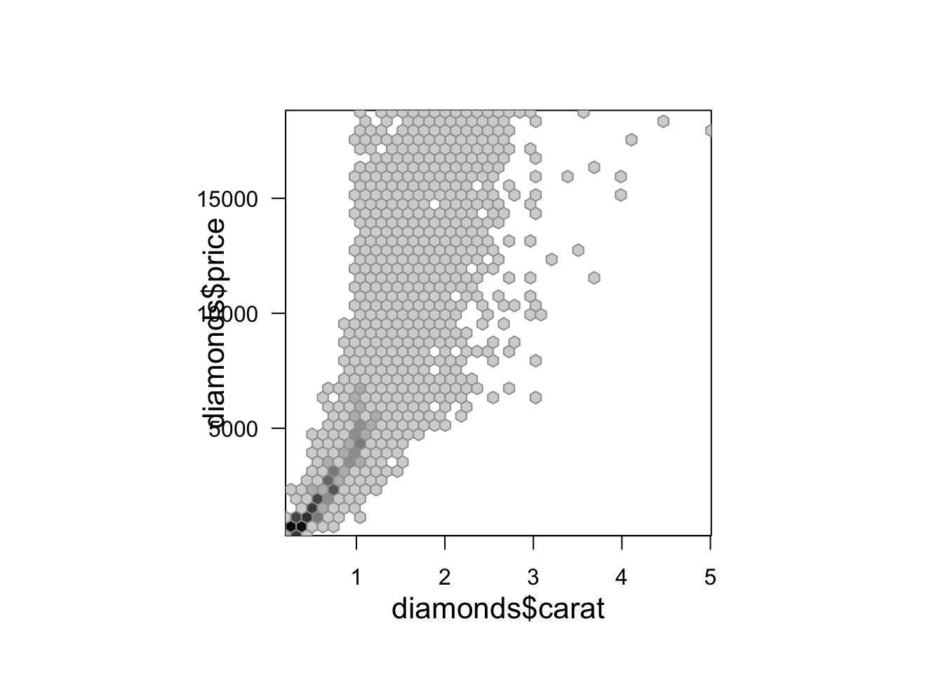
The black and white color scale is also kind of bland. We can change that up with a different color scale.
p <- hexbin(x = diamonds$carat, y = diamonds$price, xbins = 40)

plot(p, legend=FALSE, border = 8, colramp = colorRampPalette(hcl.colors(30)))
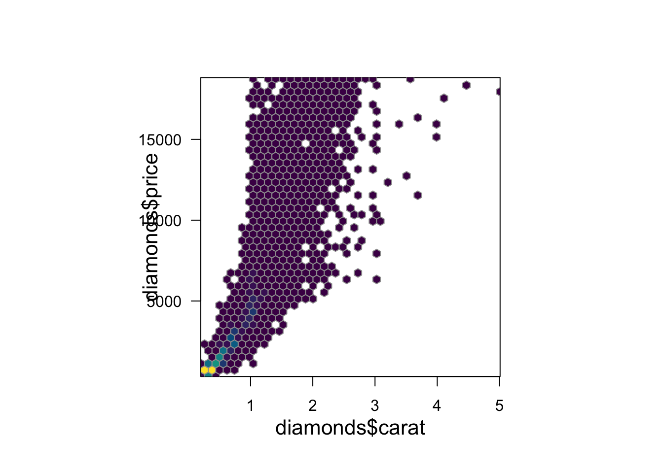
In this example we defined the color ramp palette (colorRampPalette()) by using the hcl.colors function in R to select 30 colors from the viridis color scheme.