Overview #
A histogram is a visualization that shows the spread of a numerical variable.
The way histograms are assembled is by taking a numerical variable, and chunking the data up into bins. Each bin reflects a count of the number of observations that fall within a range.
For example, if we have a super simple numerical variable made up of 1, 3, 5, 7, 11, 13, and we define two bins, where one bin includes everything from 0 to 10, and the other bin containing everything everything above 10 to 20, then the bin from 0 to 10 includes 4 observations, and the bin from above 10 to 20 includes two observations.
Visually, a histogram looks very much like a bar plot. Along the horizontal x-axis are the bins, and the height of the bars as reflected along the vertical y-axis shows how many observations appear within particular bins.
Bins #
The number of bins chosen is really up to the visualization designer.
In general, there should be enough bins to convey a sense of the spread of observations, but not so many that the sense of patterns is lost.
Data #
At a minimum, a histogram requires a single numerical variable.
Numerical simply means that the data should be made up of numbers.
R #
There are two common ways to display a histogram: by using the built in hist() function in base R, or by using ggplot2.
For these R examples, we’ll use the price field that comes along with the diamonds sample dataset that is included with ggplot2, which includes over 53,000 records.
##   [1]  326  326  327  334  335  336  336  337  337  338  339  340  342  344  345
##  [16]  345  348  351  351  351  351  352  353  353  353  354  355  357  357  357
##  [31]  402  402  402  402  402  402  402  402  403  403  403  403  403  403  403
##  [46]  403  403  403  404  404  404  404  404  404  404  405  405  405  405  405
##  [61]  552  552  552  552  552  553  553  553  553  553  553  554  554  554  554
##  [76]  554  554  554  554  554  554  554  554  554  554  554  554  554  554  554
##  [91] 2757 2757 2757 2759 2759 2759 2759 2759 2760 2760
Base R #
Base R includes a super simple (but pretty bland) way of rendering histograms.
hist(diamonds$price)

There we have it: with a single line of code made up of one function and one parameter, we have a histogram.
It can be further refined with many additional variables, including:
main– define the main title of the plotxlab– define the x-axis labelylab– define the y-axis label
For instance:
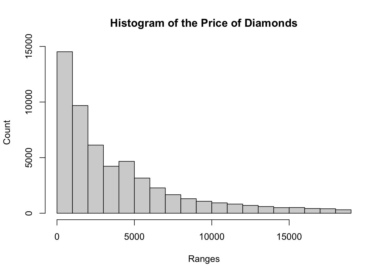
hist(
  diamonds$price,
  main = "Histogram of the Price of Diamonds",
  xlab = "Ranges",
  ylab = "Count"
  )

ggplot2 #
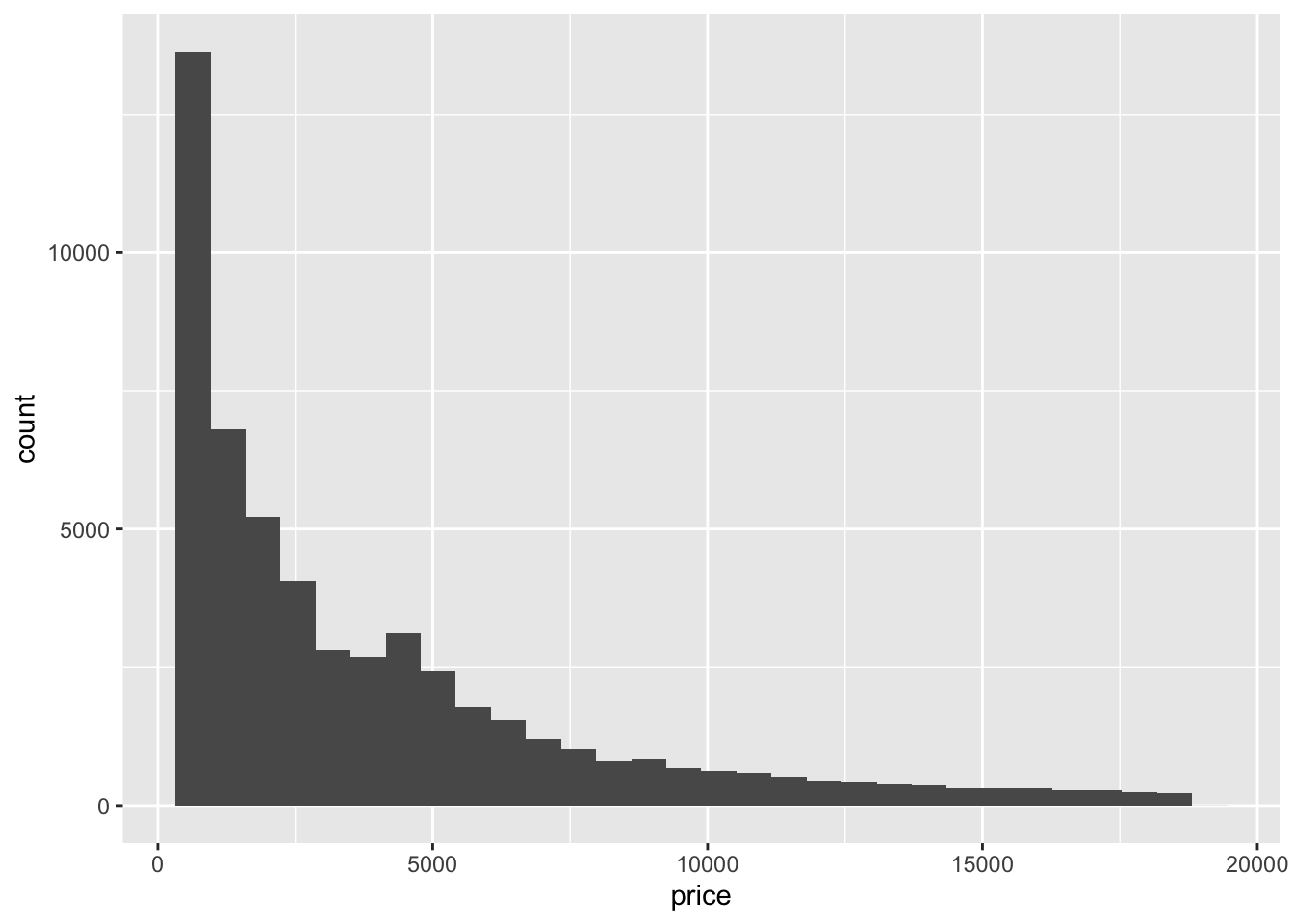
With the ggplot2 package, a histogram can be generated using the geom_histogram() function.
ggplot(data = diamonds) +
  geom_histogram(aes(x = price))
## `stat_bin()` using `bins = 30`. Pick better value with `binwidth`.

Note that until hist(), which expects a numerical vector, ggplot2 expects the incoming data to be a data frame. It’s the aesthetic mapping (aes()) that specifies which field to use to generate the histogram.
By default, geom_histogram() generates histograms with 30 bins. This might not be ideal.
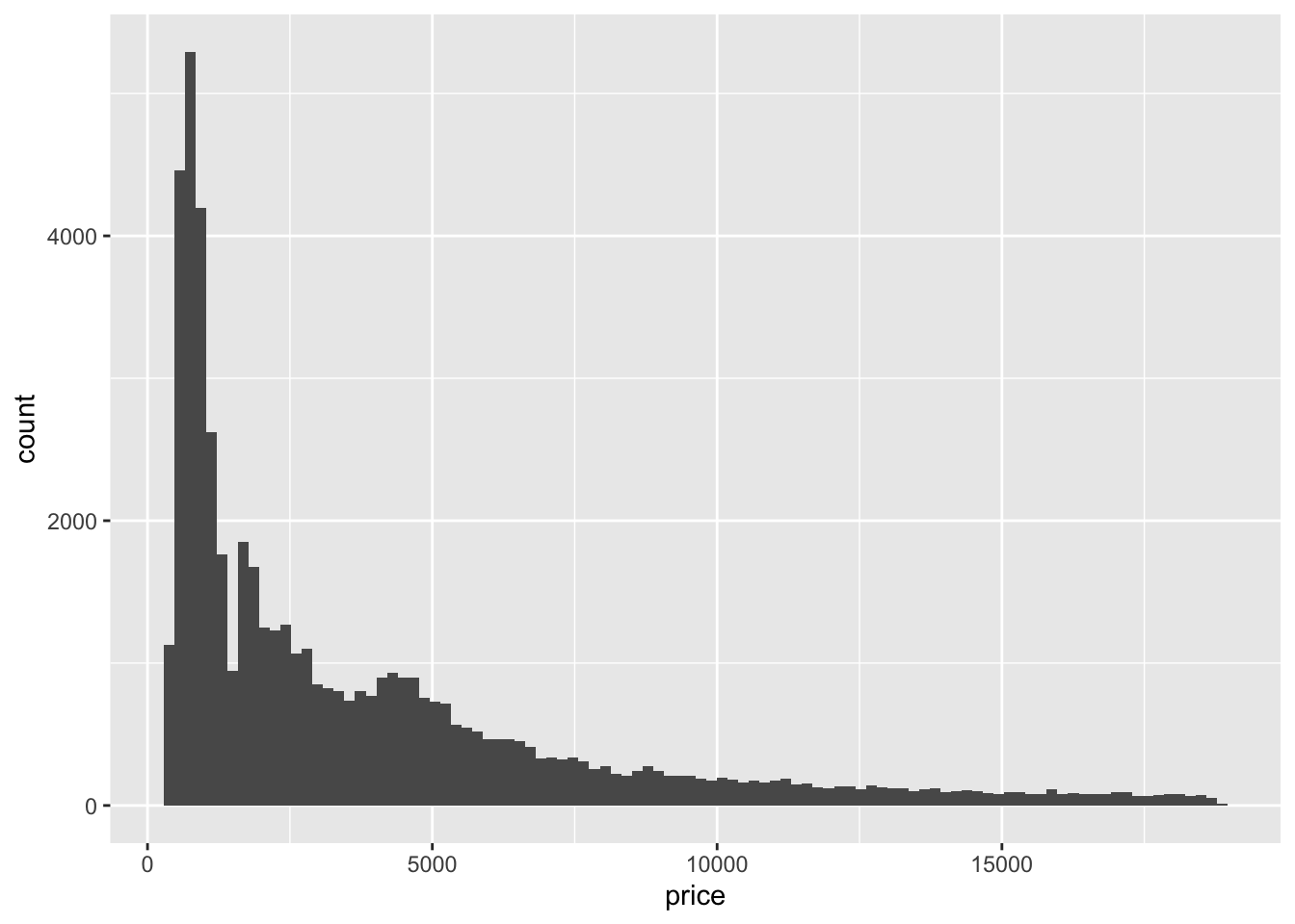
The number of bins can be explicitly specified with the bins parameter.
ggplot(data = diamonds) +
  geom_histogram(
    aes(x = price),
    bins = 100
  )

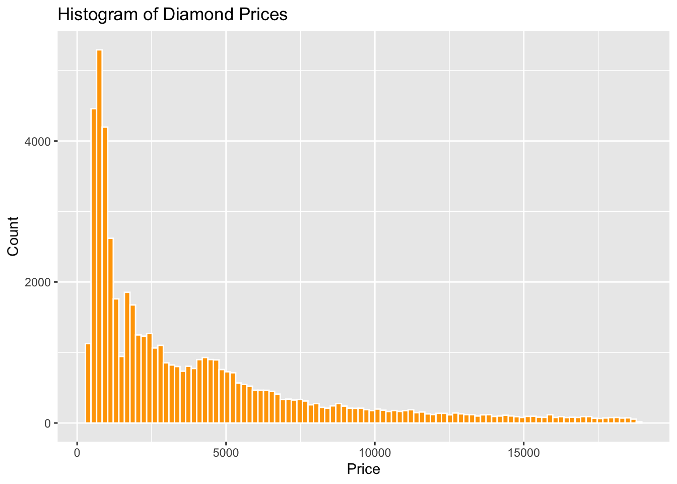
Let’s polish up the histogram some.
ggplot(data = diamonds) +
  geom_histogram(
    aes(x = price),
    bins = 100,
    color = "white", # define the color of the outline of each of the bars
    fill = "orange" # define the color fill for each bar
  ) +
  labs( # assign some labels
    title = "Histogram of Diamond Prices",
    x = "Price",
    y = "Count"
  )

With that, we now have a slightly more polished histogram.