Overview #
A line plot (or line graph, whichever you prefer) is a way to show how something changes as something else changes.
Visually, a line plot connects point to point with lines. In many instances, the points themselves are not shown prominently, and the plot itself relies more on conveying data through the sequence of lines.
Line plots are frequently used to show how some value changes over time.
Data #
Line plots require at a minimum two numerical fields:
- A numerical and sequential field for the horizontal x-axis.
- A numerical field for the vertical y-axis.
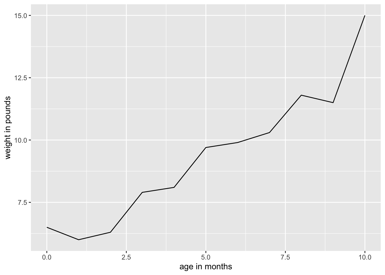
For example, a dataset suitable for a line chart might be something like a baby’s weight (expressed in pounds) over time (expressed in months).
R #
library(tidyverse)
Let’s make up a simple dataset for demonstration purposes using the tribble() function.
example_dat <- tribble(
  ~"age in months", ~"weight in pounds",
  0, 6.5,
  1, 6.0,
  2, 6.3,
  3, 7.9,
  4, 8.1,
  5, 9.7,
  6, 9.9,
  7, 10.3,
  8, 11.8,
  9, 11.5,
  10, 15.0

)

example_dat
## # A tibble: 11 × 2
##    `age in months` `weight in pounds`
##              <dbl>              <dbl>
##  1               0                6.5
##  2               1                6
##  3               2                6.3
##  4               3                7.9
##  5               4                8.1
##  6               5                9.7
##  7               6                9.9
##  8               7               10.3
##  9               8               11.8
## 10               9               11.5
## 11              10               15
With some data in hand, let’s create a simple line plot.
example_dat %>%
  ggplot() +
  geom_line(aes(x = `age in months`, y= `weight in pounds`))
