Overview #
Well, this one’s a fun one.
Parliament plots are a way to visualize the composition or votes of legislatures, with the shapes representing seats positioned in a manner reminiscent of the actual seating arrangements.
Those seats can be mapped to party or faction affiliations, or even voting alignments. Once mapped, associations can be reflected using such features as colors or shape types.
In terms of application, parliament plots are very similar to waffle plots.
In terms of implementation, parliaments plots are basically scatter plots with specifications of point positions.
Honestly, I don’t think I’ve seen the term “parliament plot” before until it was mentioned by the authors of the R ggparliament package, but it really is fairly intuitive.
Data #
At a minimum, parliament plot requires as input a dataframe that specifies associations – either by party or faction affiliation, or voting position – as well as a count of those associations.
For instance, the 4th United States Senate, which ran from 1795 to 1797, had a total of 32 seats. 21 of those seats were Federalists, and 11 were Republicans.
A dataframe for that particular Senate composition would look like this:
| Party | Seats |
|---|---|
| Federalists | 21 |
| Republicans | 11 |
R #
Parliament plots can be generated using the ggparliament package by Zoe Meers, Robert Hickman, and Thomas Leeper.
Their paper on the package can be found here in the Journal of Open Source Software.
First, load up the package.
# install.packages("ggparliament") # run this if you haven't already installed the package
library(ggparliament)
Then, we’ll grab some data.
fourth_congress
## # A tibble: 2 × 2
##   Party       Seats
##   <chr>       <dbl>
## 1 Federalists    21
## 2 Republicans    11
Once we have the data, we have to run it through the parliament_data() function for preparation prior to plotting. The essential parameters to specify include:
election_data– the source dataparl_rows– the number of rows in the legislatureparty_seats– the number of seats per partytype– the seating arrangement, selected fromhorseshoe,semicircle,circle,classroom, oropposing_benches.
Let’s prepare the data we’re working with.
prep_dat <- parliament_data(
  election_data = fourth_congress,
  parl_rows = 2, # this is fairly arbitrary
  party_seats = fourth_congress$Seats,
  type = "semicircle"
)

kable(head(prep_dat, n = 5))
| Party | Seats | x | y | row | theta | |
|---|---|---|---|---|---|---|
| 32 | Federalists | 21 | -2.0000000 | 0.0000000 | 2 | 3.141593 |
| 11 | Federalists | 21 | -1.0000000 | 0.0000000 | 1 | 3.141593 |
| 31 | Federalists | 21 | -1.9753767 | 0.3128689 | 2 | 2.984513 |
| 30 | Federalists | 21 | -1.9021130 | 0.6180340 | 2 | 2.827433 |
| 10 | Federalists | 21 | -0.9510565 | 0.3090170 | 1 | 2.827433 |
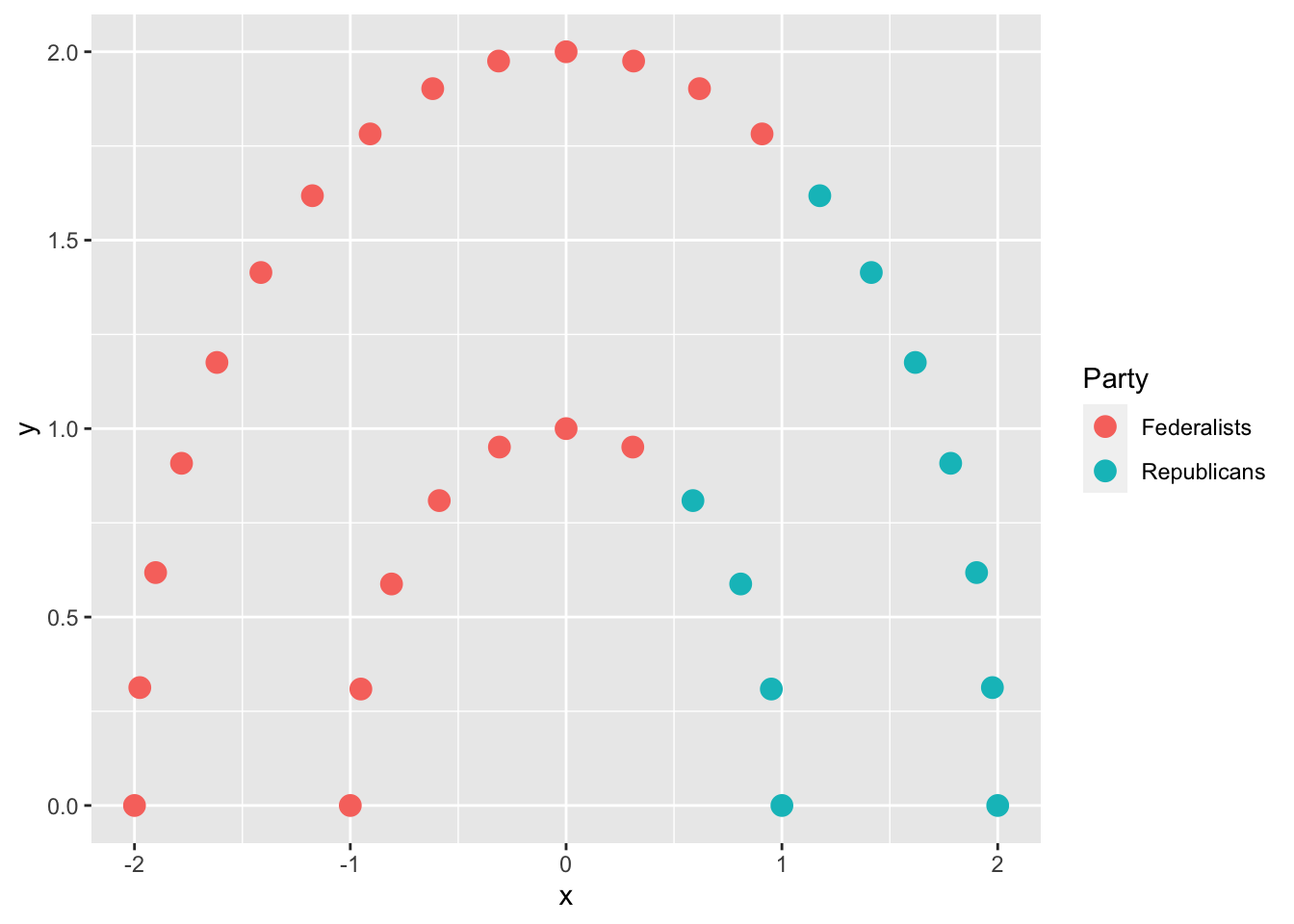
Note the introduction of x and y values that can be used to specify position.
Now that the data has been prepared, it’s a fairly straightforward ggplot2 plot.
prep_dat %>%
  ggplot(
    aes(
      x = x,
      y = y,
      color = Party
    )
  ) +
  geom_parliament_seats()

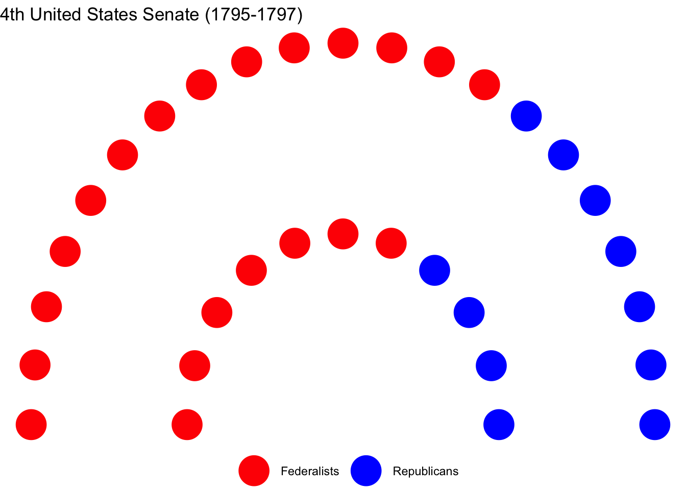
That’s pretty bland. We can certainly dress it up some.
prep_dat %>%
  ggplot(
    aes(
      x = x,
      y = y,
      color = Party
    )
  ) +
  geom_parliament_seats(size = 10) + # make the points bigger
  scale_color_manual(values = c("Red", "Blue")) + # specify colors
  theme_ggparliament() + # apply a simplified theme
  theme(
    legend.position = "bottom", # Move the legend to the bottom
    legend.title = element_blank() # Remove the legend title
  ) +
  labs(
    title = "4th United States Senate (1795-1797)"
  )

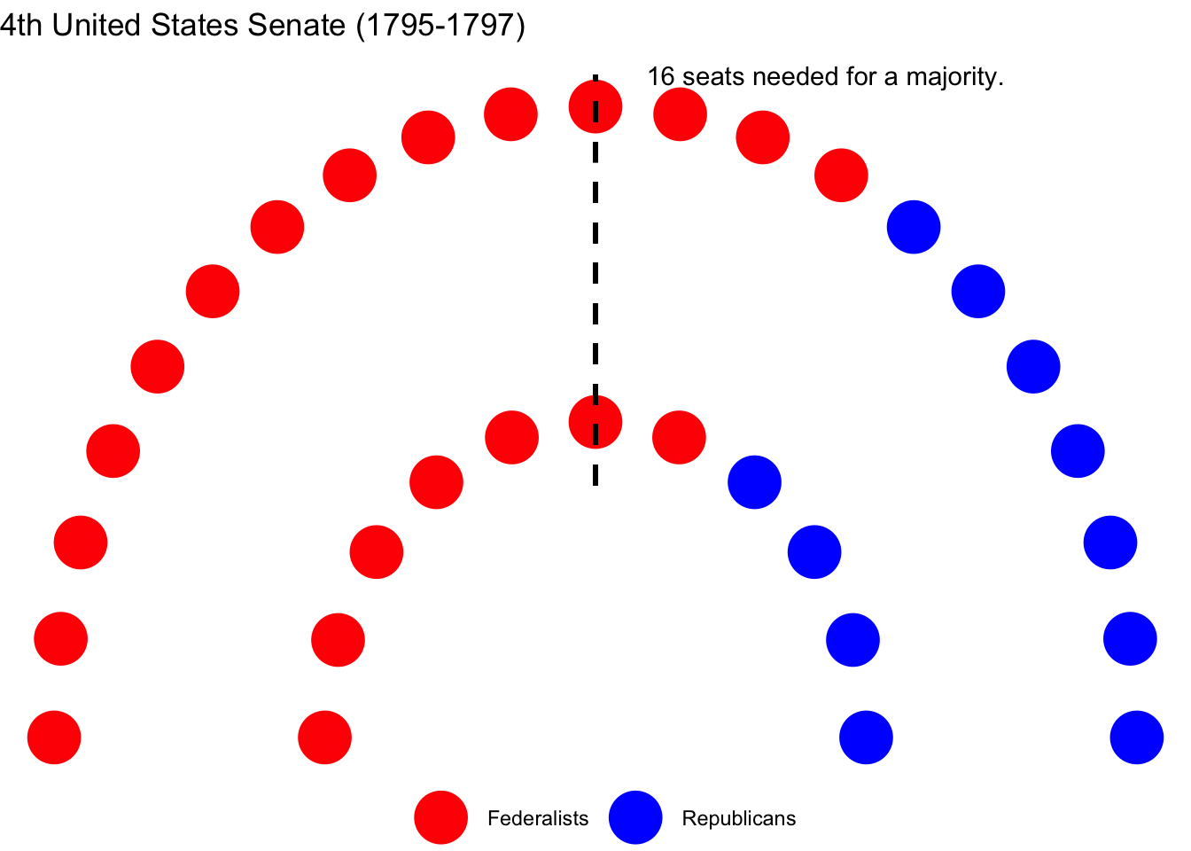
We can also throw in a line representing the majority threshold.
prep_dat %>%
  ggplot(
    aes(
      x = x,
      y = y,
      color = Party
    )
  ) +
  geom_parliament_seats(size = 10) + # make the points bigger
  draw_majoritythreshold(n = sum(fourth_congress$Seats)/2, type = "semicircle") +
  scale_color_manual(values = c("Red", "Blue")) + # specify colors
  theme_ggparliament() + # apply a simplified theme
  theme(
    legend.position = "bottom", # Move the legend to the bottom
    legend.title = element_blank() # Remove the legend title
  ) +
  labs(
    title = "4th United States Senate (1795-1797)"
  )
