Overview #
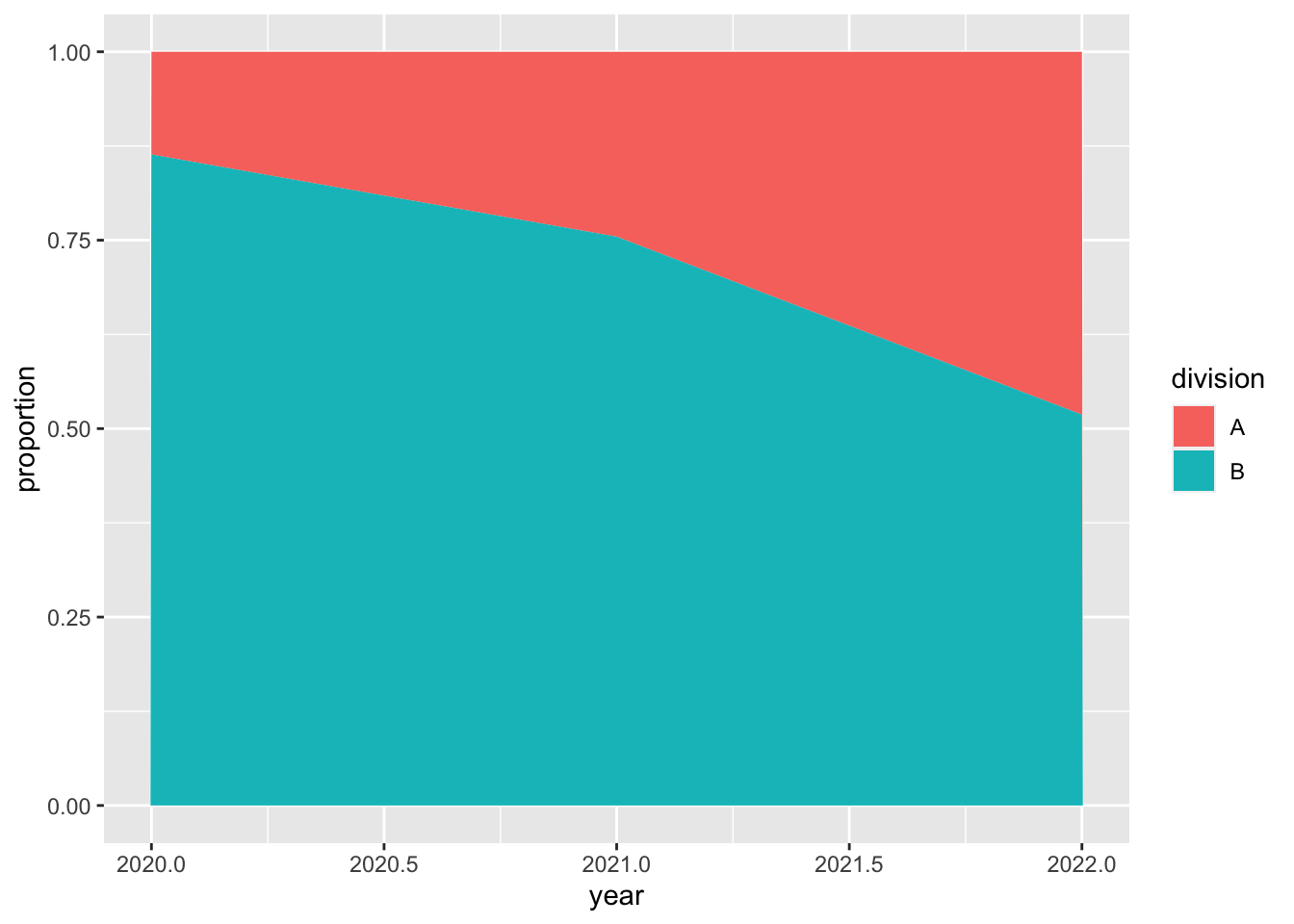
A proportional stacked area plot is used to show the proportion of a whole that different groups represent along different phases.

The whole measures out to 100% (or numerically, 1.0).
When to use #
A proportional stacked area plot is ideal for showing proportions.
By itself, it’s not great if what you want to do is communicate actual counts or values.
Data #
Similar to a stacked area plot, a proportional area plot starts with at least three fields of data:
- A numerical or categorical field that is constantly increasing or somehow ordered. This will serve as the axis along which the other numerical field changes. This is often a time measure.
- A numerical field that maps to the other axis and represents what is being measured in the visual.
- A categorical field that identifies the groups.
This data then needs to be transformed into proportional values along each value of the ordered numerical or categorical field (e.g., time dimension).
R #
The simplest way to generate a stacked area plot is with the ggplot2 package.
# install.packages("ggplot2")
library(ggplot2)
Let’s load up some example data. In this case, let’s look at the net income of the different divisions within a Company X over the years.
example <- tribble(
  ~year, ~net_income, ~division,
  2020,2050,"A",
  2020,13000, "B",
  2021,4000, "A",
  2021, 12300, "B",
  2022,13000, "A",
  2022,14000, "B"
)

kable(example)
| year | net_income | division |
|---|---|---|
| 2020 | 2050 | A |
| 2020 | 13000 | B |
| 2021 | 4000 | A |
| 2021 | 12300 | B |
| 2022 | 13000 | A |
| 2022 | 14000 | B |
We have the net_income represented in absolute values. For a proportional stacked area plot, we need to transform that into proportions.
example_prop <- example %>%
  group_by(year) %>%
  mutate(
    year_tot = sum(net_income),
    proportion = net_income / year_tot
    ) %>%
  ungroup()

kable(example_prop)
| year | net_income | division | year_tot | proportion |
|---|---|---|---|---|
| 2020 | 2050 | A | 15050 | 0.1362126 |
| 2020 | 13000 | B | 15050 | 0.8637874 |
| 2021 | 4000 | A | 16300 | 0.2453988 |
| 2021 | 12300 | B | 16300 | 0.7546012 |
| 2022 | 13000 | A | 27000 | 0.4814815 |
| 2022 | 14000 | B | 27000 | 0.5185185 |
Now that the data has been properly transformed, let’s generate a proportional stacked area plot.
example_prop %>%
  ggplot() +
  geom_area(
    aes(
      x = year,
      y = proportion,
      fill = division
    )
  )

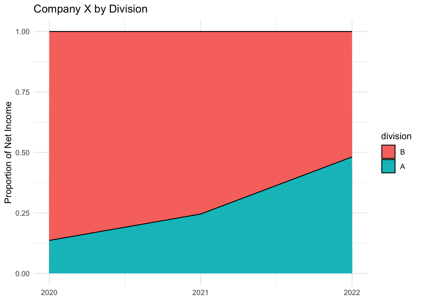
Let’s clean up a few things, including:
- Better labels
- Make the years whole years
- Move Division A to the bottom
- A different theme
- Line dividing the areas
Now that the data has been properly transformed, let’s generate a proportional stacked area plot.
example_prop %>%
  mutate(divsion = as.factor(division)) %>%
  mutate(division = factor(division, levels = c("B", "A"))) %>%
  ggplot() +
  geom_area(
    aes(
      x = year,
      y = proportion,
      fill = division
    ),
    color = "black"
  ) +
  scale_x_continuous(breaks = seq(2020,2022,1)) +
  theme_minimal() +
  labs(
    title = "Company X by Division",
    x = NULL,
    y = "Proportion of Net Income"
  )

Success! A simple proportional stacked area plot.