Overview #
A proportional stacked bar plot is used to show the relative composition of a group using bars.
The different sections of the bars correspond to the relative proportion of the distinct observations within the groups.

A proportional stacked bar plot is analogous to a proportional stacked area plot.
When to use #
Use a proportional stacked area plot when your goal is to communicate the proportions of different groups.
Proportional stacked area plots should not be used to make absolute value comparisons between groups.
If the question you’re trying to address is something like, “Is there more A in Group 1 or in Group 2?”, then a proportional stacked bar plot is not the right choice.
If however the question is, “Does Group 1 or Group 2 have a larger proportion of observation A by group?”, then a proportional stacked bar plot might be what you’re looking for.
Data #
To assemble a stacked bar plot, the data must include:
- A numerical measure
- A categorical value that identifies the observation
- A categorical value that identifies the group
Here’s an example of what that data might look like:
| measure | observation | group |
|---|---|---|
| 10 | A | Group 1 |
| 15 | B | Group 1 |
| 7 | A | Group 2 |
| 12 | B | Group 2 |
The observation value is used to partition the bars, while the group value is used to identify each bar.
When it comes down to assembling a proportional stacked bar plot, the measures are summed by group first, then the proportions are calculated as \(\frac{measure}{sum of measure by group}\).
R #
A grouped bar plot can be put together in R using the ggplot2 package.
Let’s recreate the example data from above.
example <- tribble(
  ~measure, ~observation, ~group,
  10, "A", "Group 1",
  15, "B", "Group 1",
  7, "A", "Group 2",
  12, "B", "Group 2"
)

example
## # A tibble: 4 × 3
##   measure observation group
##     <dbl> <chr>       <chr>
## 1      10 A           Group 1
## 2      15 B           Group 1
## 3       7 A           Group 2
## 4      12 B           Group 2
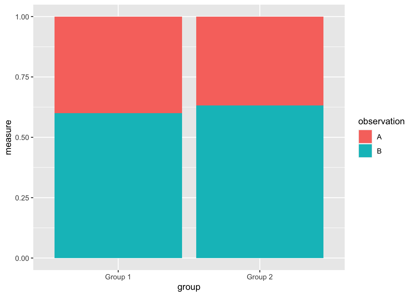
Now let’s pass that to ggplot2.
example %>%
  ggplot() +
  geom_bar(stat = "identity", position = "fill", aes(x = group, y = measure, fill = observation))

The position = "fill" is what distinguishes a stacked bar plot from other types of bar plots.
Note that in this particular plot, the height of the bars is mapped to the measure with y = measure.
The distinct groups are mapped to the different groupings with x = group.
The different observations with the groups are identified with a fill color, fill = observation.
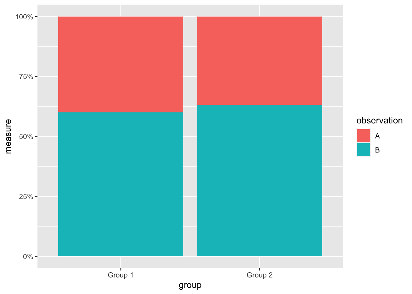
For a proportional stacked bar plot, it’s often aesthetically preferable to change the proportion value from decimals to percentages.
example %>%
  ggplot() +
  geom_bar(stat = "identity", position = "fill", aes(x = group, y = measure, fill = observation)) +
  scale_y_continuous(labels = scales::percent) # change the y-axis labels to percentages

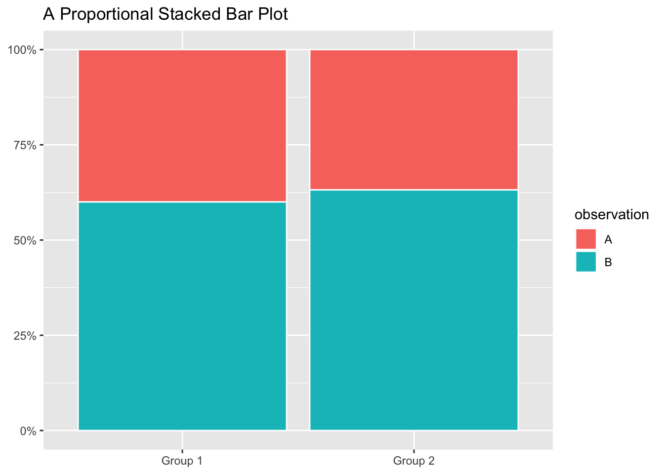
Let’s polish this up a tiny bit.
example %>%
  ggplot() +
  geom_bar(stat = "identity", position = "fill", aes(x = group, y = measure, fill = observation), color = "white") + # add a white outline
  scale_y_continuous(labels = scales::percent) +
  labs(
    title = "A Proportional Stacked Bar Plot",
    x = NULL, # remove axis title
    y = NULL # remove axis title
  )
