Overview #
A pyramid plot is a variation of a divergent bar plot where the same types of observations appear across the two classes.

“Pyramid plot” sounds a bit nefarious, sort of like a “pyramid scheme”, but there’s really nothing awful about it. In fact, it’s pretty awesome as a visual.
When to use #
Use a pyramid plot when you want to keep the same types of observations that appear across different classes very close together. This sort of arrangement is helpful for visual comparisons.
Data #
Really pay attention to the data – the data is what distinguishes pyramid plots from conventional divergent bar plots.
The data should include a numerical value and two categorical values. One of those categorical values identifies the observations, and the other identifies the class.
A simple example:
| observation | measure | class |
|---|---|---|
| A | 10 | class1 |
| B | 3 | class1 |
| C | 2 | class1 |
| A | 7 | class2 |
| B | 3 | class2 |
| C | 12 | class2 |
Note that the same set of observations appears across the two classes.
A less abstract and more real example might have the observations be something like nationality, measure be average income, and class be gender (male or female).
For demonstration purposes, I’ll stick to abstract values for now just so we don’t get bogged down in details.
R #
I usually put together pyramid plots in R using ggplot2.
library(tidyverse) # this includes ggplot2, along with other data manipulation tools
Let’s use the example data from above.
example
## # A tibble: 6 × 3
##   observation measure class
##   <chr>         <dbl> <chr>
## 1 A                10 class1
## 2 B                 3 class1
## 3 C                 2 class1
## 4 A                 7 class2
## 5 B                 3 class2
## 6 C                12 class2
We’ll first drop this into a regular bar plot.
example %>%
  ggplot() +
  geom_bar(
    stat = "identity",
    aes(
      x = observation,
      y = measure,
      fill = class
    )
  )

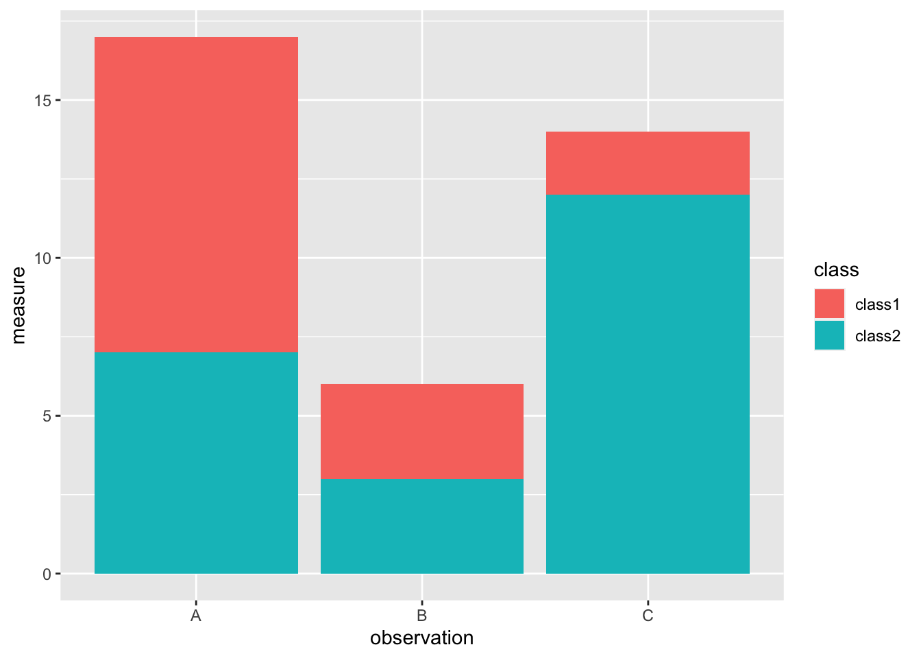
Well, that turned into a stacked bar plot, which isn’t what we’re trying to make here.
We need to manipulate the data some first to force divergence.
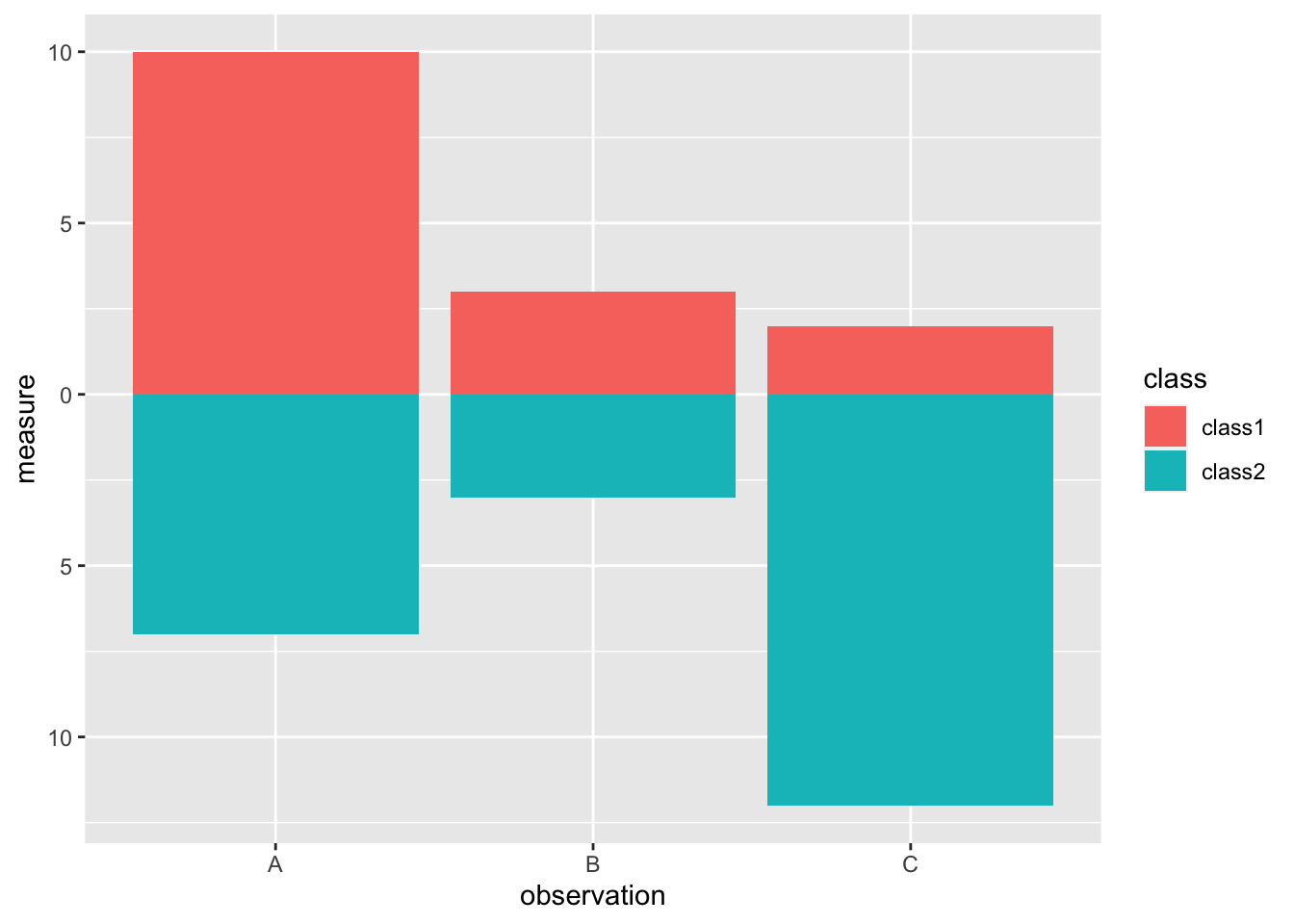
I’ll set class2 to negative initially.
example %>%
  mutate(measure = ifelse(class == "class2", -1*measure, measure)) %>%
  ggplot() +
  geom_bar(
    stat = "identity",
    aes(
      x = observation,
      y = measure,
      fill = class
    )
  )

Assuming the measure is always something positive, having negative measures showing up on the plot is a bit nonsensical.
We can fix that by changing the labels to be absolute values.
example %>%
  mutate(measure = ifelse(class == "class2", -1*measure, measure)) %>%
  ggplot() +
  geom_bar(
    stat = "identity",
    aes(
      x = observation,
      y = measure,
      fill = class
    )
  ) +
  scale_y_continuous(labels = abs)

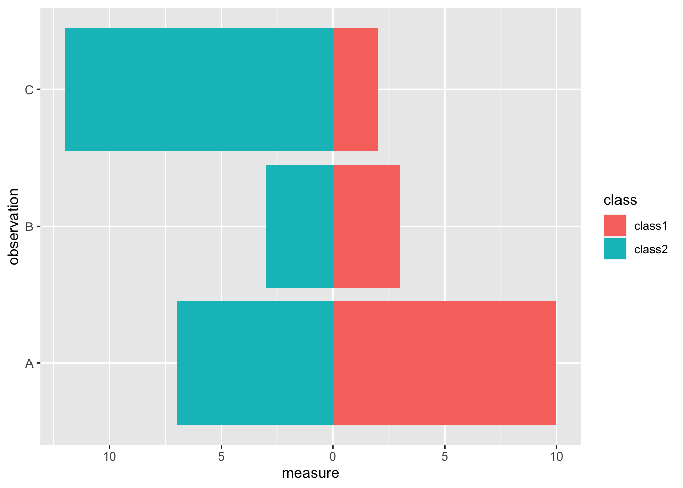
Conventionally, pyramid plots are made up of horizontal bars.
example %>%
  mutate(measure = ifelse(class == "class2", -1*measure, measure)) %>%
  ggplot() +
  geom_bar(
    stat = "identity",
    aes(
      x = observation,
      y = measure,
      fill = class
    )
  ) +
  scale_y_continuous(labels = abs) +
  coord_flip()

With that, we now have a basic pyramid plot.