Overview #
A ridgeline plot (previously referred to as as a “joyplot”) is a way to examine the distributions of a numerical variable for several different groups.
Ridgeline plots can present values in absolute terms (i.e., the heights of the ridges correspond to the actual values) or as densities (i.e., the heights of the ridges correspond to proportions within edge ridge component).
Ridgeline plots showing absolute values is sort of like a filled line plot. Ridgeline plots presenting densities is like a bunch of histograms.
Generally, I prefer using ridgeline plots to communicate densities. A ridgeline plot that communicates absolute values can be presented more simply as a line plot with multiple lines instead and would be cleaner.
Here, I’ll focus mainly on density ridgeline plots. This is a highly opinionated position.
Visually, a ridgeline plot looks like mountain ranges that slightly overlap one another.
When done correctly, ridgeline plots are both useful and visually appealing.
Joyplot no more #
Previously, ridgeline plots were referred to as “joyplots”. This seemed harmless enough, and as words alone, it certainly evokes a sense of positivity.
The term “joyplot” was meant to be an homage to the Joy Division band, which had put out an album called Unknown Pleasures. That album had a cover that looked quite a bit like these ridgelines that we’re talking about here.
Unfortunately, it turned out that there was a very, very dark and troubling origin to the band’s name, “Joy Division”.
For more details, check out this post by Claus Wilke, the original author of the ggjoy package that was subsequently replaced by the ggridges package.
Data #
A density ridgeline plot requires a numerical field and a categorical field if multiple groups are to be plotted concurrently on the same plot.
A bare minimum datatset that would be suitable for a density ridgeline plot might look something like this:
| numerical | group |
|---|---|
| 12 | A |
| 1 | A |
| 3 | A |
| 30 | B |
| 25 | B |
| 23 | B |
If there is only one group, you may as well just use a histogram to convey density.
R #
A ridgeline plot can be generated in R using the ggridges package. The ggridges package is built upon the ggplot2 package.
# ("ggridges") # run this if you haven't already installed the package
library(ggridges)
Let’s look at what ggridges can do using the example data from above.
example_dat
## # A tibble: 6 × 2
##   numerical group
##       <dbl> <chr>
## 1        12 A
## 2         1 A
## 3         3 A
## 4        30 B
## 5        25 B
## 6        23 B
That example data can be passed into a ridgeline plot.
ggplot(example_dat) +
  geom_density_ridges(
    aes(
      x = numerical,
      y = group
    )
  )
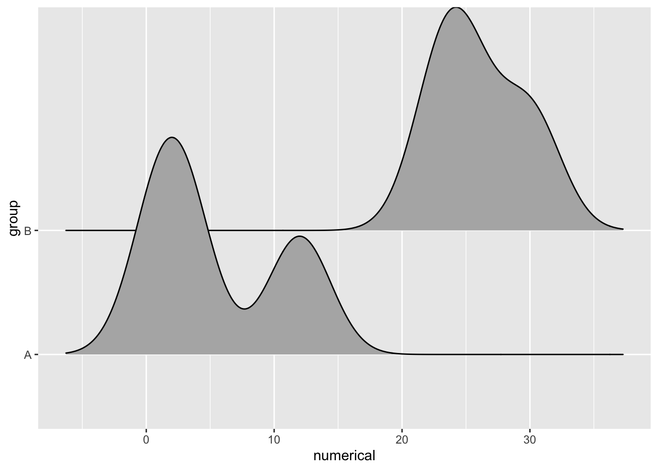
There’s also a geom_density_ridges2() function that uses closed polygons, or shapes with complete outlines, including on the bottom.
ggplot(example_dat) +
  geom_density_ridges2(
    aes(
      x = numerical,
      y = group
    )
  )
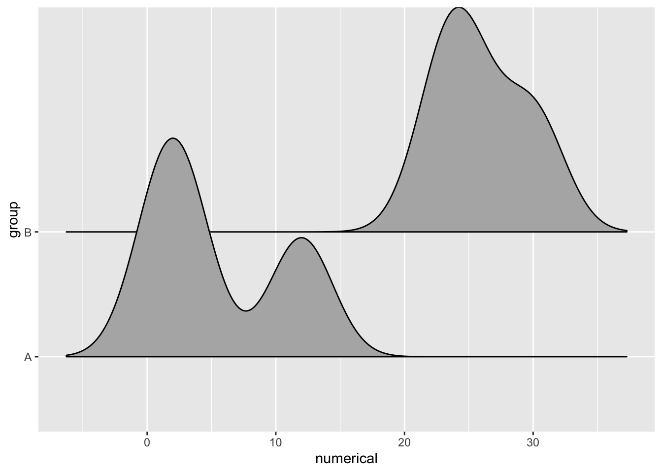
The long tails can also be trimmed for a cleaner look by using the rel_min_height parameter.
ggplot(example_dat) +
  geom_density_ridges2(
    aes(
      x = numerical,
      y = group
    ),
    rel_min_height = 0.01
  )
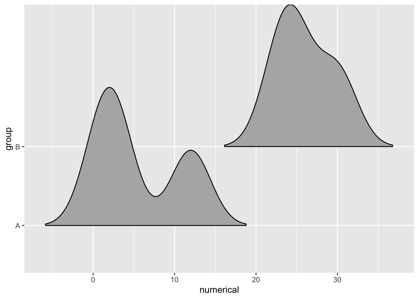
How much the ridges overlap can be adjusted using the scale parameter. A scale value of 1 means the ridges just barely make contact. Values less than 1 cause more separation between the ridges, and values greater than 1 cause more overlap.
ggplot(example_dat) +
  geom_density_ridges2(
    aes(
      x = numerical,
      y = group
    ),
    rel_min_height = 0.01
  )

ggplot(example_dat) +
  geom_density_ridges2(
    aes(
      x = numerical,
      y = group
    ),
    rel_min_height = 0.01,
    scale = 10
  )
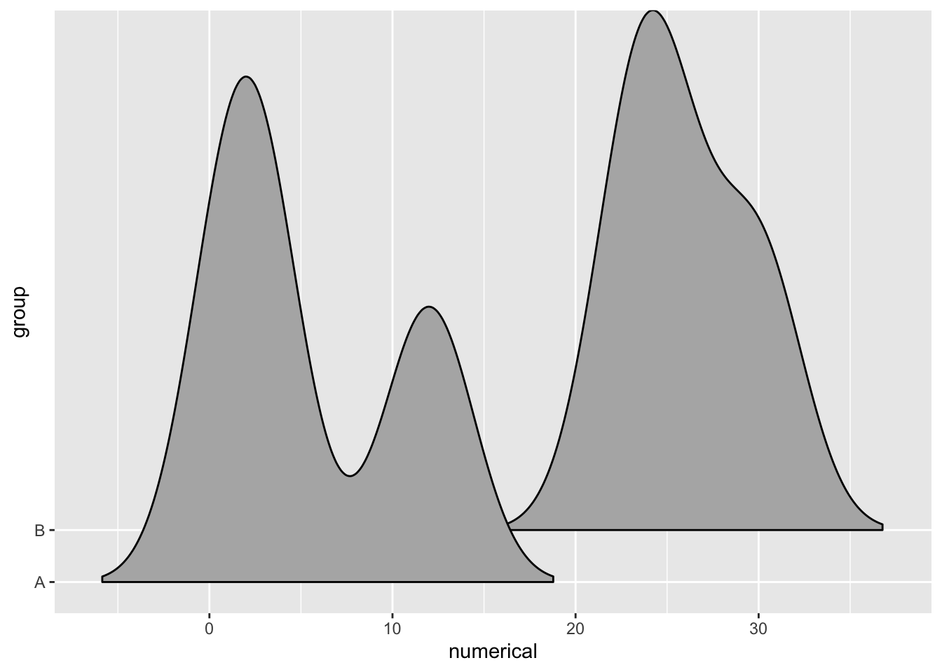
When there’s overlap, a little bit of transparency is often helpful.
ggplot(example_dat) +
  geom_density_ridges2(
    aes(
      x = numerical,
      y = group
    ),
    rel_min_height = 0.01,
    scale = 10,
    alpha = .5
  )
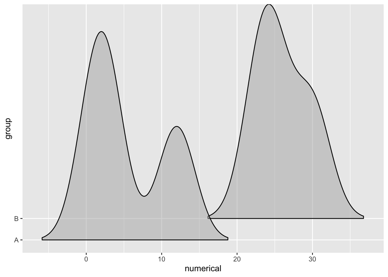 There’s also an option to show the original data points using a
 jittered_points parameter.
ggplot(example_dat) +
  geom_density_ridges2(
    aes(
      x = numerical,
      y = group
    ),
    rel_min_height = 0.01,
    scale = 10,
    alpha = .5,
    jittered_points = TRUE
  )

Or as a rug along the bottom with the addition of a few more parameters.
ggplot(example_dat) +
  geom_density_ridges2(
    aes(
      x = numerical,
      y = group
    ),
    rel_min_height = 0.01,
    scale = 10,
    alpha = .5,
    jittered_points = TRUE,
    position = position_points_jitter(width = 0.1, height = 0),
    point_shape = 'X', point_size = 5, point_alpha = .5
  )

This is a non-exhaustive coverage of what ggridges is capable of.
For more details on how to use the ridgeline plot, check out out the ggridges vignettes.