Overview #
A scatter plot is a simple way to present at least two numerical types of data together.
This sort of presentation is often useful to convey a sense of the relationship between two types of data.
R #
Let’s make a scatter plot in R with the ggplot2 package. We’ll also use tooling from tidyverse to manipulate the data.
library(tidyverse)
library(ggplot2) # a bit redundant, since this is included in tidyverse, but showing it explicitly here
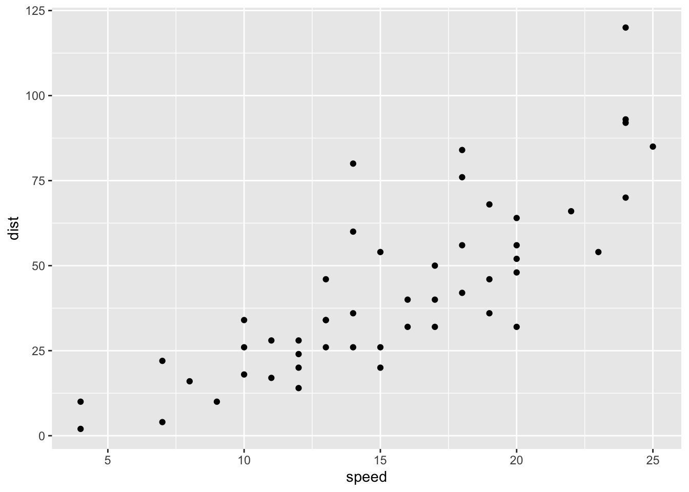
In this case, we’ll use the cars data set as an example. This data set presents the speed of 50 cars and the distance it took them to stop.
## Rows: 50
## Columns: 2
## $ speed <dbl> 4, 4, 7, 7, 8, 9, 10, 10, 10, 11, 11, 12, 12, 12, 12, 13, 13, 13…
## $ dist  <dbl> 2, 10, 4, 22, 16, 10, 18, 26, 34, 17, 28, 14, 20, 24, 28, 26, 34…
Normally, the independent variable – the data that affects something else – goes on the x-axis (or the horizontal axis), and the dependent variable – the data that gets affected – goes on the y-axis (or the vertical axis).
In this case, we can assume that speed affects the distance required for a car to stop. We’ll make a scatter plot then with the speed on the x-axis and the distance on the y-axis.
ggplot(
  data = cars,
  aes(
    x = speed,
    y = dist
    )
  ) +
  geom_point()
