Overview #
A slopegraph is a way to display change for particular observations across very few periods or categories.
A very common use case for a slopegraph is to show how a set of observations change from one period to the next, and no more.

Visually, a slopegraph looks like a line plot, with the ends connecting a starting point and an endining point.
The slope of the lines communicates the degree and the direction of change for a given observation. The steeper the slope, the bigger the change.
When to use #
Use a slope graph when the main intent is to quickly convey how something changed from a start to the finish.
Did something go up? Down? No change? If that’s the sort of question that you’re trying to address with a visual, a slopegraph is probably a good choice.
While a line plot can also be used to communicate change over some dimension like time, a line plot is comparatively busier.
Usually, a line plot communicates information for many periods, not just a few. When there’s too much information on the screen, it can dilute the core message.

A slopegraph shows less than a line graph, and as such, can communicate a message of change with much greater impact.
Design #
It’s usually a good idea to map some sort of identifier to the observations both at the start and at the finish. This might create redundancy, but it’s immensely helpful when there are many observations on the page.
The identifier can be such things as:
- Labels extending from the points
- Color for the points and lines
- Shapes for the points
Data #
The data should include a categorical field, which contains the observations to be tracked from one period to the next.
The data should also include at least two numerical fields, which track the state of an observation from one period to the next.
Here’s an example dataset, which follows three stocks and their stock prices at the start and the end of the year.
| stock | start | end |
|---|---|---|
| Acme | 40 | 50 |
| Booming Co | 20 | 22 |
| Crashing Inc | 80 | 30 |
Depending on the implementation, the shape of the data may have to be changed.
R #
Within R, a slopegraph can be generated with the newggslopegraph() function in the CGPfunctions package.
# install.packages("CGPfunctions") # run this if the package hasn't already been installed
library(CGPfunctions)
We’ll use the example dataset from before for a simple demonstration.
example_dat
## # A tibble: 3 × 3
##   stock        start   end
##   <chr>        <dbl> <dbl>
## 1 Acme            40    50
## 2 Booming Co      20    22
## 3 Crashing Inc    80    30
This isn’t precisely the format that newggslopegraph() requires the data to be in, so we’ll have to do some data manipulation.
There should be three fields: a period (or time) field, an observation field to that uniquely identifies what we’re talking about, and a measurement field.
We can use some tidyverse tooling to reshape the data appropriately.
reshape_dat <- example_dat %>%
  pivot_longer(
    !stock,
    names_to = "period",
    values_to = "price"
  )

reshape_dat
## # A tibble: 6 × 3
##   stock        period price
##   <chr>        <chr>  <dbl>
## 1 Acme         start     40
## 2 Acme         end       50
## 3 Booming Co   start     20
## 4 Booming Co   end       22
## 5 Crashing Inc start     80
## 6 Crashing Inc end       30
Let’s put it all together now into a slopegraph.
newggslopegraph(
  dataframe = reshape_dat, # specify the data
  Times = period, # pick the frame
  Measurement = price, # define what the measurement is
  Grouping = stock # identify the unique observations
)

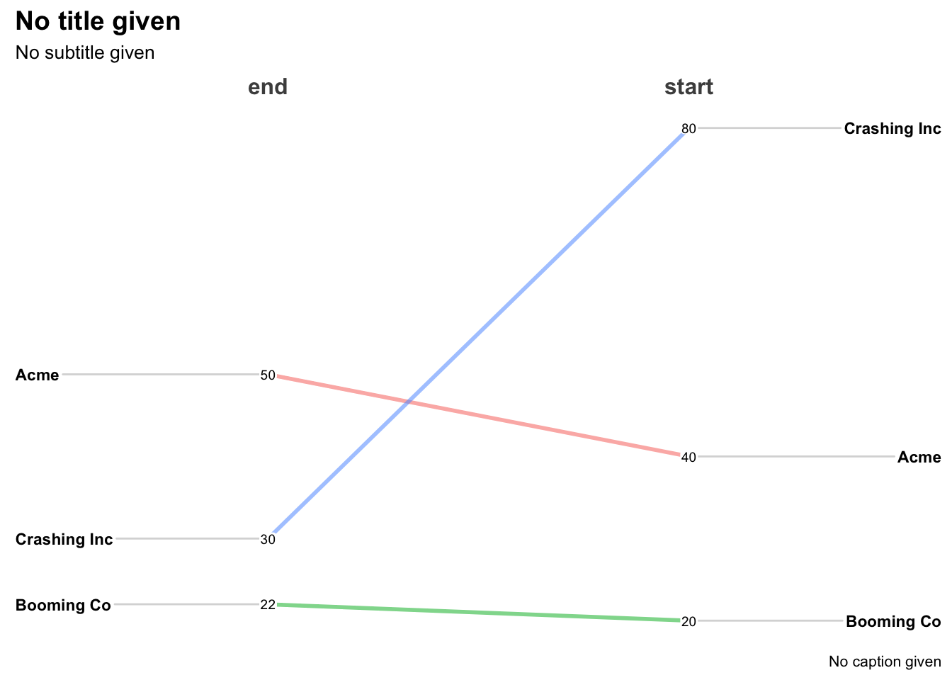
Great! We have a slopegraph.
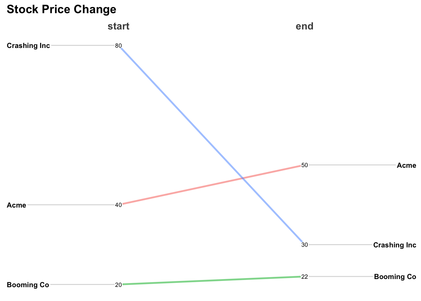
Not so great: we should have start on the left, and end on the right. And we should fill in some labels and remove others that we aren’t using.
reshape_dat %>%
  mutate(period = factor(period, levels = c("end", "start"))) %>% # manually define the factor order
  newggslopegraph(
    Times = period,
    Measurement = price,
    Grouping = stock,
    ReverseXAxis = TRUE,
    Title = "Stock Price Change",
    SubTitle = NULL,
    Caption = NULL
  )
