Overview #
A spine plot shows stacked bars with varying widths along two numerical variables – one on each of the vertical and horizontal axis.
The height of the bars correspond to the vertical axis, and the width of the bars correspond to the horizontal axis.
Each bar represents values for a particular group or category.
Visually, it looks like a stacked bar chart with bars of varying widths.

Functionally, spine plots bear some similarity to treemaps, but with added constraints where the shapes have to be contained within bars.
These plots are considered a form of mosaic plot.
When to use #
Spine plots are great when you have something that could suitably be displayed with a stacked bar plot, but you have one more value that you’d like to include in your visual.
Because there are multiple things moving at the same time, it might be tricky to use spine plots for precise comparisons.
Generally speaking, spine plots are probably less useful for comparison but are visually interesting and are best used only to convey a relative sense of scale.
Data #
Spine plots require:
- A numerical value to be mapped to the horizontal axis
- A numerical value to be mapped to the vertical axis
- A categorical value to be mapped to each bar
- An optional categorical value to be mapped to subsections of each bar
This part gets tricky – with a spine plot, the details of the necessary data can be presented in a number of different formats.
A very common format is to have a categorical field as a column, and numerical fields, where each numerical field is named after a group or category.
Here’s a mock data set:
| group | male | female |
|---|---|---|
| A | 10 | 20 |
| B | 25 | 25 |
| C | 5 | 40 |
Sometimes, the underlying data doesn’t neatly fit in the desired form. Data can be restructured as necessary to get it to work for visualization purposes.
R #
There are a few different ways to make spine plots within R, including:
- spineplot function within base R
- ggmosiac by Haley Jeppson, which builds upon the ggplot2 ecosystem of tools
Base R #
We’ll make a spine plot in base R using the example data from above.
The source data needs to be either a single variable or a two-way table.
Here’s how to recreate the example data above as a two-way table.
example_data <- matrix(c(10, 20, 25, 25, 5, 40), ncol = 2)

example_data
##      [,1] [,2]
## [1,]   10   25
## [2,]   20    5
## [3,]   25   40
Now we’ll rename the rows and columns.
rownames(example_data) <- c("A", "B", "C")
colnames(example_data) <- c("male", "female")

example_data
##   male female
## A   10     25
## B   20      5
## C   25     40
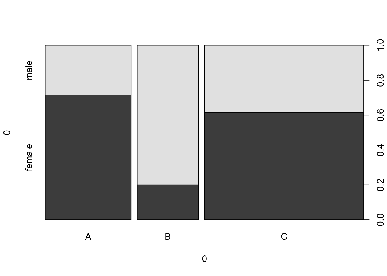
And we’ll just pass that right off to the spineplot() function.
spineplot(example_data)

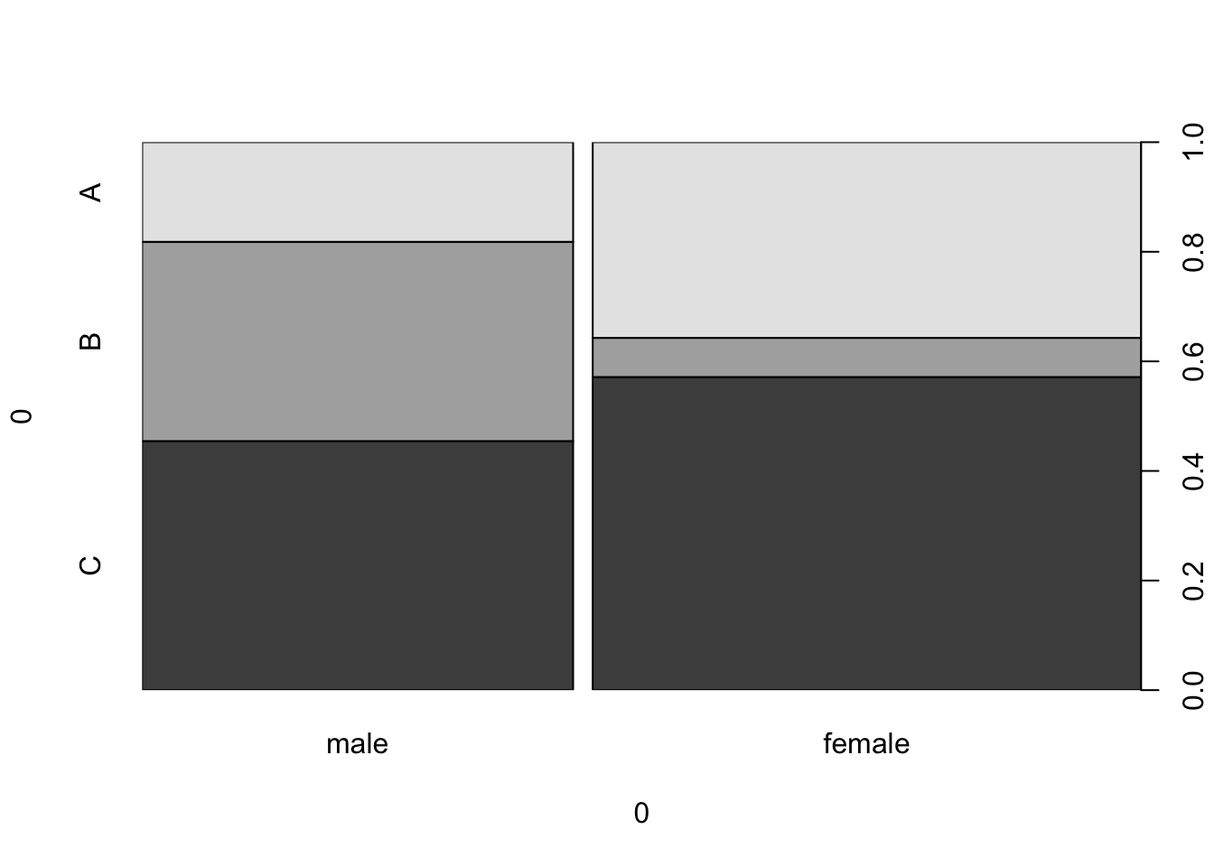
We can flip the categories around by transposing the data.
example_data_t <- t(example_data)

example_data_t
##         A  B  C
## male   10 20 25
## female 25  5 40
spineplot(example_data_t)
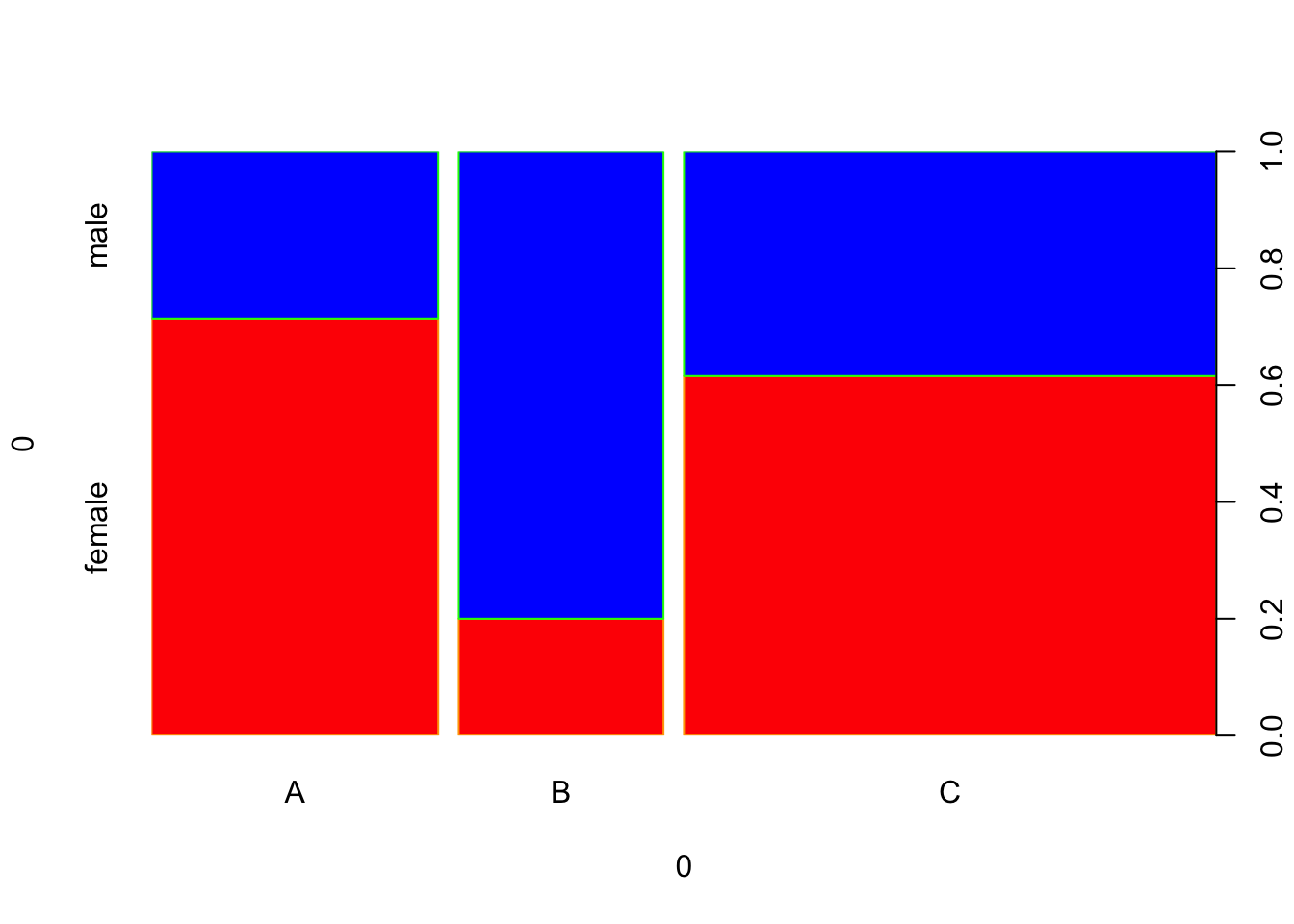
 We can further enhance the plot by changing some colors.
spineplot(example_data, col = c("red", "blue"), border = c("orange", "green"))

ggmosiac #
I find the built-in spineplot function extremely limiting, and favor using ggmosaic.
# install.packages("ggmosaic")
library(ggmosaic)
Oftentimes, it’s best to start with the raw, underlying data. That’s because the tooling within ggmosiac actually calculates the positions of each object that will go on the plot, based on the underlying data.
For instance, the titanic dataset looks like this:
glimpse(titanic)
## Rows: 2,201
## Columns: 4
## $ Class    <fct> 3rd, 3rd, 3rd, 3rd, 3rd, 3rd, 3rd, 3rd, 3rd, 3rd, 3rd, 3rd, 3…
## $ Sex      <fct> Male, Male, Male, Male, Male, Male, Male, Male, Male, Male, M…
## $ Age      <fct> Child, Child, Child, Child, Child, Child, Child, Child, Child…
## $ Survived <fct> No, No, No, No, No, No, No, No, No, No, No, No, No, No, No, N…
If we count by Age and Survived, it looks like this:
count(titanic, Age, Survived)
##     Age Survived    n
## 1 Child       No   52
## 2 Child      Yes   57
## 3 Adult       No 1438
## 4 Adult      Yes  654
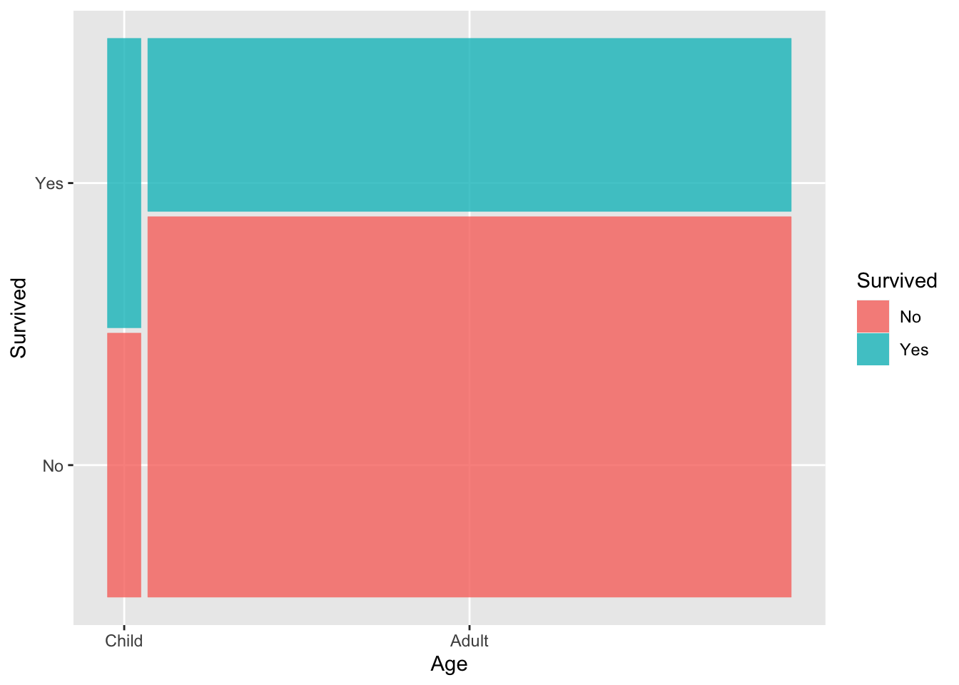
As a spine plot, that would look like this:
ggplot(titanic) +
  geom_mosaic(aes(x = product(Age), fill = Survived))

From this, we can see that most passengers were adults, and smaller proportion of adults survived as compared to the children.
The product function looks like something out of left-field, but it is a convenience function that helps get the raw data into the right shape by counting the values, which becomes the heights of the bars, and also determining the position and width of the bars.
From the ggmosiac vignette itself:
The product() function alludes to ggmosaic’s predecessor productplots and to the joint distribution as the product of the conditional and marginal distributions. product() creates a list of the variables…