Overview #
A stacked area plot is used to visualize how the values of a group of things change as another value changes.
The different groups are – as the name suggests – stacked on top of one another. The total height represents the sum of the different groups at different stages.

This is an extension of the simple area plot, which you can think of as a stacked area plot, but with just one group.
While we can think of a simple area plot as being functionally identical to a line plot, we cannot say that a stacked area plot is functionally identical to a line plot with multiple lines. That’s because a stacked area plot’s vertical positioning (heights) is summed up, while a line plot with multiple lines is overlapped.

There is an option to make area plots overlap, but I find that sort of a plot to be visually challenging to read and not very effective, so I tend to stay away from that.
When to use #
The stacked area plot is great to show both the value of the whole as well as the pieces that the whole is composed of.
Because the starting position of all the different areas other than the bottom-most area is different, it makes it difficult for readers to get a precise sense of the scale of the different groups.
Basically the value of each group on a stacked area chart is the difference between the top of the area and the bottom of the area.

The stacked area plot really only conveys sense of scale for each of the pieces and isn’t all that great for getting accurate comparisons between groups.
If your goal is to allow for precise comparisons of different groups along some value, then a better way to show that might be with a dodged bar plot or a line plot with multiple lines.

Data #
A stacked area plot requires at a minimum three fields:
- A numerical or categorical field that is constantly increasing or somehow ordered. This will serve as the axis along which the other numerical field changes. This is often a time measure.
- A numerical field that maps to the other axis and represents what is being measured in the visual.
- A categorical field that identifies the groups.
R #
The simplest way to generate a stacked area plot is with the ggplot2 package.
# install.packages("ggplot2")
library(ggplot2)
Let’s load up some example data. In this case, let’s look at the net income of the different divisions within a Company X over the years.
example <- tribble(
  ~year, ~net_income, ~division,
  2020,2050,"A",
  2020,13000, "B",
  2021,4000, "A",
  2021, 12300, "B",
  2022,13000, "A",
  2022,14000, "B"
)

kable(example)
| year | net_income | division |
|---|---|---|
| 2020 | 2050 | A |
| 2020 | 13000 | B |
| 2021 | 4000 | A |
| 2021 | 12300 | B |
| 2022 | 13000 | A |
| 2022 | 14000 | B |
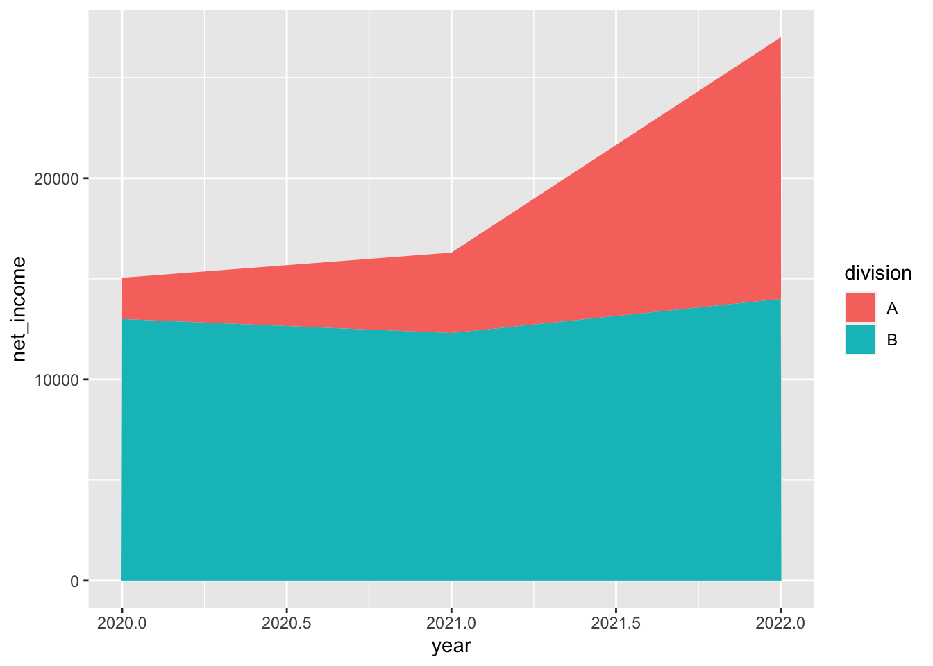
Now let’s produce a basic stacked area plot.
example %>%
  ggplot() +
  geom_area(
    aes(
      x = year,
      y = net_income,
      fill = division
    )
  )

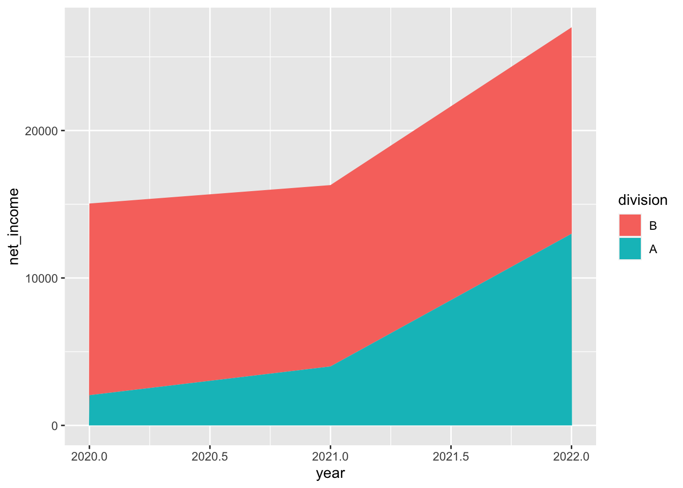
We can control the stacking order by manually defining the factor levels of the categories.
Let’s put Division A on the bottom.
example %>%
  mutate(division = factor(division, levels = c("B", "A"))) %>%
  ggplot() +
  geom_area(
    aes(
      x = year,
      y = net_income,
      fill = division
    )
  )

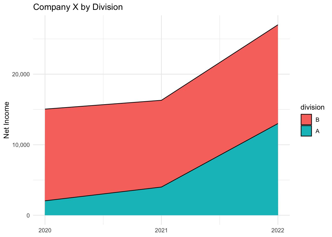
There are a few minor, cosmetic things I’d like to change:
- Note that the x-axis has values like “2020.0” and “2020.5”. I only want marks for the whole years.
- Give the net income values some commas.
- Labels could use some cleanup.
- Let’s change the default theme.
- Give the areas a black line.
example %>%
  mutate(divsion = as.factor(division)) %>%
  mutate(division = factor(division, levels = c("B", "A"))) %>%
  ggplot() +
  geom_area(
    aes(
      x = year,
      y = net_income,
      fill = division
    ),
    color = "black"
  ) +
  scale_x_continuous(breaks = seq(2020,2022,1)) +
  scale_y_continuous(labels = scales::comma) +
  theme_minimal() +
  labs(
    title = "Company X by Division",
    x = NULL,
    y = "Net Income"
  )

And there you have it: a basic stacked area plot.