Overview #
A stream graph is a variation of a stacked area chart. Stream graphs shows proportions of different categories along some other piece of sequenced data.
If you look at the data as vertical slices, the width of each section represents how much of something there is at each particular vertical slice.
You could call it a “stream plot” I suppose, but “stream graph” seems to be much more common.
Usage #
Stream graphs are often stacked in the sense that each vertical slice includes multiple categories. This makes it somewhat challenging to visually get a sense of how an individual category compares from slice to slice. Stream graphs are therefore more appropriately used to get a sense of how the collective of the categories changes across different vertical slices.
So far, I’ve been saying “vertical slices” to keep the terminology simple. More specifically, I’m referring to different points along the x-axis, where the x-axis is a numerical, sequential value of some sort.
A common x-axis is some sort of time dimension. When the x-axis is a time dimension, what a stream graph effectively conveys is how a collection of things change over time.
Data #
Stream graphs require at least two numerical fields, where one is a measure of some sort and the other is a sequenced numerical value. The “sequenced numerical value” really just means something that can be ordered from smallest to largest. A reasonable sequenced numerical value is something like dates or some other time marker.
Stream graphs also often include a third categorical field that can be used to separate data into groups.
R #
We can mock up and display some example data using the tidyverse and knitr packages.
library(tidyverse)
library(knitr)
A minimal example of a dataset that would work well with a stream graph might look something like this:
example_data <- tribble(
  ~year, ~measure, ~category,
  2000, 10, "A",
  2001, 14, "A",
  2002, 11, "A",
  2000, 3, "B",
  2001, 2, "B",
  2002, 7, "B",
  2000, 12, "C",
  2001, 4, "C",
  2002, 6, "C",
)

kable(example_data)
| year | measure | category |
|---|---|---|
| 2000 | 10 | A |
| 2001 | 14 | A |
| 2002 | 11 | A |
| 2000 | 3 | B |
| 2001 | 2 | B |
| 2002 | 7 | B |
| 2000 | 12 | C |
| 2001 | 4 | C |
| 2002 | 6 | C |
Static streamgraph in R #
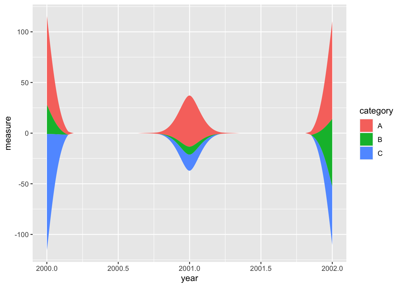
The package ggstream by David Sjoberg can be used to generate static streamgraphs using the ggplot2 tooling foundations.
# devtools::install_github("davidsjoberg/ggstream") # install ggstream if it's not already available
library(ggstream)
example_data %>%
  ggplot() +
  geom_stream(
    aes(
      x = year,
      y = measure,
      fill = category
    )
  )

That’s kind of sloppy, but is probably more a reflection of the underlying data being sparse.
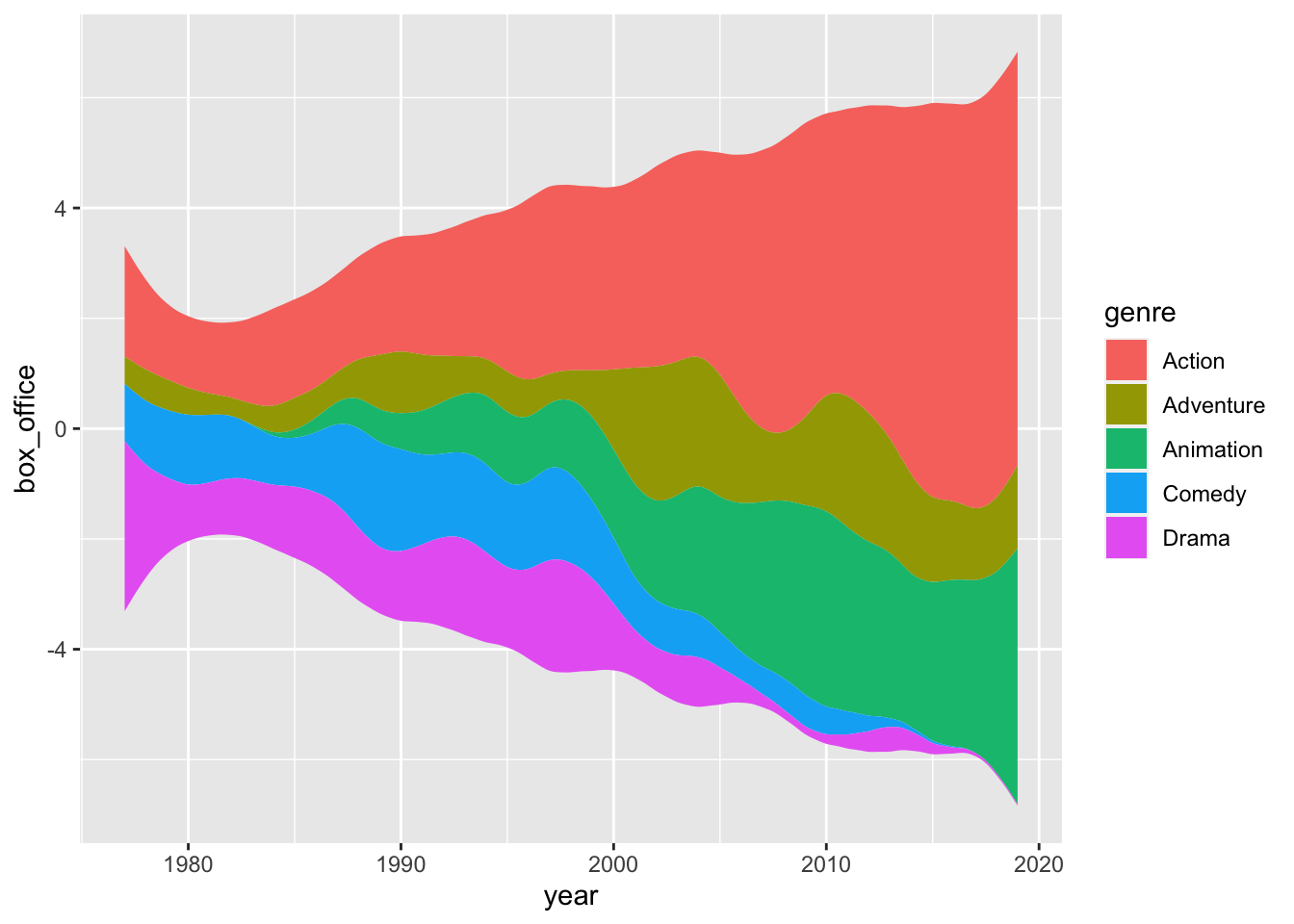
Here’s another example using the larger blockbusters sample dataset included in the ggstream package.
blockbusters
## # A tibble: 157 × 3
##     year genre     box_office
##    <dbl> <chr>          <dbl>
##  1  1977 Action         2.98
##  2  1977 Adventure      0.209
##  3  1977 Comedy         0.516
##  4  1977 Drama          2.54
##  5  1978 Action         1.92
##  6  1978 Adventure      0.760
##  7  1978 Comedy         1.04
##  8  1978 Drama          0.202
##  9  1979 Action         1.15
## 10  1979 Adventure      0.312
## # ℹ 147 more rows
blockbusters %>%
  ggplot() +
  geom_stream(
    aes(
      x = year,
      y = box_office,
      fill = genre
    )
  )

Interactive streamgraph in R #
There’s an R package available by hrbrmstr that is built on htmlwidget and is therefore interactive.
And then build a simple stream graph:
example_data %>%
  streamgraph(
    key = category,
    value = measure,
    date = year
  )
We can expand on that some with some more refinement and interactivity.
example_data %>%
  streamgraph(
    key = category,
    value = measure,
    date = year
  ) %>%
  sg_axis_x(
    tick_interval = 1, # change the number of ticks along the x-axis
    tick_units = "year" # change the tick units
    ) %>%
  sg_legend(show = TRUE, label = "Categories") # add a dropdown to highlight categories
Let’s try the same thing with the blockbusters dataset in the ggstream package:
blockbusters %>%
  streamgraph(
    key = genre,
    value = box_office,
    date = year
  ) %>%
  sg_axis_x(
    tick_interval = 5,
    tick_units = "year"
    ) %>%
  sg_legend(show = TRUE, label = "Genre")