Overview #
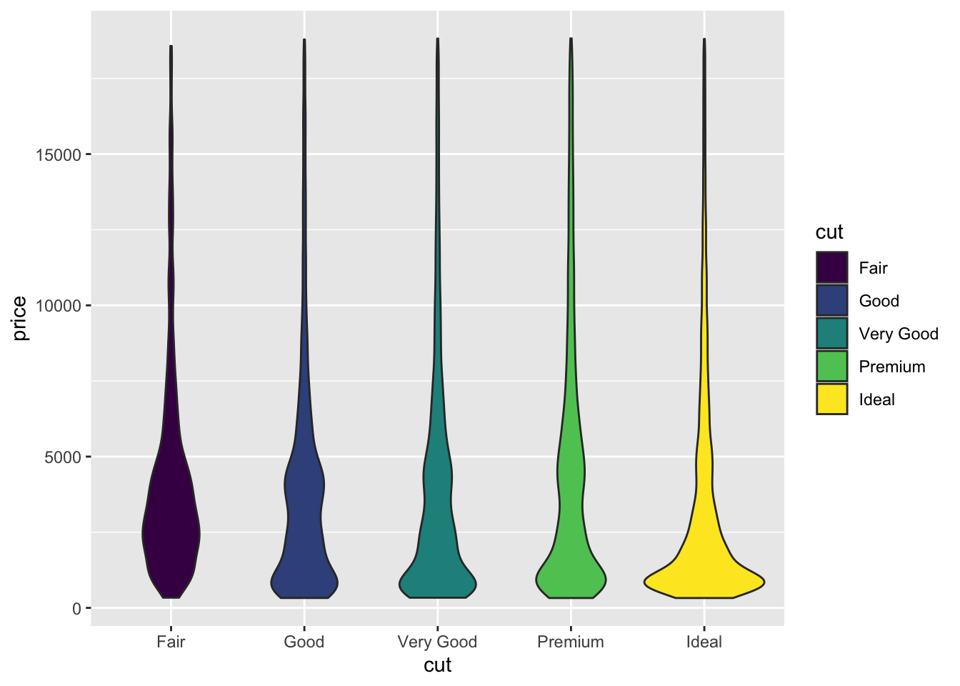
A violin plot is used to display the distribution of numerical variables. The width along the cross section of any part of the plotted violin represents how many data points there are within that given section.
A single violin plot can display the distribution of numerical variables for multiple categories.
Data #
A violin plot requires at least one categorical variable and one numerical variable.
R #
Let’s make a violin plot in R with the ggplot2 package. We’ll also use tooling from tidyverse to manipulate the data.
library(tidyverse)
library(ggplot2)
For this example, we’ll use the built in diamonds dataset.
## # A tibble: 53,940 × 10
##    carat cut       color clarity depth table price     x     y     z
##    <dbl> <ord>     <ord> <ord>   <dbl> <dbl> <int> <dbl> <dbl> <dbl>
##  1  0.23 Ideal     E     SI2      61.5    55   326  3.95  3.98  2.43
##  2  0.21 Premium   E     SI1      59.8    61   326  3.89  3.84  2.31
##  3  0.23 Good      E     VS1      56.9    65   327  4.05  4.07  2.31
##  4  0.29 Premium   I     VS2      62.4    58   334  4.2   4.23  2.63
##  5  0.31 Good      J     SI2      63.3    58   335  4.34  4.35  2.75
##  6  0.24 Very Good J     VVS2     62.8    57   336  3.94  3.96  2.48
##  7  0.24 Very Good I     VVS1     62.3    57   336  3.95  3.98  2.47
##  8  0.26 Very Good H     SI1      61.9    55   337  4.07  4.11  2.53
##  9  0.22 Fair      E     VS2      65.1    61   337  3.87  3.78  2.49
## 10  0.23 Very Good H     VS1      59.4    61   338  4     4.05  2.39
## # ℹ 53,930 more rows
Since a violin plot requires a categorical variable and a numerical variable, let’s go with the cut (categorical) and the price (numerical).
Let’s plot a very simple violin plot using cut and price.
ggplot(
  data = diamonds,
  aes(
    x = cut,
    y = price,
    fill = cut
    )
  ) +
  geom_violin()

Let’s break that down a bit.
data = diamonds defines the dataset we’re using here.
aes(...) defines the aesthetic mappings. Within aes, we’re basically saying that the x-axis should be used for the cut, the y-axis should be used for the price, and we’ll fill the plots by color based on the cut.