Overview #
A waffle plot is an excellent way to display proportions.
It can often be used in place of a pie chart. In fact, waffle charts are sometimes lovingly referred to as “square pie charts”.
One of the major advantages of waffle charts over pie charts is the absence of ambiguity.
Waffle charts are displayed in discrete blocks. Pie charts on the other hand are displayed in wedges, which can sometimes be difficult for the human eye to discern scale and proportions.
R #
A simple way to display a waffle plot in R is to use the waffle package by hrbrmstr.
To install the waffle package, run the following command (you may need to install the devtools package first by running install.packages("devtools")):
devtools::install_github("hrbrmstr/waffle")
Once installed, load it up along with ggplot2 and tidyverse for use:
library(tidyverse)
library(ggplot2)
library(waffle)
The waffle plot requires data that includes at least a categorical type and a numerical type. This can be represented using a vector or a dataframe.
A vector might look like:
vector <- c(
  "apples" = 5,
  "bananas" = 10,
  "cranberries" = 7
)

vector
##      apples     bananas cranberries
##           5          10           7
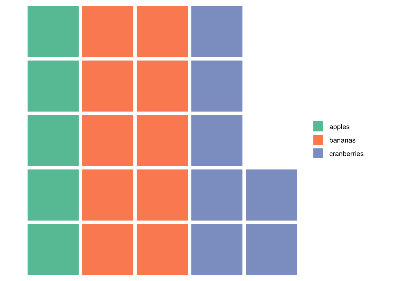
The vector can then be passed into an extremely simple waffle plot:
waffle(vector, rows = 5)

A waffle plot generated using a vector probably isn’t the most common use case. In practice, waffle plots are probably more often generated from dataframes with a categorical field and a numerical field.
We can use the diamonds dataset as an example, which reflects the prices and attributes of over 54,000 diamonds. This dataset includes a a few categorical fields, including the cut of the diamond.
Here, we’ll simply count the number of the different types of cuts, and represent them as cleanly rounded proportions.
prep_dat <- diamonds %>%
  count(cut) %>%
  mutate(
    tot = sum(n),
    prop = round((n / tot)*100)
    )

prep_dat
## # A tibble: 5 × 4
##   cut           n   tot  prop
##   <ord>     <int> <int> <dbl>
## 1 Fair       1610 53940     3
## 2 Good       4906 53940     9
## 3 Very Good 12082 53940    22
## 4 Premium   13791 53940    26
## 5 Ideal     21551 53940    40
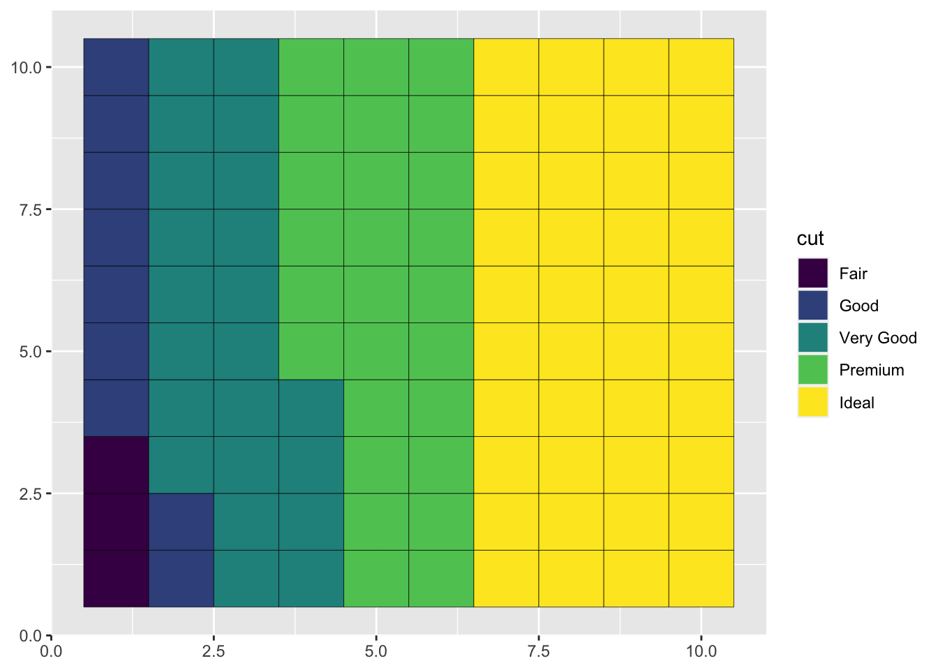
The proportions of the different cuts can be presented in a waffle plot:
prep_dat %>%
  ggplot(
    aes(
      fill = cut,
      values = prop
    )
  ) +
  geom_waffle()

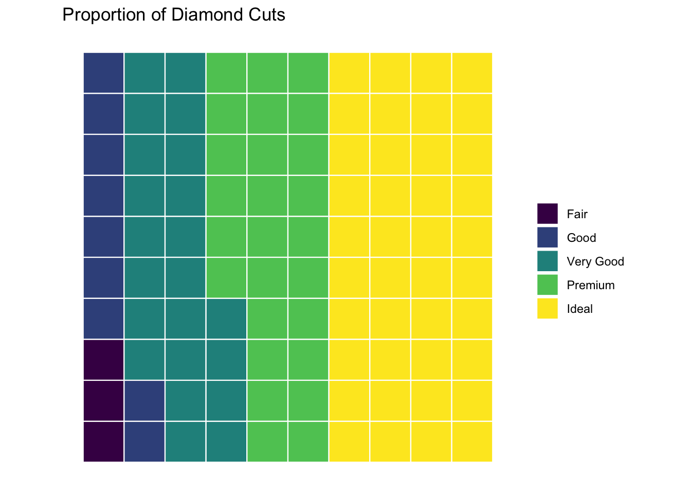
That waffle plot above is a minimum viable plot and is pretty rough. It can be polished up some with a few tweaks.
prep_dat %>%
  ggplot(
    aes(
      fill = cut,
      values = prop
    )
  ) +
  geom_waffle(
    n_rows = 10,
    size = .4,
    color = "white"
  ) +
  coord_equal() +
  theme_minimal() +
  theme_enhance_waffle() +
  theme(
    legend.title = element_blank()
  ) +
  labs(
    title = "Proportion of Diamond Cuts"
  )

There you have it: a fairly simple but functional waffle plot.