FBI Internet Crime Compaint Center Report
March 28, 2022
Overview #
The FBI’s Internet Crime Complaint Center (IC3) puts out an annual report that summarizes the recent year’s experiences with Internet crime.
It includes analysis that hints at the availability of quantitative data (versus purely qualitative anecdotes).

Here’s a copy of the IC3’s latest report.
Data #
The available data is embedded in the reports themselves, which are in .pdf – less than ideal.

Fortunately, my colleague hrbrmstr has been generous enough the manually collect the data on crime types, monetary losses, and victim counts from several years worth of reports, and consolidate it all into an easily-workable .csv file.
What the raw data looks like:
Most of the crime type labels are I think pretty self-explanatory. BEC/EAC stands for “Business Email Compromise / Email Account Compromise”.
Analysis #
The multi-year panel data lends itself well to a bump plot visualization, which is handy for presenting ordinal ranking over multiple periods.
Here’s how to put together some bump plots.
First, let’s load up the packages we’ll be using.
library(tidyverse)
library(hrbrthemes)
library(ggbump)
To assemble a bump plot, we have to derive rankings.
ranked <- dat %>%
  group_by(year) %>%
  arrange(desc(loss)) %>%
  mutate(rank_loss = row_number()) %>%
  arrange(desc(victim_count)) %>%
  mutate(rank_victims = row_number()) %>%
  ungroup()

head(ranked)
## # A tibble: 6 × 6
##   crime_type                     year   loss victim_count rank_loss rank_victims
##   <chr>                         <dbl>  <dbl>        <dbl>     <int>        <int>
## 1 Phishing/Vishing/Smishing/Ph…  2021 4.42e7       323972        18            1
## 2 Phishing/Vishing/Smishing/Ph…  2020 5.42e7       241342        17            1
## 3 Phishing/Vishing/Smishing/Ph…  2019 5.78e7       114702        13            1
## 4 Non-Payment/Non-Delivery       2020 2.65e8       108869         4            2
## 5 Non-Payment/Non-Delivery       2021 3.37e8        82478         7            2
## 6 Extortion                      2020 7.09e7        76741        14            3
It also helps to assign the number of distinct categories to a fixed variable that can easily be referenced later.
We could easily do this manually, but I like adhering the the DRY principle – “Don’t Repeat Yourself”. By encoding the value, we won’t have to change things across multiple pieces of code if the underlying data ever changes; we’ll only have to change the code in one spot.
crime_type_count <- length(unique(ranked$crime_type))

crime_type_count
## [1] 28
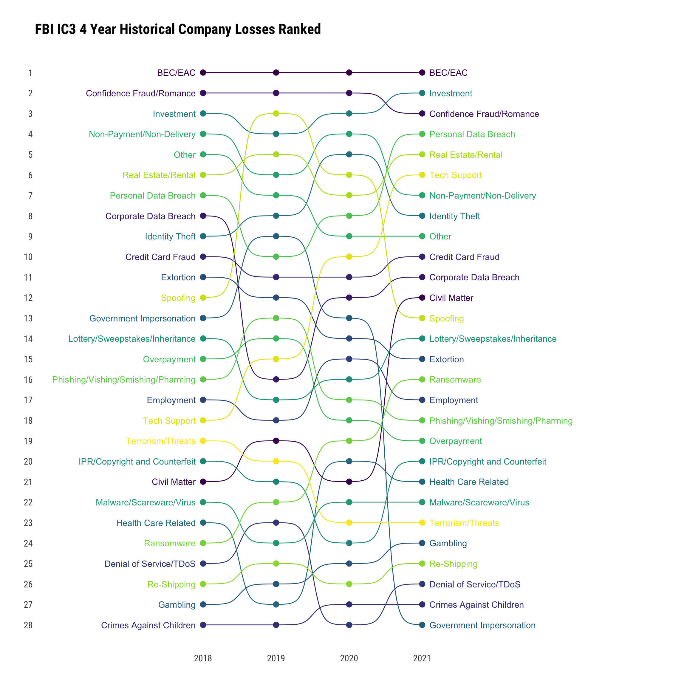
Bump plot ordered by monetary losses:
ranked %>%
  ggplot(aes(x = year, y = rank_loss, color = crime_type)) +
  geom_bump() +
  geom_point(size = 3) +
  geom_text(data = ranked %>% filter(year == min(year)), aes(x = year - .1, label = crime_type), hjust = 1) +
  geom_text(data = ranked %>% filter(year == max(year)), aes(x = year + .1, label = crime_type), hjust = 0) +
  scale_x_continuous(limits = c(2017.5, 2022.5), expand = c(.3,.3), breaks = c(2018,2019,2020,2021)) +
  scale_y_reverse(breaks = seq(1,crime_type_count,1)) +
  theme_ipsum_rc(grid = "") +
  scale_color_viridis_d() +
  theme(
    legend.position = "none",
    axis.title.y = element_text(angle = 0)
    ) +
  labs(
    title = "FBI IC3 4 Year Historical Company Losses Ranked",
    x = NULL,
    y = NULL
  )

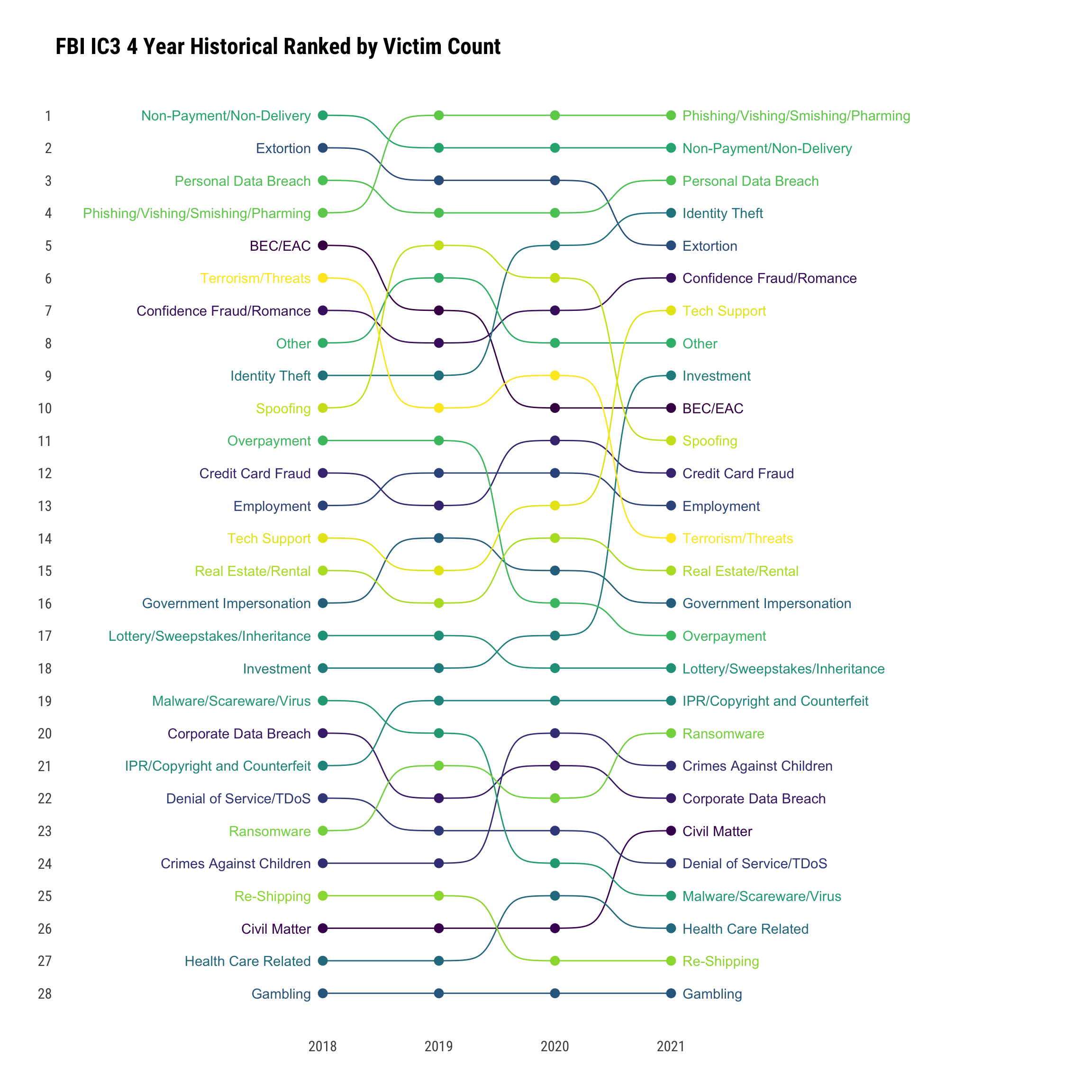
Bump plot ordered by number of victims:
ranked %>%
  ggplot(aes(x = year, y = rank_victims, color = crime_type)) +
  geom_bump() +
  geom_point(size = 3) +
  geom_text(data = ranked %>% filter(year == min(year)), aes(x = year - .1, label = crime_type), hjust = 1) +
  geom_text(data = ranked %>% filter(year == max(year)), aes(x = year + .1, label = crime_type), hjust = 0) +
  scale_x_continuous(limits = c(2017.5, 2022.5), expand = c(.3,.3), breaks = c(2018,2019,2020,2021)) +
  scale_y_reverse(breaks = seq(1,crime_type_count,1)) +
  theme_ipsum_rc(grid = "") +
  scale_color_viridis_d() +
  theme(
    legend.position = "none",
    axis.title.y = element_text(angle = 0)
    ) +
  labs(
    title = "FBI IC3 4 Year Historical Ranked by Victim Count",
    x = NULL,
    y = NULL
  )

I’ve chosen to use the viridis color palette because it’s friendly to printers and the color blind.
Parting Thoughts #
There are more ways to analyze this particular dataset.
If you have ideas, feel free to drop me a message.